
Dashboard Tile을 사용하여 쉽게 대시보드 작성
새로운 차트 기능인 대시보드 타일을 소개하게 되어 매우 기쁩니다. 이 차트 작성 기능을 사용하여 거의 수동 코딩 없이 대화형 대시보드를 구축하는 방법을 알아보세요.
 그레이엄 머레이
7분 읽기
그레이엄 머레이
7분 읽기
소개
이번 출시에서는 Infragistics 새롭고 흥미로운 차트 기능을 공개할 예정입니다. 우리는 그것을DashboardTile 그리고 최종 사용자가 다양한 툴바 동작을 통해 런타임에 변경할 수 있는 동적 시각화를 제공하는 것이 목적입니다. 이 문서는 이용 가능합니다 지금 미리 보기 Ignite UI에 대해 Angular / React / 웹컴포넌트 / Blazor 그리고 Ultimate UI for WPF (그리고 앞으로도 더 많은 플랫폼이 출시될 예정입니다).
동기
Infragistics 에서는 일반적으로 구성 요소를 매우 모듈식으로 구성합니다. 완전한 차트 작성 환경에는 차트, 범례, 도구 모음, ZoomSlider, 레이블, 설정 등을 포함하여 구성/연결해야 하는 여러 가지 서로 다른 구성 요소가 포함될 수 있습니다. 한 사용자는 한 가지 방식으로 구성 및 배치하기를 원할 수 있고 다른 사용자는 완전히 다른 방식으로 구성 및 배치하기를 원할 수 있으므로 이러한 구성 요소가 분리되어 있지만 연결되어 있고 재량에 따라 사용자의 레이아웃에 배치하고 개별적으로 구성할 수 있다는 것이 유용합니다.
그러나 이로 인해 간단한 작업을 완료하기 위해 자세한 구성의 양이 발생할 수 있으며 사용자가 구성 요소를 구성할 수 있는 정도가 어려울 수 있습니다. 상황을 더 어렵게 만드는 것은 웹에서 미학적으로 만족스러운 데이터 시각화 레이아웃을 달성하는 것이 특히 플랫폼에 대한 경험이 적은 사람들에게는 어려울 수 있다는 것입니다. 또한 많은 사용자가 구성 요소의 합리적으로 간단한 구성을 원할 수 있습니다.
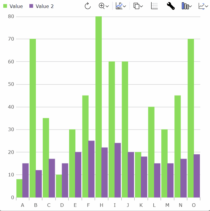
예를 들어, 다음은 시각화가 표시되도록 하는 매우 일반적인 방법입니다.
그리고 그 효과를 내기 위해이 html이 필요했습니다.
<!DOCTYPE html>
<html>
    <head>
        <title>Sample | Ignite UI | Web Components | infragistics</title>
        <meta charset="UTF-8" />

        <link rel="stylesheet"
        href="/src/index.css"
        type="text/css" />
    </head>

    <body>
        <div id="root">
            <div class="container sample">
                <div class="aboveContentSplit">
                    <div
                    class="aboveContentLeftContainer">
                        <igc-toolbar
                        name="toolbar"
                        id="toolbar"
                        orientation="Horizontal">
                        </igc-toolbar>
                    </div>
                    <div
                    class="aboveContentRightContainer">
                        <igc-legend
                        name="legend"
                        id="legend"
                        orientation="Horizontal">
                        </igc-legend>
                    </div>
                </div>

                <div class="container fill">
                    <igc-category-chart name="chart"
                    id="chart"
                    chart-type="Line"
                    is-horizontal-zoom-enabled="true"
                    is-vertical-zoom-enabled="true"
                    included-properties="year, europe, china, america"
                    y-axis-title="TWh"
                    is-transition-in-enabled="true">
                    </igc-category-chart>
                </div>
            </div>
        </div>
    </body>
</html>
그리고이 CSS :
.aboveContentSplit {
    display: flex;
    flex-direction: row;
}
.aboveContentLeftContainer {
    margin-left: 1.25rem;
    display: flex;
    flex-grow: 1;
    justify-content: flex-start;
    align-items: flex-end;
}
.aboveContentRightContainer {
    margin-right: 1.25rem;
    display: flex;
    flex-grow: 1;
    justify-content: flex-end;
    align-items: flex-end;
}

html,
body,
#root {
    margin: 0px;
    height: 100%;
}

.container {
    display: flex;
    flex-flow: column;
    flex-wrap: nowrap;
    align-items: stretch;
    align-self: stretch;
    /* min-width: 200px; */
    height: 100%;
    width: 100%;
    padding: 0px;
    margin: 0px;
    box-sizing: border-box;
}

.fill > * {
    height: 100%;
}
그리고 구성 요소는 다음과 같이 코드로 구성해야했습니다.
import {
    IgcLegendModule,
    IgcCategoryChartModule,
    IgcCategoryChartToolbarModule }
    from "igniteui-webcomponents-charts";
import { IgcToolbarModule } from "igniteui-webcomponents-layouts";
import {
    IgcLegendComponent,
    IgcCategoryChartComponent
    }
    from "igniteui-webcomponents-charts";
import { IgcToolbarComponent } from "igniteui-webcomponents-layouts";
import { CountryRenewableElectricity } from "./CountryRenewableElectricity";
import { ModuleManager } from "igniteui-webcomponents-core";

import "./index.css";

ModuleManager.register(
    IgcLegendModule,
    IgcToolbarModule,
    IgcCategoryChartModule,
    IgcCategoryChartToolbarModule);

var legend = document.getElementById("legend") as IgcLegendComponent;
var toolbar = document.getElementById("toolbar") as IgcToolbarComponent;
var chart = document.getElementById("chart") as IgcCategoryChartComponent;

toolbar.target = chart;
chart.dataSource = new CountryRenewableElectricity();
chart.legend = legend;
이에 대응DashboardTile 하여 제공된 데이터에 대해 0 또는 거의 0에 가까운 구성으로 공통 구성 요소 집합을 제시하고, 모두 미적으로 보기 좋게 배치되도록 설계되었습니다.
또한 Infragistics는 모든 구성 요소의 통합에 대해 더 큰 제어 권한을 부여하기 때문에 최종 사용자가 사용 가능한 다양한 메뉴를 기반으로 시각화가 표시되는 방식을 조정할 수 있는 편집 가능한 대시보드 타일 시나리오를 만들 수 있습니다. 이는 응용 프로그램에서 동적 대시보드를 더 쉽게 만들 수 있도록 하기 위한 것입니다.
비교하자면, 위 시나리오는 다음 html로DashboardTile 만들 수 있습니다:
<!DOCTYPE html>
<html>
    <head>
        <title>Sample | Ignite UI | Web Components | infragistics</title>
        <meta charset="UTF-8" />

        <link rel="stylesheet"
        href="/src/index.css"
        type="text/css" />
    </head>

    <body>
        <igc-dashboard-tile
            id="tile"
            tile-title="Renewable Electricity by Country"
            width="100%"
            height="100%">
        </igc-dashboard-tile>
    </body>
</html>
그리고이 CSS :
html,
body {
    margin: 0px;
    height: 100%;
}
그리고이 코드는 다음과 같습니다.
import { CountryRenewableElectricity } from "./CountryRenewableElectricity";
import { ModuleManager } from "igniteui-webcomponents-core";
import {
    IgcDashboardTileComponent,
    IgcDashboardTileModule,
    IgcDataChartDashboardTileModule,
    IgcGeographicMapDashboardTileModule,
    IgcLinearGaugeDashboardTileModule,
    IgcPieChartDashboardTileModule,
    IgcRadialGaugeDashboardTileModule
} from "igniteui-webcomponents-dashboards";
import "./index.css";

ModuleManager.register(
    IgcDashboardTileModule,
    IgcDataChartDashboardTileModule,
    IgcPieChartDashboardTileModule,
    IgcGeographicMapDashboardTileModule,
    IgcRadialGaugeDashboardTileModule,
    IgcLinearGaugeDashboardTileModule);

var tile = document.getElementById("tile") as IgcDashboardTileComponent;
tile.dataSource = new CountryRenewableElectricity();
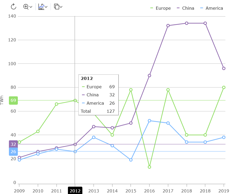
하지만 정말 멋진 점은 시나리오 버전이DashboardTile 이전CategoryChart 버전보다 훨씬 더 역동적이라는 것입니다.
대시보드 타일 분석
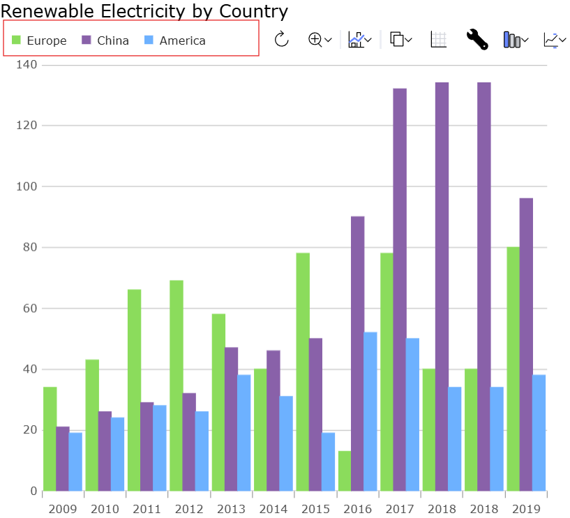
DashboardTile통합된 직함이 있습니다:
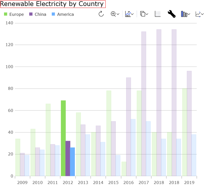
이 기능은 다음에tileTitle 설정할 수 있습니다.
DashboardTile통합 범례가 있으며, 이 평범한 표는 해당 차트에서 항목을 표시하도록 자동으로 설정되어 있습니다.
DashboardTile카테고리 차트와 유사한 명령어 집합을 보여주는 툴바를 제시합니다:
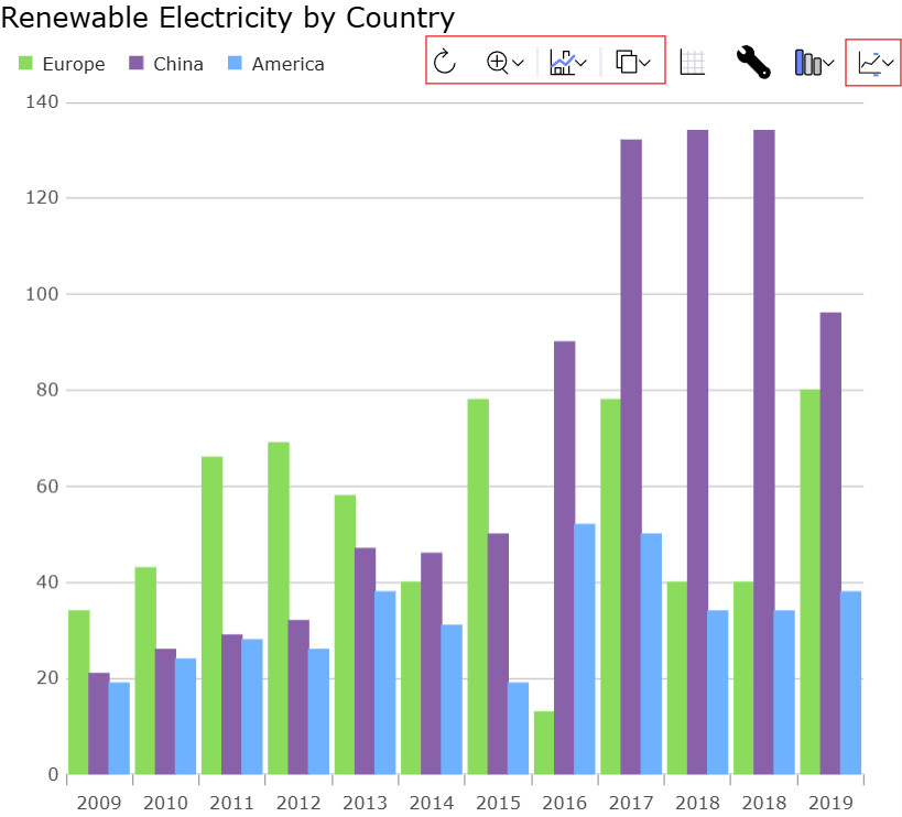
하지만 특정 행동DashboardTile 들도 몇 가지 있습니다.
그리드 액션을 클릭하면 데이터에 묶DashboardTile 인 그리드가 표시됩니다. 선택 상태는 그리드와 차트 간에 동기화됩니다.

편집기 작업을 클릭하면 현재 표시된 시각화에 대한 컨텍스트 설정이 있는 편집기가 표시되며, 이를 통해 최종 사용자는 시각화를 원하는 대로 수정할 수 있습니다.
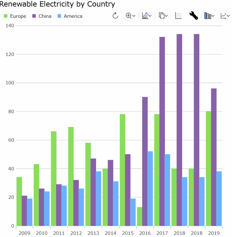
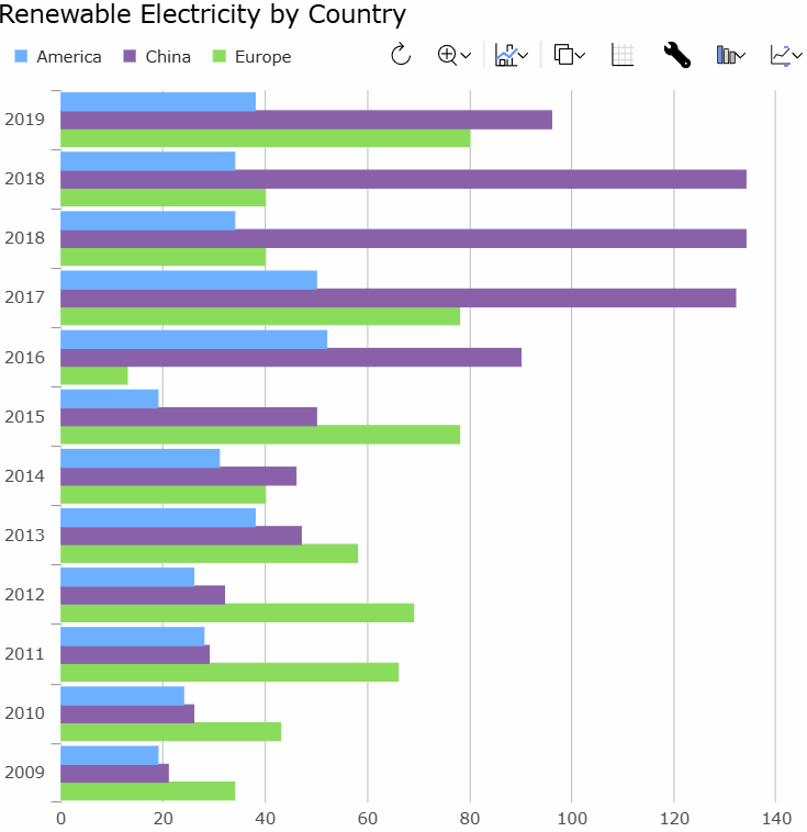
처음 표시할 때DashboardTile 어떤 시각화를 보여줄지 최선의 추측을 합니다(이 부분은 나중에 더 설명합니다). 만약 틀렸거나 다른 시각화 방법과 비교하고 싶다면, 툴바의 차트 유형 동작을 사용할 수 있습니다:
만약 에DashboardTileLocalDataSource 묶으면 그룹화/요약 상태가 그리드와 차트 간에 동기화되어, 그리드 집계의 변경 사항이 차트로 전파됩니다.
자동 시각화
데이터 시각화 시나리오를 쉽게 구성하고 배치할 수 있게 해주고, 최종 사용자가 런타임에 수정할 수 있게 하는 것 외에도,DashboardTile 설정 없이도 유용한 시각화를 자동으로 렌더링할 수 있게 도와줍니다.
이렇게 하면 더 적은 코드로 더 많은 작업을 더 쉽게 수행할 수 있지만 응용 프로그램에 매우 동적인 데이터가 있고 빌드 시 사용할 시각화를 반드시 예측할 수 없는 경우에도 도움이 됩니다.
DashboardTile휴리스틱 라이브러리를 사용하여 가장 적합한 시각화를 결정하려고 합니다. 다음은 몇 가지 예시입니다:
- 단일 값을 제공하면,
DashboardTile당신에게 ORLinearGaugeRadialGauge을 제시할 가능성이 높습니다. - 서로 쉽게 구분할 수 있는 소수의 값을 제공하면,
DashboardTile이는 당신PieChart에게 보여줄 가능성이 높습니다. - 정확
DashboardTile히 비교하기 어려운 소수의 값을 제공하면 대신PieChart열형 차트를 제시할 수 있습니다. - 열형 차트
DashboardTile에 비해 많은 값이 있으면 선형 차트를 보여줄 수 있습니다. - 데이터가 산란 값으로 보인다면,
DashboardTile산점도가 보통 나타납니다. - 산란 데이터가 지리 좌표로 보인다면,
DashboardTile차트 대신 지도에 표시하는 것을 선택할 수도 있습니다. - 데이터가 기하학적 모양으로 표시되는 경우 차트 또는 맵에 그려질 수 있습니다.
- 만약 데이터가 주식 데이터로 보인다면,
DashboardTile캔들스틱이나 OHLC 플롯을 표시할 수도 있습니다. - 만약 휴리스틱이 속는다면
DashboardTile, 속성을 통해chartType원하는 차트 유형을 설정하거나 툴바 차트 타입 액션으로 차트 유형을 수정할 수 있습니다.
결론
DashboardTile이 기능은 이제 미리보기로 공개한 흥미로운 새로운 차트 기능 중 하나입니다. 최종 출시 전에 더 많은 개선을 위해 여러분의 피드백을 주시면 감사하겠습니다.

