
Building Dashboards with Ease Using the Dashboard Tile
We are extremely excited to introduce a brand-new charting functionality – Dashboard Tile. Learn how to use this charting feature to build interactive Dashboards with almost no hand-coding at all.
 Graham Murray
7 min read
Graham Murray
7 min read
Introduction
This release, Infragistics has a new and exciting charting feature to reveal. We call it the DashboardTile and its purpose is to present a dynamic visualization that the end user can alter at runtime via its various toolbar actions. It is available now as a Preview for Ignite UI For Angular/React/WebComponents/Blazor and Ultimate UI for WPF (and more platforms to come).
Motivation
At Infragistics, we usually organize our components to be extremely modular. A complete charting experience can involve a number of disparate components to configure/connect, including: Chart, Legend, Toolbar, ZoomSlider, Labels, Settings, etc. One user may want these configured and laid out in one way, while another user may want them configured and laid out in an entirely different way, so it’s useful to us that these components are separate but connected, and can be placed in the user’s layout at their discretion and individually configured.
However, this can result in a verbose amount of configuration to complete simple tasks, and the degree to which we allow the user to configure the components can be daunting. To make things more challenging, achieving aesthetically pleasing data visualization layouts can be challenging on the web, especially for those less experienced with the platform. Moreover, a large portion of users may want a reasonably straightfoward configuration of the components.
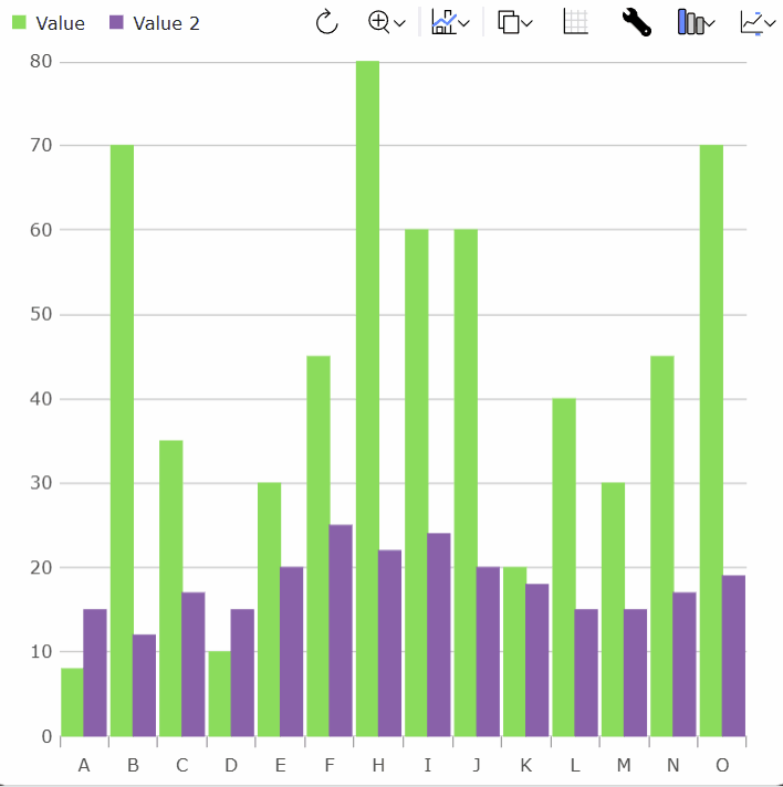
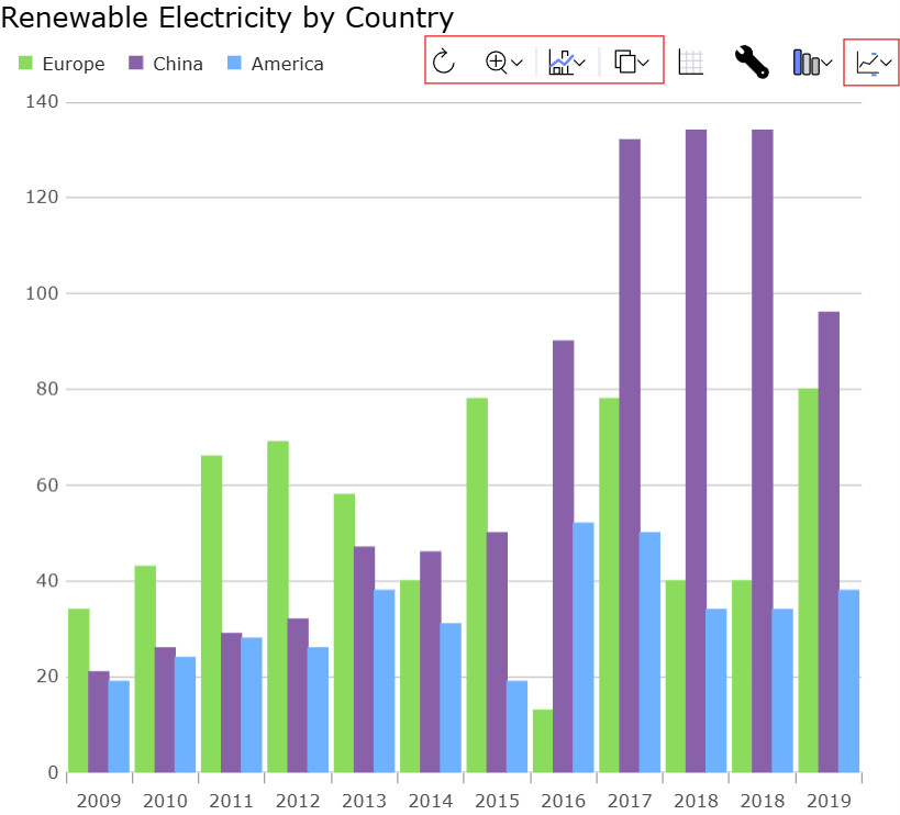
For example, this is a pretty common way to want a visualization to look:
And to produce that effect, this html was required:
<!DOCTYPE html>
<html>
    <head>
        <title>Sample | Ignite UI | Web Components | infragistics</title>
        <meta charset="UTF-8" />

        <link rel="stylesheet"
        href="/src/index.css"
        type="text/css" />
    </head>

    <body>
        <div id="root">
            <div class="container sample">
                <div class="aboveContentSplit">
                    <div
                    class="aboveContentLeftContainer">
                        <igc-toolbar
                        name="toolbar"
                        id="toolbar"
                        orientation="Horizontal">
                        </igc-toolbar>
                    </div>
                    <div
                    class="aboveContentRightContainer">
                        <igc-legend
                        name="legend"
                        id="legend"
                        orientation="Horizontal">
                        </igc-legend>
                    </div>
                </div>

                <div class="container fill">
                    <igc-category-chart name="chart"
                    id="chart"
                    chart-type="Line"
                    is-horizontal-zoom-enabled="true"
                    is-vertical-zoom-enabled="true"
                    included-properties="year, europe, china, america"
                    y-axis-title="TWh"
                    is-transition-in-enabled="true">
                    </igc-category-chart>
                </div>
            </div>
        </div>
    </body>
</html>
And this css:
.aboveContentSplit {
    display: flex;
    flex-direction: row;
}
.aboveContentLeftContainer {
    margin-left: 1.25rem;
    display: flex;
    flex-grow: 1;
    justify-content: flex-start;
    align-items: flex-end;
}
.aboveContentRightContainer {
    margin-right: 1.25rem;
    display: flex;
    flex-grow: 1;
    justify-content: flex-end;
    align-items: flex-end;
}

html,
body,
#root {
    margin: 0px;
    height: 100%;
}

.container {
    display: flex;
    flex-flow: column;
    flex-wrap: nowrap;
    align-items: stretch;
    align-self: stretch;
    /* min-width: 200px; */
    height: 100%;
    width: 100%;
    padding: 0px;
    margin: 0px;
    box-sizing: border-box;
}

.fill > * {
    height: 100%;
}
and the components needed to be configured in code like so:
import {
    IgcLegendModule,
    IgcCategoryChartModule,
    IgcCategoryChartToolbarModule }
    from "igniteui-webcomponents-charts";
import { IgcToolbarModule } from "igniteui-webcomponents-layouts";
import {
    IgcLegendComponent,
    IgcCategoryChartComponent
    }
    from "igniteui-webcomponents-charts";
import { IgcToolbarComponent } from "igniteui-webcomponents-layouts";
import { CountryRenewableElectricity } from "./CountryRenewableElectricity";
import { ModuleManager } from "igniteui-webcomponents-core";

import "./index.css";

ModuleManager.register(
    IgcLegendModule,
    IgcToolbarModule,
    IgcCategoryChartModule,
    IgcCategoryChartToolbarModule);

var legend = document.getElementById("legend") as IgcLegendComponent;
var toolbar = document.getElementById("toolbar") as IgcToolbarComponent;
var chart = document.getElementById("chart") as IgcCategoryChartComponent;

toolbar.target = chart;
chart.dataSource = new CountryRenewableElectricity();
chart.legend = legend;
In response, DashboardTile is meant to present a common set of components for the provided data with zero or next to zero configuration, and all laid out in an aesthetically pleasing way.
Additionally, since Infragistics is taking greater control over the integration of all the components we take the opportunity to create an editable dashboard tile scenario whereby the end user is able to tweak how the visualization is presented based on various menus that are made available. This is intended to make it easier to create dynamic dashboards in your applications.
By comparison, the above scenario can be created with DashboardTile with this html:
<!DOCTYPE html>
<html>
    <head>
        <title>Sample | Ignite UI | Web Components | infragistics</title>
        <meta charset="UTF-8" />

        <link rel="stylesheet"
        href="/src/index.css"
        type="text/css" />
    </head>

    <body>
        <igc-dashboard-tile
            id="tile"
            tile-title="Renewable Electricity by Country"
            width="100%"
            height="100%">
        </igc-dashboard-tile>
    </body>
</html>
and this css:
html,
body {
    margin: 0px;
    height: 100%;
}
and this code:
import { CountryRenewableElectricity } from "./CountryRenewableElectricity";
import { ModuleManager } from "igniteui-webcomponents-core";
import {
    IgcDashboardTileComponent,
    IgcDashboardTileModule,
    IgcDataChartDashboardTileModule,
    IgcGeographicMapDashboardTileModule,
    IgcLinearGaugeDashboardTileModule,
    IgcPieChartDashboardTileModule,
    IgcRadialGaugeDashboardTileModule
} from "igniteui-webcomponents-dashboards";
import "./index.css";

ModuleManager.register(
    IgcDashboardTileModule,
    IgcDataChartDashboardTileModule,
    IgcPieChartDashboardTileModule,
    IgcGeographicMapDashboardTileModule,
    IgcRadialGaugeDashboardTileModule,
    IgcLinearGaugeDashboardTileModule);

var tile = document.getElementById("tile") as IgcDashboardTileComponent;
tile.dataSource = new CountryRenewableElectricity();
But the truly awesome part is that the DashboardTile version of the scenario is much more dynamic than the version that used CategoryChart.
Anatomy of the Dashboard Tile
DashboardTile has an integrated title:
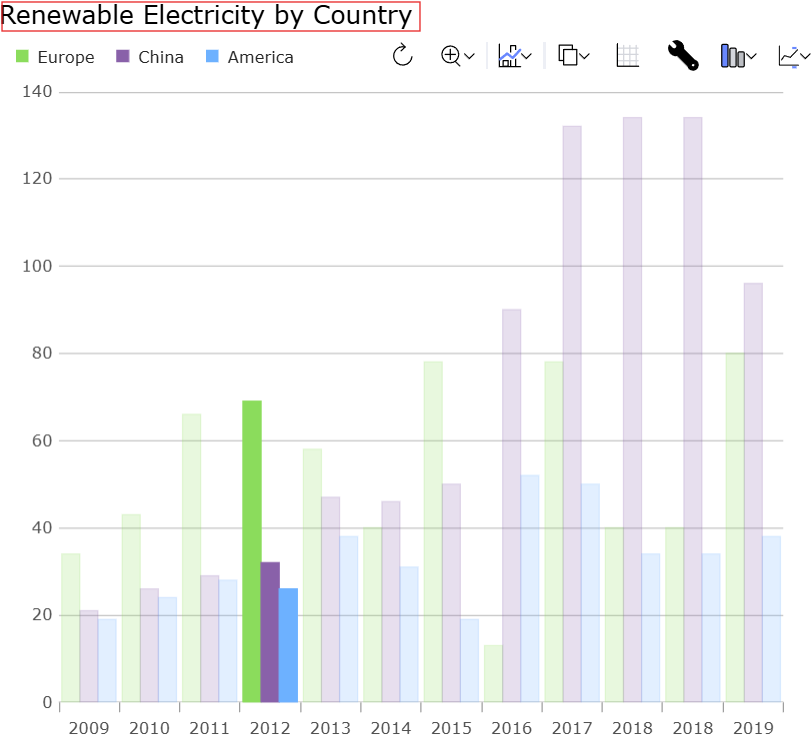
which you can set via the tileTitle.
DashboardTile has an integrated legend which is automatically configured to display items from the associated chart, whichever that may be:
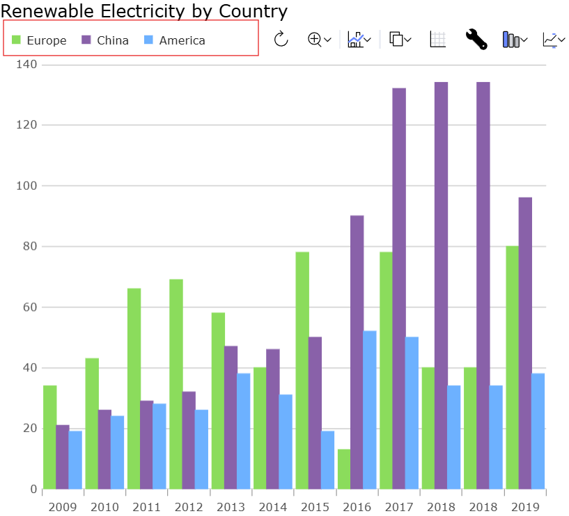
DashboardTile presents a toolbar which surfaces a similar set of commands compared to category chart:
But there are additionally several other actions that are specific to DashboardTile.
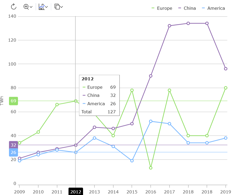
If you click the grid action, it shows a grid containing the data that is bound to the DashboardTile. Selection state is synchronized between the grid and the chart.

If you click the editor action, it shows an editor with contextual settings for the current displayed visualization which allow the end-user to modify the visualization to their liking.
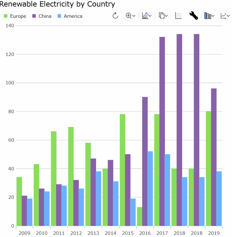
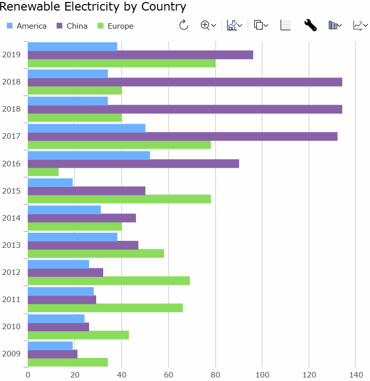
When the DashboardTile initially displays it gives its best guess as to which visualization to show you (more on that later). If it was incorrect, though, or if you’d like to compare with other ways to visualize the data you can use the chart type action on the toolbar:
If you bind the DashboardTile to a LocalDataSource the grouping/summary state is even synchronized between the grid and the chart, so that changes to the grid aggregation are propagated to the chart.
Automatic Visualization
Apart from making it easier to lay out and configure a data visualization scenario, and letting the end user modify things are runtime, the DashboardTile also helps you automatically render a useful visualization with no configuration.
This is helpful to make it easier to do more with less code, but it also helps if your application has very dynamic data, and you can’t necessarily predict which visualization to use at build time.
DashboardTile uses a library of heuristics to try to determine the most appropriate visualization to display. Here are some examples:
- If you provide a single value,
DashboardTileis likely to present you with aLinearGaugeorRadialGauge. - If you provide a small number of values that are easy to distinguish from one another,
DashboardTileis likely to present you with aPieChart. - If you provide a small number of values that are difficult to compare precisely
DashboardTilewill avoid aPieChartand instead present you with a column chart. - If you have more values than make sense for a column chart,
DashboardTilewill tend to show you a line chart. - If your data appears to be scatter values,
DashboardTilewill tend to show you a scatter chart. - If your scatter data seems to be geographic coordinates,
DashboardTilemay choose to plot these on a map rather than a chart. - If your data appears to be geometric shapes, these might be plotted on a chart or a map.
- If your data appears to be stock data,
DashboardTilemay chose to show a candlestick or OHLC plot. - If
DashboardTile‘s heuristics are fooled, you can always set the desired chart type via thechartTypeproperty, or modify the chart type via the toolbar chart type action.
Conclusion
DashboardTile is an exciting new charting feature which we have now released as a Preview. We’d appreciate your feedback so that we can make more improvements before final release.

