What’s New: Ignite UI for Angular 19.1
Ignite UI for Angular 19.1에는 쿼리 빌더 및 캐러셀 구성 요소를 비롯한 강력한 새 기능이 포함되어 있습니다. 이 릴리스 블로그 게시물에서 자세히 알아보세요.
 라도슬라프 미르체프
7분 읽기
라도슬라프 미르체프
7분 읽기
2024년 11월 Angular 19와의 호환성과 향상된 그리드 요약 기능과 함께 제공되는 Ignite UI for Angular 19.0이 출시된 후 Ignite UI for Angular 19.1이 필요한 시점입니다. 새로운 디자인과 강력한 새 기능이 함께 제공됩니다.
- 쿼리 빌더 – 새로운 디자인, 다중 테이블 쿼리 지원, 중첩 쿼리 등.
- 캐러셀 – 업데이트된 디자인 및 수직 방향 지원.
각 테마에 대해 더 자세히 살펴보겠습니다.
Query Builder 구성 요소 업데이트
Angular Query Builder 구성 요소는 출시된 지 얼마 되지 않았으며 개발자가 지정된 데이터 세트에 대한 복잡한 데이터 필터링 쿼리를 작성할 수 있는 풍부한 UI를 제공합니다. 환상적인 새 디자인과 몇 가지 강력한 새 기능을 받았습니다.
먼저 디자인 및 동작 변경에 대해
Full list of behavioral changes:
- Expression은 한 번의 클릭으로 편집 모드에 들어갑니다.
EnterSpace - Query Builder 구성 요소 내에서 조건을 선택하는 것은 더 이상 지원되지 않습니다.
- 그룹화/그룹 해제 표현식은 이제 새로 노출된 드래그 앤 드롭 기능을 통해 달성되거나 사용자는 화살표 위쪽/아래쪽 키를 사용하여 컨디션 칩의 위치를 변경할 수 있습니다.
- 상황에 맞는 메뉴를 통해 여러 표현식을 삭제하는 것은 더 이상 지원되지 않습니다.
- 범례가 제거됩니다.
- title 입력이 설정되지 않으면 기본적으로 빈 문자열이 됩니다.
다음으로, 새로운 기능에 대해 설명합니다
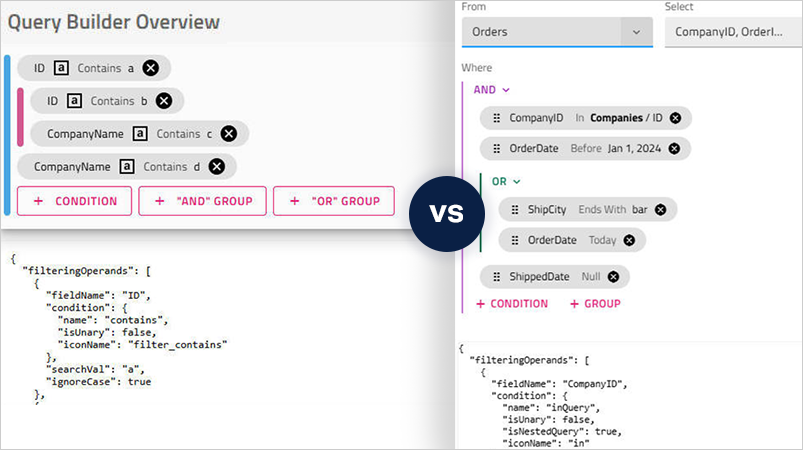
Angular Query Builder는 이제 다중 테이블 쿼리 지원을 지원합니다.
Orders, Customers 및 Products에 대한 별도의 테이블이 있는 전자 상거래 응용 프로그램이 있는 시나리오를 상상해 보십시오. 다중 테이블 쿼리는 이러한 테이블의 데이터를 결합하여 고객 세부 정보 및 제품 정보를 포함하여 각 주문에 대한 자세한 보기를 모두 하나의 그리드 구성 요소 내에 표시할 수 있습니다. 특정 시나리오에 따라 사용자가 즉석에서 향상시킬 수 있습니다. 이렇게 하면 서로 다른 응용 프로그램 섹션 사이를 이동할 필요 없이 전체적인 보기를 제공하여 사용자 경험을 개선할 수 있습니다.
이와 관련하여 Angular Query Builder 구성 요소를 사용하면 이러한 복잡한 쿼리를 시각적으로 만들 수 있습니다. 이 구성 요소를 통해 사용자는 다른 테이블에서 필드를 선택하고, 관계를 정의하고, 조건을 설정할 수 있습니다. 그런 다음 결과 쿼리를 실행하여 결합된 데이터를 가져올 수 있으며, 이 데이터는 표시를 위해 Ignite UI Angular Grid 구성 요소에 바인딩할 수 있습니다. 이 방법을 사용하면 관계형 데이터에 대한 작업 프로세스가 간소화되고 SQL 쿼리 작성에 익숙하지 않은 사용자가 관계형 데이터에 더 쉽게 액세스할 수 있습니다.
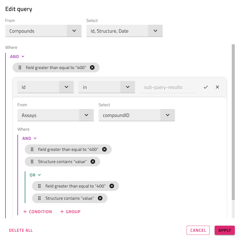
연산자를 사용하여IN and NOT IN 중첩된 쿼리를 생성할 수 있습니다
또는IN 비교 연산자를 선택하면NOT IN SQL 하위 쿼리를 생성할 수 있습니다. 이들은 한 쿼리 안에 다른 쿼리를 삽입하여 더 복잡한 쿼리를 수행할 수 있게 해주는 강력한 도구입니다. 이제 이는 쿼리 빌더 UI를 통해 구현할 수 있습니다.
angular Query Builder의 검색 값 입력을 템플릿화하는 새로운 옵션
<ng-template igxQueryBuilderSearchValue
            let-searchValue
            let-selectedField = "selectedField"
            let-selectedCondition = "selectedCondition"
            let-defaultSearchValueTemplate = "defaultSearchValueTemplate">
    @if (selectedField?.field === 'Id' && selectedCondition === 'equals'){
        <input type="text" required [(ngModel)]="searchValue.value"/>
    } @else {
        <ng-container #defaultTemplate *ngTemplateOutlet="defaultSearchValueTemplate"></    ng-container>
    }
</ng-template>
직렬화 가능한 출력
마지막으로 출력 개체를 JSON으로 직렬화할 수 있습니다. 이러한 향상된 기능을 통해 Angular Query Builder는 그 어느 때보다 다양하고 사용자 친화적입니다.
캐러셀 구성 요소 업데이트
이제 Angular Carousel 구성 요소는 탐색 버튼의 세로 방향을 지원합니다.
Ignite UI for Angular 19.1.0 Changelog
여기에서 모든 세부 정보를 살펴보세요.
IgxCarousel- Behavioral Changes– 입력 속성은
maximumIndicatorsCount이제 기본값으로 설정10됩니다. - 폐기–
CarouselIndicatorsOrientation열거 멤버top중 일부는bottom폐기되었으며 향후 버전에서 삭제될 예정입니다. 대신 사용start하세요end.
- Behavioral Changes– 입력 속성은
IgxBanner- 배너 상태를 동적으로 제어할 수 있는 새로운
expanded입력 속성을 도입했습니다. 배너는 이제 초기와 실행 시 모두 프로그래밍적으로 "확장"(보이는) 또는 "접힘"(숨겨짐)으로 설정할 수 있습니다. 애니메이션은 런타임 업데이트 중에 트리거되며, 열린 애니메이션은 설정expanded되면true재생되고, 닫는 애니메이션false은 설정되면 재생됩니다. 하지만 속성이 처음 설정되었을 때는 어떤 애니메이션도 트리거되지 않습니다. - 배너의 이벤트 수명주기(
opening,opened,closing,closed)는 사용자 상호작용(예: 열기/닫기 클릭)을 통해서만 트리거됩니다. 이 속성을 이용한expanded프로그래매틱 업데이트는 어떤 이벤트도 발생시키지 않습니다. - 진행 중인 애니메이션 중에 속성이
expanded변경되면 현재 애니메이션이 멈추고, 이전 애니메이션이 끝난 지점부터 반대 애니메이션이 시작됩니다. 예를 들어, 오픈 애니메이션(10초)이 6초에 중단되어expanded로false설정되면, 닫는 애니메이션(5초)은 3초부터 시작됩니다.
- 배너 상태를 동적으로 제어할 수 있는 새로운
IgxQueryBuilder새로운 디자인과 업데이트된 외관, 새로운 기능을 갖추고 있습니다IgxQueryBuilderComponent- IN/NOT IN 연산자를 지정하여 중첩된 쿼리를 만드는 기능을 도입했습니다.
- 드래그하거나 사용
Arrow Up/Down하여 조건 칩을 재배치할 수 있는 기능을 도입했습니다. - 엔티티 이름과 필드 배열을 설명하는 객체 배열
entities을 받아들이는 속성을 추가EntityType했습니다. 입력 속성은fields더 이상 지원되지 않으며, 향후 버전에서 삭제될 예정입니다. 자동 마이그레이션이 가능하며 적용ng update될 예정입니다. - 초기 선택 후 루트 레벨에서 선택한 엔티티를 비활성화할 수 있는 속성을 추가
disableEntityChange했습니다. 기본값은false - 루트 레벨에서 필드 콤보를 비활성화할 수 있는 추가
disableReturnFieldsChange속성입니다. 기본값은false - 그리고 공개 메서드를 추가
canCommitcommitdiscard하여 사용자가 표현식 트리의 현재 상태를 저장/폐기할 수 있게 했습니다. - 검색 값 입력을 템플릿으로 만들 수 있는 옵션 추가:
<ng-template igxQueryBuilderSearchValue let-searchValue let-selectedField = "selectedField" let-selectedCondition = "selectedCondition" let-defaultSearchValueTemplate = "defaultSearchValueTemplate"> @if (selectedField?.field === 'Id' && selectedCondition === 'equals'){ <input type="text" required [(ngModel)]="searchValue.value"/> } @else { <ng-container #defaultTemplate *ngTemplateOutlet="defaultSearchValueTemplate"></ ng-container> } </ng-template> - Behavioral Changes
- Expression은 한 번의 클릭으로 편집 모드에 들어갑니다.
EnterSpace - 내부 조건
IgxQueryBuilderComponent선택은 더 이상 지원되지 않습니다. 표현식의 그룹화/해제는 이제 새로 공개된 드래그 앤 드롭 기능을 통해 이루어집니다. - 상황에 맞는 메뉴를 통해 여러 표현식을 삭제하는 것은 더 이상 지원되지 않습니다.
IgxQueryBuilderHeaderComponent- Behavioral Change
- Legend is no longer shown.
- 입력 속성이
title설정되어 있지 않으면 기본적으로 빈 문자열이 됩니다. - Deprecation
- 그리고
showLegend입력 속성은resourceStrings더 이상 지원되지 않으며, 향후 버전에서 삭제될 예정입니다. 자동 마이그레이션이 가능하며 적용ng update될 예정입니다.
IFilteringExpression- 새로운 선택적 속성
conditionName이 도입되었습니다. 이는 일반적으로 기존condition.name조건과 동일합니다.
- 새로운 선택적 속성
IFilteringOperation- 새로운 선택적 속성
isNestedQuery이 도입되었습니다. 이 조건이 중첩된 쿼리 생성으로 이어지는지 여부를 나타내는 데 사용됩니다.
- 새로운 선택적 속성
요약하자면...
호환성을 위해 매끄럽게 제작된 Ignite UI for Angular는 최신 기술과 주요 릴리스의 기능을 활용할 수 있는 라이브러리입니다. 최고의 Angular UI 툴킷 및 관련 인사이트를 제공하기 위해 최선을 다하고 있으며, 더 많은 노하우, 새로운 기능, 향상된 성능 및 향상된 안정성을 제공하는 것이 목표입니다. Ignite UI for Angular GitHub 리포지토리를 통해 여러분과 같은 사용자의 요청 덕분에 일부 개선 사항이 추가되었습니다. 이를 염두에 두고 우리는 항상 제안과 피드백에 열려 있습니다 – 이를 통해 우리는 성장하고 귀하의 개발 요구에 더 잘 대응할 수 있습니다.
자세한 내용이 필요한 경우 다음을 확인하는 것이 좋습니다.