
React 개발자를 위한 최고의 머티리얼 UI 대안
Material UI는 여전히 많은 개발자와 팀의 기본 옵션으로 남아 있습니다. 하지만 데이터 중심의 애플리케이션을 구축할 수 있도록 지원하는 엔터프라이즈급 기능과 도구를 찾으면 어떻게 될까요?
 케이티 미코바
15분 읽기
케이티 미코바
15분 읽기
수년간 MUI는 특히 머티리얼 디자인 미학에 익숙한 개발자들에게 React UI 라이브러리 중 가장 널리 채택된 것 중 하나였습니다. 가장 큰 매력은 MIT 라이선스 커뮤니티 옵션과 기본 버튼부터 데이터 그리드, 날짜 선택기 등 다양한 무료 컨트롤과 기능입니다. 하지만 MUI에는 몇 가지 복잡한 점들이 있어, 팀들이 탄탄한 기반을 제공함에도 불구하고 Material UI 대안을 찾기 시작하는 경우가 많습니다.
다양한 옵션을 비교하기 위해, 이 글에서는 기능, 라이선스, 장점 및 단점에 대해 솔직하게 검토하여 현명한 결정을 내릴 수 있도록 돕습니다. 또한 Ignite UI for React 상업 용 등급의 50+ 무료 MIT 라이선스 부품과 강력한 기업용 역량, 프리미엄 제어 기능을 제공하여 오늘날 가장 강력한 대안 중 하나가 된 이유도 강조합니다.
개발자들이 왜 Material UI 대안을 찾나요?
더 복잡하거나 디자인 중심의 애플리케이션을 개발하는 팀은 종종 다음과 같은 도전에 직면합니다:
- 더 가볍고 성능이 좋은 번들 크기에 대한 필요성.
- 속도와 렌더링 효율성에 대한 더 높은 요구 조건.
- 강력한 기본 스타일을 적용하는 것이 어렵거나 시간이 많이 걸릴 수 있습니다.
- Extra setup, boilerplate, or configuration overhead.
- 각 구성 요소 내에 무겁게 추상화되고 간접 처리가 이루어져 있습니다.
- 내장된 스타일링 관습에 대한 좌절감.
- 주요 버전 간 마이그레이션 마찰.
- 유틸리티 우선 CSS 프레임워크나 헤드리스 UI 라이브러리를 선호하는 경향이 있습니다.
- 더 복잡하고 데이터 중심의 앱을 위해 더 풍부하고 엔터프라이즈급 컴포넌트가 필요합니다.
참고: 이러한 제한은 Reddit 스레드, Stack Overflow, GitHub 이슈 토론에서 공유된 개발자 경험과 Ignite UI 개발자들의 피드백에서 직접 나옵니다.
이러한 MUI 문제점 때문에 많은 팀이 결국 이렇게 묻습니다: React에게 Material UI 대체 방법이 무엇인가? 성능, 맞춤화, 기능성, 장기적 안정성의 적절한 조합을 제공하는 라이브러리는 어디일까요?
다음은 MUI를 대체할 수 있는 최고의 옵션에 대한 간략한 개요입니다.
| Material UI 대안 | License | 성능 | 최고 | 단점 |
|---|---|---|---|---|
| Ignite UI for React | 상업 + MIT | 훌륭합니다 — 데이터 중심의 UI와 빠른 렌더링에 최적화되어 있습니다 | Enterprise apps, dashboards, complex data grids | 일부 고급 부품은 상업용 라이선스가 필요합니다 |
| 앤트 디자인 | MIT | Good | Enterprise UI with a polished design system | CSS가 많고 의견이 뚜렷한 스타일입니다 |
| Chakra UI | MIT | Very good | 고도로 맞춤화 가능하고 기본적으로 접근 가능한 UI | Lacks advanced data components |
| Mantine | MIT | Very good | Dev-friendly, modern apps needing broad UI coverage | No major enterprise-grade grid |
| Fluent UI | MIT | Good | 마이크로소프트 생태계, 오피스 유사 앱 | Design language not very flexible |
| Radix UI | MIT | Excellent | 헤드리스 워크플로우, 맞춤형 설계 시스템 구축 | 기본 상태에서 스타일링된 부품은 없습니다 |
| shadcn/ui | MIT | Very good | Tailwind teams creating fully custom UIs | 진정한 컴포넌트 라이브러리는 아니고; 수동 유지보수 |
| PrimeReact | MIT | Good | 대규모 컴포넌트 제품군, 다양한 위젯 | 무거운 스타일링; 일관성 없는 사용자 체험 |
머티리얼 UI의 주요 대안
오늘날 시장에서 가장 인기 있는 모든 Material UI 대안들을 좀 더 자세히 살펴보겠습니다.
Ignite UI for React
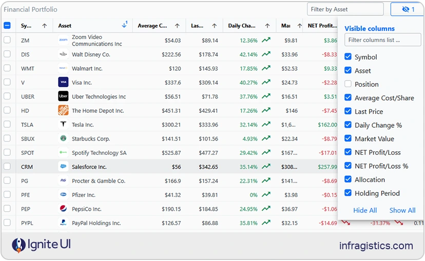
Ignite UI for React 미션 크리티컬 애플리케이션을 위해 설계된 100+ 고급 고성능 구성 요소를 갖춘 완전한 엔터프라이즈급 UI 라이브러리를 제공합니다. 시장에서 가장 빠른 React 데이터 그리드부터 강력한 차트, 게이지, 도크 매니저 및 기타 고성능 구성 요소까지, 우리 라이브러리는 팀이 현대적이고 데이터가 풍부한 앱과 훌륭한 UX를 구축할 수 있도록 필요한 도구를 제공합니다.
가장 최근의 변화 중 하나이자 지금까지 Ignite UI 가장 큰 업데이트는 MIT 라이선스 하에 50+ 완전 오픈소스 컴포넌 트(무료 React 데이터 그리드 등 포함)가 배포된 것입니다. 이는 운영 환경에 적합합니다. 이번 조치는 각 프로젝트가 요구하는 유연성과 함께 최고의 개발자 생산성, 경험, 현대적 역량을 제공하겠다는 우리의 목표를 확고히 합니다. 따라서 제한 없이 자유롭게 데이터 그리드와 MIT 라이선스 부품을 React 라이선스 장벽 없이 상업용 제품에 통합할 수 있는 기능을 원하거나, 완전한 소유권을 유지하고 싶다면 Ignite UI for React의 오픈 소스 컨트롤이 최고의 React Material UI 대안이 될 것입니다.
Ignite UI 오픈소스 구성 요소: 무료 React 데이터 그리드 그리드 라이트, 아코디언, 아바타, 배지, 배너, 버튼, 버튼 그룹, 달력, 카드, 회전목마, 체크박스, 칩, 원형 진행, 콤보, 스테퍼, 날짜 선택기, 드롭다운, 입력, 대화, 리스트, 툴바, 타일 관리자, 스낵바 등 다양합니다.
Ignite UI 프리미엄 부품: 하지만 고성능 데이터 그리드, 계층 그리드, 트리 그리드, 피벗 그리드, 차트 라이브러리, 게이지, 쿼리 빌더, 지도, 도크 매니저, 엑셀 라이브러리, 스프레드시트 등 고급 기능과 엔터프라이즈급 컴포넌트를 원한다면 Ignite UI for React 프리미엄 도구 모음도 제공합니다.
Strengths:
- 첨단 기능과 함께 현대적이고 생산 준비가 된 엔터프라이즈급 UI 컨트롤입니다.
- 사용 제한이 없는 MIT 라이선스 부품입니다.
- 접근성에 큰 비중을 두었고, WAI-ARIA 요건을 충족합니다.
- 가볍고 빠르며, 많은 Material UI 컴포넌트보다 번들 크기가 눈에 띄게 작아요.
- Material, Fluent, Bootstrap, 커스텀 스타일링 테마 옵션이 포함된 일관된 디자인 시스템.
- 기존 React 프로젝트와 쉽게 통합할 수 있으며, 최소한의 설정으로 가능합니다.
- Scalable upgrade path to enterprise-grade controls.
- 훌륭한 문서, 사용법 가이드, 웨비나, 튜토리얼 등 다양한 자료가 있습니다.
- 35+년의 경력을 바탕으로 장기적인 안정성과 전문적인 지원을 보장합니다.
약점: MIT 라이선스 제어는 복잡한 데이터 기반 프로젝트를 위한 고급 기능과 역량을 갖추고 있지 않으며, 차트, 빠른 성능 그리드 등이 필요합니다.
최적 용도: 유연한 React UI 라이브러리, 기능이 풍부한 컨트롤, 고급 앱 개발 경험을 요구하는 팀; 라이선스 없이 무료 React 데이터 그리드 및 기타 유연한 MIT 라이선스 React 컴포넌트가 필요한 개발자; 다양한 앱 개발—스타트업 프로젝트, PWA, 경량 앱, 고객 대상 애플리케이션, 관리자 대시보드, 엔터프라이즈급, 데이터 중심 솔루션 등—을 개발합니다.
React의 개미 설계
이 제품은 사전 구축된 컴포넌트, 커스터마이징 옵션, 인터랙티브 UI 구축을 위한 데모를 제공하는 오픈 소스 컬렉션으로, 2015년 알리바바 그룹에 의해 출시되었습니다. Ant Design이 제공하는 React 컨트롤에는 텍스트 필드, 드롭다운, 날짜 선택기, 선택 메뉴, 차트, 아이콘, 버튼, 페이지네이션, 트리 셀렉트, 입력, 폼 등이 있습니다. 그런데 왜 Material UI 대안 중 하나로 좋은 걸까요?
Strengths:
- Enterprise-friendly design language applied across large-scale applications.
- 데이터 표시에 필수적인 구성 요소를 갖춘 좋은 구성 요소 생태계.
- 시스템 전체에 걸쳐 일관된 스타일링과 상호작용.
- 충분한 문서화, 활발한 커뮤니티, 그리고 React 생태계 내에서의 장기적인 지원.
- 커뮤니티는 복잡한 프로젝트에서 도서관을 활용하는 방법에 대한 안내를 제공하며, 영어로 된 다양한 자료를 제공합니다.
Weaknesses:
- 커스터마이징 옵션이 제한적이고 번들 크기가 크고요.
- 디자인 미학은 좀 더 전통적인 느낌과 외관에 치우쳐 있어 현대의 요구와는 잘 맞지 않을 수 있습니다.
- 특히 Table 구성 요소는 성능 문제를 겪을 수 있습니다.
- 사용자는 Ant Design Pro, Umi와 같은 관련 도구를 배워야 할 수도 있어 학습 곡선이 더 어려워집니다.
최적 용도: 구조적이고 완성된 설계 시스템이 필요한 기업 팀; 내부 비즈니스 애플리케이션; 대시보드; 그리고 데이터 기반 관리 인터페이스.
Chakra UI
이 템플릿은 템플릿을 사용해 생성된 프로젝트에 포함된 파일과 의존성을 결정하는 React 프로젝트를 만들 수 있는 또 다른 Material UI 대안입니다. 제공하는 주요 구성 요소로는 서랍, 그리드, 버튼, 체크박스, 폼 컨트롤, 아이콘 버튼, 입력, 라디오, 셀렉트, 텍스트 영역, 슬라이더, 배지, 테이블, 아바타 등이 있습니다.
Strengths:
- 모든 구성 요소에 대해 WAI-ARIA 표준을 따릅니다.
- 디자인 요구 사항과 미학에 맞출 수 있도록 테마화할 수 있습니다.
- 밝은 UI와 어두운 UI를 사용하여 여러 색상 모드에 최적화되어 있습니다.
- Active community.
- 이 문서는 작문을 위해 설계되었으며 잘 문서화되어 있습니다.
- 충분한 접근성 기본값을 제공합니다.
- 접근하기 쉽고 현대적이며 스타일링하기 쉬운 UI 컴포넌트.
Weaknesses:
- 한정 구성 요소 세트.
- 필요한 React 그리드와 차트 기능을 제공하지 않을 수도 있습니다.
- Not very customizable.
최적 용도: 스타트업, SaaS 인터페이스, MVP, 접근성과 테마가 필요한 최신 앱, 그리고 마케팅 사이트들.
Mantine
Mantine은 React와 TypeScript 위에 구축된 경량 React UI 라이브러리입니다. 120개의 쉽게 커스터마이즈할 수 있는 부품과 70개의 후크를 제공합니다. 가장 인기 있는 컨트롤로는 콤보박스, 커스텀 셀렉트, 데이트 피커, 알림, 모달 등이 있습니다.
Strengths:
- 스타일 API가 있어 많은 맞춤화가 가능합니다.
- 대형 부품 카탈로그를 가지고 있습니다.
- Clear documentation.
- 컨트롤은 네이티브 CSS로 만들어져 있어 스타일이 성능이 좋고 쉽게 덮어쓸 수 있습니다.
- 만틴 컴포넌트(감정, 바닐라 익스트랙트, Sass)를 스타일링하기 위해 자신만의 라이브러리를 가져갈 수도 있습니다.
- 밝은 테마와 어두운 테마 모두에 대해 글로벌 스타일을 수출합니다.
- 이 프로젝트는 500명 이상의 기여자가 참여하는 커뮤니티 주도 프로젝트입니다.
Weaknesses:
- Lacks an advanced, enterprise-grade data grid.
- 이전 라이브러리만큼 기업 환경에서 검증된 경험은 없습니다.
- 복잡한 구성 요소들 사이에서 스타일링에 약간의 불일치가 있습니다.
최적 용도: 스타트업, SaaS 제품, 그리고 다양한 UI 컴포넌트가 필요한 빠르게 움직이는 팀; 현대적인 테마와 UI 패턴 전반에 걸친 빠른 개발이 필요한 애플리케이션들입니다.
Fluent UI
이것은 Fluent Design System 기반으로 앱을 구축하기 위한 마이크로소프트의 공식 React 컴포넌트 라이브러리입니다. 가장 많이 사용되고 인기 있는 구성 요소는 버튼, 그리드, 체크박스, 알림, 메뉴, 필수 입력, 툴박스 등입니다.
Strengths:
- Microsoft의 에코시스템과 일치하는 구성 요소입니다.
- 다양한 플랫폼과 기기에서 일관된 외관과 느낌을 보장합니다.
- 강력한 접근성 및 키보드 지원.
- Office 또는 Teams 브랜딩과 일치하는 쉬운 테마.
- Full TypeScript support.
- 무료이며 오픈 소스입니다.
- 접근성과 반응성을 염두에 두고 만들어졌습니다.
- 코드를 사용하고 필요에 따라 수정할 수 있습니다.
Weaknesses:
- 일부 구성 요소는 Microsoft 관련 사용 사례에 맞게 조정된 것으로 느껴집니다.
- 데이터가 많은 앱에는 적합하지 않을 수 있습니다.
- Not a vibrant dev community.
최적 용도: Microsoft 365 내에 존재하거나 기업 스타일링과 일치하는 앱; 이전 경험이 있는 개발자와 디자이너들.
Radix UI
이 오픈 소스 컴포넌트 라이브러리는 접근성과 유지보수 용이성 덕분에 좋은 MUI 대안입니다. 여기서 눈에 띄는 점은 Radix UI가 스타일링되지 않고 접근 가능한 UI 원시 자료를 제공하여 완전히 맞춤화된 인터페이스를 구축할 수 있다는 것입니다. 어떤 부품을 포함하고 있나요? 그리드, 데이터 리스트, 대화 상자, 툴팁, 드롭다운 메뉴, 호버 카드, 아이콘 버튼, 삽입, 팝오버, 체크박스, 카드, 버튼, 아바타, 툴팁, 탭, 테마 등 다양한 항목이 있습니다.
Strengths:
- 완전히 접근 가능하며 기본적으로 WAI-ARIA 표준을 준수합니다.
- Headless 구성 요소이며 Tailwind, 스타일 구성 요소 또는 사용자 지정 CSS와 함께 작동합니다.
- 맞춤형 설계 시스템에 적합한 구성 가능한 아키텍처입니다.
- 일관된 성능을 위한 브라우저 간 호환성.
- 소형 모듈식 – 필요한 것만 가져옵니다.
- 완전 오픈 소스이며 무료입니다.
Weaknesses:
- 미리 스타일이 지정된 구성 요소가 없습니다. 스타일 오버헤드는 개발자에게 있습니다.
- 강력한 디자인 자원과 다듬어진 UI 요소를 만드는 데 더 많은 노력이 필요합니다.
- 학습 곡선.
최고 : 맞춤형 디자인을 구축하는 팀은 스타일을 완벽하게 제어하려는 디자인 시스템 설계자 및 개발자의 출발점으로 이상적입니다.
shadcn/ui
SHADCN/UI는 컴포넌트 개발에 있어 독특한 접근 방식입니다. 전통적인 라이브러리 대신, Radix 프리미티브와 Tailwind CSS로 구축된 미리 만들어진 UI 컴포넌트 모음을 제공합니다. 그런데 왜 Material UI 대안 목록에 포함되어 있나요? shadcn/ui를 사용할 때의 주요 아이디어는 코드를 직접 코드베이스에 복사할 수 있게 해주어, 모든 컴포넌트의 구현, 스타일링, 장기적인 유지보수를 완전히 제어할 수 있게 하는 것입니다. 가장 두드러진 컨트롤로는 필드, 입력 그룹, 항목, 데이터 테이블, 비트톤, 날짜 선택기, 드롭다운 메뉴, 차트, 페이지네이션 등 다양한 기능이 있습니다.
Strengths:
- Tailwind로 만든 아름답고 깔끔한 기본 스타일링.
- 컴포넌트가 코드베이스에 직접 존재하기 때문에 완전한 소유권을 갖습니다.
- 추상화되지 않아 매우 커스터마이즈가 가능합니다.
Weaknesses:
- 완전한 기능을 갖춘 컴포넌트 라이브러리가 아닙니다.
- 유지보수 책임은 전적으로 팀과 본인 노력에 달려 있습니다.
- 더 큰 프로젝트는 중복되거나 일관성 없는 구성 요소가 쌓일 수 있습니다.
최적 용도: 뒷바람이 먼저인 팀; 맞춤형 또는 강력한 브랜드 UI를 개발하는 개발자; 모든 구성 요소를 완전히 제어해야 하는 응용 프로그램; 디자인 중심의 스타트업과 마케팅 사이트들.
PrimeReact
저희가 추천하는 Material UI 대안 중 마지막 하나는 PrimeReact로, React.js 위한 완전한 UI 스위트입니다. 칩, 드롭다운, 에디터, 입력그룹, 아이콘필드, 캘린더, 리스트박스, 노브, 토글버튼 등 80개 이상의 기능이 풍부하고 쉽게 커스터마이즈할 수 있는 컴포넌트를 제공합니다.
Strengths:
- 다양한 맞춤형 부품과 위젯이 있습니다.
- 여러 테마와 스타일링 프리셋이 기본 제공되어 있습니다.
- 강한 커뮤니티와 오랜 신뢰도.
- 좋은 문서화와 예제 기반 학습 자료가 필요합니다.
Weaknesses:
- 스타일링은 현대 라이브러리에 비해 무겁거나 구식으로 느껴질 수 있습니다.
- 일부 UX 패턴은 구성 요소 간에 일관성이 없습니다.
- 더 가볍고 최적화된 라이브러리에 비해 성능 문제가 있을 수 있습니다.
최적 용도: 즉시 사용할 수 있는 컴포넌트 스위트를 원하고 무거운 스타일링을 개의치 않는 팀; 많은 UI 위젯이 필요한 애플리케이션; 대규모 생태계를 선호하는 개발자들, 즉 무거운 맞춤화나 디자인 작업이 필요 없는 경우입니다.
Material UI에서 Ignite UI으로 마이그레이션하는 방법
애플리케이션을 처음부터 만들고 Ignite UI for React를 사용하도록 설정하려면 Ignite UI CLI를 사용할 수 있습니다. 첫 번째 단계는 해당 패키지를 다음과 같이 전역적으로 설치하는 것입니다:
npm install -g igniteui-cli
cmd
이용 가능한 옵션들을 안내해 보고 싶다면, 단계별 모드를 초기화하여 새 애플리케이션을 만들고 설정하는 데 도움을 줄 수 있습니다. 가이드를 시작하려면 다음 명령을 실행ig 하세요:
ig
cmd
그 다음 프레임워크로 React을 선택하고, TS를 타입으로 React 다음, 기본 상단 내비게이션 프로젝트 템플릿을 선택한 뒤 특정 컴포넌트/뷰를 추가하거나 선택하세요Complete & Run. 또한, 이 주제에서 Ignite UI CLI에 대해 더 읽어볼 수 있습니다.
또는 React 팀에서 권장하는 대로 Next.js, Vite 또는 Expo와 같은 널리 사용되는 프레임워크를 사용할 수 있습니다. 다음은 이러한 방법 중 하나를 사용하여 Ignite UI React 사용하여 React 애플리케이션을 만드는 단계별 지침입니다.
- NodeJS를 설치합니다.
- 비주얼 스튜디오 코드를 설치합니다.
모든 단계를 보거나 새 프로젝트를 만들거나 기존 앱을 업데이트하려면 공식 문서를 확인하세요.
싸다...
Material UI는 여전히 많은 개발자와 팀의 기본 옵션으로 남아 있습니다. 사용이 무료이고, 다양한 기능이 풍부한 구성 요소를 제공하며, 활발한 커뮤니티의 인상을 주고, 훌륭한 문서도 갖추고 있습니다. 하지만 데이터 중심의 애플리케이션을 구축할 수 있도록 지원하는 엔터프라이즈급 기능과 도구를 찾으면 어떻게 될까요? 어떤 Material UI 대안을 고려해야 할까요?
현재 수천 개의 React 라이브러리가 있지만, 그중 비교적 소수는 완전하고 잘 관리되어 있으며 현대 프로젝트에서 요구하는 컨트롤과 기능으로 가득 차 있습니다. 특히 Material UI 대안을 찾고 있을 때 선택지를 좁히기 위해, 저희는 이 솔루션 목록을 만들고 Ignite UI for React의 가장 큰 장점을 강조했습니다.
탐색하고 시도해 보세요.

