Angular Hierarchical Data Grid Component Overview
The Ignite UI for Angular Hierarchical Data Grid is used to display and manipulate hierarchical tabular data. Quickly bind your data with very little code or use a variety of events to customize different behaviors. This component provides a rich set of features like data selection, excel style filtering, sorting, paging, templating, column moving, column pinning, export to Excel, CSV and PDF and more. The Hierarchical Grid builds upon the Flat Grid Component and extends its functionality by allowing the users to expand or collapse the rows of the parent grid, revealing corresponding child grids, when more detailed information is needed.
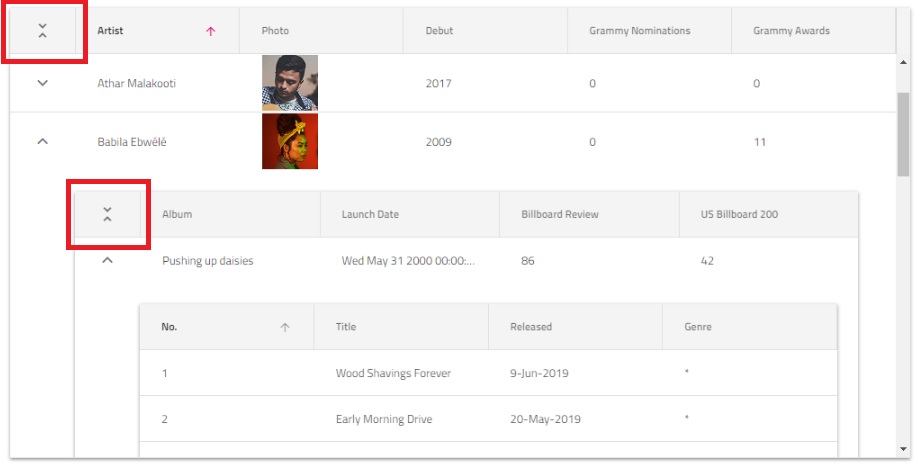
Angular Hierarchical Data Grid Example
In this angular grid example you can see how users can visualize hierarchical sets of data and use cell templating to add other visual components like Sparkline.
Getting Started with Ignite UI for Angular Hierarchical Data Grid
Note
This component can utilize the HammerModule optionally. It can be imported in the root module of the application in order for touch interactions to work as expected.
Note
This component uses Material Icons. Add the following link to your index.html: <link href="https://fonts.googleapis.com/icon?family=Material+Icons" rel="stylesheet">
To get started with the Ignite UI for Angular Hierarchical Data Grid component, first you need to install Ignite UI for Angular. In an existing Angular application, type the following command:
ng add igniteui-angular
For a complete introduction to the Ignite UI for Angular, read the getting started topic.
The next step is to import the IgxHierarchicalGridModule in your app.module.ts file.
// app.module.ts

import { IgxHierarchicalGridModule } from 'igniteui-angular/grids/hierarchical-grid';
// import { IgxHierarchicalGridModule } from '@infragistics/igniteui-angular'; for licensed package

@NgModule({
    imports: [
        ...
        IgxHierarchicalGridModule,
        ...
    ]
})
export class AppModule {}
Alternatively, as of 16.0.0 you can import the IgxHierarchicalGridComponent as a standalone dependency, or use the IGX_HIERARCHICAL_GRID_DIRECTIVES token to import the component and all of its supporting components and directives.
// home.component.ts

import { IGX_HIERARCHICAL_GRID_DIRECTIVES } from 'igniteui-angular/grids/hierarchical-grid';
// import { IGX_HIERARCHICAL_GRID_DIRECTIVES } from '@infragistics/igniteui-angular'; for licensed package

@Component({
    selector: 'app-home',
    template: `
    <igx-hierarchical-grid #hierarchicalGrid [data]="singers" [autoGenerate]="true">
        <igx-row-island [key]="'Albums'" [autoGenerate]="true">
            <igx-row-island [key]="'Songs'" [autoGenerate]="true">
            </igx-row-island>
        </igx-row-island>
        <igx-row-island [key]="'Tours'" [autoGenerate]="true">
        </igx-row-island>
    </igx-hierarchical-grid>
    `,
    styleUrls: ['home.component.scss'],
    standalone: true,
    imports: [IGX_HIERARCHICAL_GRID_DIRECTIVES]
    /* or imports: [IgxHierarchicalGridComponent, IgxRowIslandComponent] */
})
export class HomeComponent {
    public singers: Artist [];
}
Now that you have the Ignite UI for Angular Hierarchical Grid module or directives imported, you can start using the igx-hierarchical-grid component.
Using the Angular Hierarchical Data Grid
Data Binding
igx-hierarchical-grid derives from igx-grid and shares most of its functionality. The main difference is that it allows multiple levels of hierarchy to be defined. They are configured through a separate tag within the definition of igx-hierarchical-grid, called igx-row-island. The igx-row-island component defines the configuration for each child grid for the particular level. Multiple row islands per level are also supported.
The Hierarchical Grid supports two ways of binding to data:
Using hierarchical data
If the application loads the whole hierarchical data as an array of objects referencing children arrays of objects, then the Hierarchical Grid can be configured to read it and bind to it automatically. Here is an example of a properly structured hierarchical data source:
export const singers = [{
    "Artist": "Naomí Yepes",
    "Photo": "assets/images/hgrid/naomi.png",
    "Debut": "2011",
    "Grammy Nominations": 6,
    "Grammy Awards": 0,
    "Tours": [{
        "Tour": "Faithful Tour",
        "Started on": "Sep-12",
        "Location": "Worldwide",
        "Headliner": "NO",
        "Toured by": "Naomí Yepes"
    }],
    "Albums": [{
        "Album": "Dream Driven",
        "Launch Date": new Date("August 25, 2014"),
        "Billboard Review": "81",
        "US Billboard 200": "1",
        "Artist": "Naomí Yepes",
        "Songs": [{
            "No.": "1",
            "Title": "Intro",
            "Released": "*",
            "Genre": "*",
            "Album": "Dream Driven"
        }]
    }]
}];
Each igx-row-island should specify the key of the property that holds the children data.
<igx-hierarchical-grid #hierarchicalGrid [data]="singers" [autoGenerate]="true">
    <igx-row-island [key]="'Albums'" [autoGenerate]="true">
        <igx-row-island [key]="'Songs'" [autoGenerate]="true">
        </igx-row-island>
    </igx-row-island>
    <igx-row-island [key]="'Tours'" [autoGenerate]="true">
    </igx-row-island>
</igx-hierarchical-grid>
Note
Note that instead of data the user configures only the key that the igx-hierarchical-grid needs to read to set the data automatically.
Using Load-On-Demand
Most applications are designed to load as little data as possible initially, which results in faster load times. In such cases igx-hierarchical-grid may be configured to allow user-created services to feed it with data on demand. The following configuration uses a special @Output and a newly introduced loading-in-progress template to provide a fully-featured load-on-demand.
<!-- hierarchicalGridSample.component.html -->

<igx-hierarchical-grid #hGrid [primaryKey]="'CustomerID'" [autoGenerate]="true" [height]="'600px'" [width]="'100%'">
    <igx-row-island [key]="'Orders'" [primaryKey]="'OrderID'" [autoGenerate]="true"  (gridCreated)="gridCreated($event, 'CustomerID')">
        <igx-row-island [key]="'Order_Details'" [primaryKey]="'ProductID'" [autoGenerate]="true" (gridCreated)="gridCreated($event, 'OrderID')">
        </igx-row-island>
    </igx-row-island>
</igx-hierarchical-grid>
//  hierarchicalGridSample.component.ts

@Component({...})
export class HierarchicalGridLoDSampleComponent implements AfterViewInit {
    @ViewChild("hGrid")
    public hGrid: IgxHierarchicalGridComponent;

    constructor(private remoteService: RemoteLoDService) { }

    public ngAfterViewInit() {
        this.hGrid.isLoading = true;
        this.remoteService.getData({ parentID: null, rootLevel: true, key: "Customers" }).subscribe((data) => {
            this.hGrid.isLoading = false;
            this.hGrid.data = data;
            this.hGrid.cdr.detectChanges();
        });
    }

    public gridCreated(event: IGridCreatedEventArgs, _parentKey: string) {
        const dataState = {
            key: event.owner.key,
            parentID: event.parentID,
            parentKey: _parentKey,
            rootLevel: false
        };
        event.grid.isLoading = true;
        this.remoteService.getData(dataState).subscribe(
            (data) => {
                event.grid.isLoading = false;
                event.grid.data = data;
                event.grid.cdr.detectChanges();
            }
        );
    }
}
// remote-load-on-demand.service.ts

@Injectable()
export class RemoteLoDService {
    public url = `https://services.odata.org/V4/Northwind/Northwind.svc/`;

    constructor(private http: HttpClient) { }

    public getData(dataState?: any): Observable<any[]> {
        return this.http.get(this.buildUrl(dataState)).pipe(
            map((response) => response["value"])
        );
    }

    public buildUrl(dataState) {
        let qS = "";
        if (dataState) {
            qS += `${dataState.key}?`;

            if (!dataState.rootLevel) {
                if (typeof dataState.parentID === "string") {
                    qS += `$filter=${dataState.parentKey} eq '${dataState.parentID}'`;
                } else {
                    qS += `$filter=${dataState.parentKey} eq ${dataState.parentID}`;
                }
            }
        }
        return `${this.url}${qS}`;
    }
}
Hide/Show row expand indicators
If you have a way to provide information whether a row has children prior to its expanding, you could use the hasChildrenKey input property. This way you could provide a boolean property from the data objects which indicates whether an expansion indicator should be displayed.
<igx-hierarchical-grid #grid [data]="data" primaryKey="ID" hasChildrenKey="hasChildren">
        ...
</igx-hierarchical-grid>
Note that setting the hasChildrenKey property is not required. In case you don't provide it, expansion indicators will be displayed for each row.
Additionally if you wish to show/hide the header expand/collapse all indicator you can use the showExpandAll property. This UI is disabled by default for performance reasons and it is not recommended to enable it in grids with large data or grids with load on demand.
Features
The grid features could be enabled and configured through the igx-row-island markup - they get applied for every grid that is created for it. Changing options at runtime through the row island instance changes them for each of the grids it has spawned.
<igx-hierarchical-grid [data]="localData" [autoGenerate]="false"
    [allowFiltering]='true' [height]="'600px'" [width]="'800px'" #hGrid>
    <igx-column field="ID" [pinned]="true" [filterable]='true'></igx-column>
    <igx-column-group header="Information">
        <igx-column field="ChildLevels"></igx-column>
        <igx-column field="ProductName" hasSummary='true'></igx-column>
    </igx-column-group>
    <igx-row-island [key]="'childData'" [autoGenerate]="false" [rowSelection]="'multiple'" #layout1>
        <igx-column field="ID" [hasSummary]='true' [dataType]="'number'"></igx-column>
        <igx-column-group header="Information2">
            <igx-column field="ChildLevels"></igx-column>
            <igx-column field="ProductName"></igx-column>
        </igx-column-group>
        <igx-paginator *igxPaginator [perPage]="5"></igx-paginator>
    </igx-row-island>
    <igx-paginator>
    </igx-paginator>
</igx-hierarchical-grid>
The following grid features work on a per grid level, which means that each grid instance manages them independently of the rest of the grids:
- Sorting
- Filtering
- Paging
- Multi Column Headers
- Hiding
- Pinning
- Moving
- Summaries
- Search
The Selection and Navigation features work globally for the whole igx-hierarchical-grid
- Selection Selection does not allow selected cells to be present for two different child grids at once.
- Navigation When navigating up/down, if next/prev element is a child grid, navigation will continue in the related child grid, marking the related cell as selected and focused. If the child cell is outside the current visible view port it is scrolled into view so that selected cell is always visible.
Collapse All Button
The Hierarchical Grid allows the users to conveniently collapse all its currently expanded rows by pressing the "Collapse All" button at its top left corner. Additionally, every child grid which contains other grids and is a Hierarchical Grid itself, also has such a button - this way the user is able to collapse only a given grid in the hierarchy:
Sizing
See the Grid Sizing topic.
CRUD operations
Note
An important difference from the flat Data Grid is that each instance for a given row island has the same transaction service instance and accumulates the same transaction log. In order to enable the CRUD functionality users should inject the IgxHierarchicalTransactionServiceFactory.
Calling CRUD API methods should still be done through each separate grid instance.
Check out the How-to Build CRUD operations with igxGrid topic.
Styling
The igxHierarchicalGrid allows styling through the Ignite UI for Angular Theme Library. The grid's grid-theme exposes a wide variety of properties, which allow the customization of all the features of the grid.
In the below steps, we are going through the steps of customizing the igxHierarchicalGrid styling.
Importing global theme
To begin the customization of the hierarchical grid, you need to import the index file, where all styling functions and mixins are located.
@use "igniteui-angular/theming" as *;

// IMPORTANT: Prior to Ignite UI for Angular version 13 use:
// @import '~igniteui-angular/lib/core/styles/themes/index';
Defining custom theme
Next, create a new theme, that extends the grid-theme and accepts the parameters, required to customize the hierarchical grid as desired.
Note
There is no specific sass hierarchical grid function.
$custom-theme: grid-theme(
  $cell-active-border-color: #ffcd0f,
  $cell-selected-background: #6f6f6f,
  $row-hover-background: #f8e495,
  $row-selected-background: #8d8d8d,
  $header-background: #494949,
  $header-text-color: #fff,
  $expand-icon-color: #ffcd0f,
  $expand-icon-hover-color: #e0b710,
  $resize-line-color: #ffcd0f,
  $row-highlight: #ffcd0f
);
Note
Instead of hardcoding the color values like we just did, we can achieve greater flexibility in terms of colors by using the palette and color functions. Please refer to Palettes topic for detailed guidance on how to use them.
Applying the custom theme
The easiest way to apply your theme is with a sass @include statement in the global styles file:
:host {
  @include tokens($custom-theme);
}
In order for the custom theme do affect only specific component, you can move all of the styles you just defined from the global styles file to the custom component's style file (including the import of the index file).
This way, due to Angular's ViewEncapsulation, your styles will be applied only to your custom component.
Demo
Note
The sample will not be affected by the selected global theme from Change Theme.
Performance (Experimental)
The igxHierarchicalGrid's design allows it to take advantage of the Event Coalescing feature that has Angular introduced. This feature allows for improved performance with roughly around 20% in terms of interactions and responsiveness. This feature can be enabled on application level by simply setting the ngZoneEventCoalescing and ngZoneRunCoalescing properties to true in the bootstrapModule method:
platformBrowserDynamic()
  .bootstrapModule(AppModule, { ngZoneEventCoalescing: true, ngZoneRunCoalescing: true })
  .catch(err => console.error(err));
Note
This is still in experimental feature for the igxHierarchicalGrid. This means that there might be some unexpected behaviors in the Hierarchical Grid. In case of encountering any such behavior, please contact us on our Github page.
Note
Enabling it can affects other parts of an Angular application that the igxHierarchicalGrid is not related to.
Known Limitations
| Limitation | Description |
|---|---|
| Group By | Group By feature is not supported by the hierarchical grid. |
Note
igxHierarchicalGrid uses igxForOf directive internally hence all igxForOf limitations are valid for igxHierarchicalGrid. For more details see igxForOf Known Issues section.
API References
- IgxHierarchicalGridComponent
- IgxRowIslandComponent
- IgxGridComponent
- IgxGridComponent Styles
- IgxColumnComponent
- IgxHierarchicalGridRow
- IgxGridCell
Theming Dependencies
- IgxIcon Theme
- IgxInputGroup Theme
- IgxChip Theme
- IgxRipple Theme
- IgxButton Theme
- IgxOverlay Theme
- IgxDropDown Theme
- IgxCalendar Theme
- IgxActionStrip Theme
- IgxSnackBar Theme
- IgxBadge Theme
Additional Resources
- Grid Sizing
- Virtualization and Performance
- Paging
- Filtering
- Sorting
- Summaries
- Column Moving
- Column Pinning
- Column Resizing
- Selection
- Ignite UI for Angular Skills — Agent Skills for grids, data operations, and theming
 GitHub