Rick Barraza returns to Pixel8 to discuss magic, storytelling, mind control interfaces and even a little development! According to Rick, true experience design mixes elements you may not automatically attribute to software design. Using these unexpected elements along with the tried-and-true principals of user interface design, usability and information design help you craft polished experiences.
Rick explores the concepts of what it takes to turn raw technology into something compelling for end users and accessible for busy developers. He uses two of his research projects as object lessons for these concepts.
Project Maestro
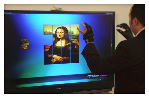
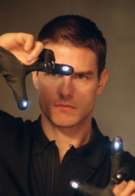
A working example of the final product of an experience architect’s work is embodied in the Maestro Project. If you are a long time follower of Pixel8, you’ll remember our interview highlighting Maestro: 8 Days, 1 Dev = MS Surface *Minority Report* Style in WPF. If you have yet so see this video, please take the time - it is a half hour very well spent!


The initial work conducted by Johnny Chung Lee and Brian Peek created the foundation for Maestro, but the additions of a simple WPF layout and the use of some familiar gloves gave Maestro the hook to be truly compelling.
Emotiv Thought Control Demo
The Emotiv thought control device is an input device that allows the user to provide input data using while using their thoughts exclusively. Much like voice recognition input the thought “reader” must first be trained to the user to establish a baseline of brain activity. Once this baseline is established then changes in brain activity are read and recognized by the hardware eventually translating to events that may be programmatically handled.
One of the first demonstrations to appear on the web of such a device is the Emotiv Stonehenge Demo.
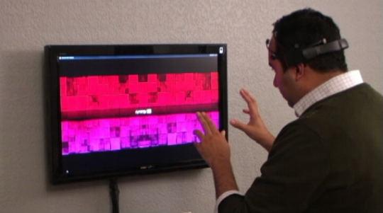
While technically sufficient, Rick saw and opportunity to improve on the experience using the input device while creating a much more compelling demonstration of the technology. Check out Rick's take on conducting the same type of demonstration:

The key to this execution is the use of a pixel shader effect. When Rick first started to give this demonstration some observers were dubious. Were the transitions timed? Did Rick have a Wii controller hidden somewhere? The addition of a warp effect as a transition between photos echoed the same effects moviegoers are conditioned to see when space and time are manipulated with one’s mind finally produced a believable result.
Because everyone knows that when you control matter with your mind the result is a rippled environment ;)

‘Hollywood Draws First Blood’
Rick establishes the concept that Hollywood has created visual cues for thought control, so preserving them helps make the experience more enjoyable and understandable. The real-world technology may be new, but the concept is often simulated in the movies and on TV where storytellers have set expectations on what the experience might be like in real life.

A perfect everyday example of this concept is found on the iPhone. When you snap a picture, what do you hear? That shutter sound is not only unnecessary, but in a sense it is a lie told to the user. There is no exposing film or shutter in a digital camera! It’s the addition of this familiar sound, however that gives users a recognizable source of feedback to know when the picture taking is complete.
Support or Reject Assumptions?
So the question remains, should you support false assumptions? Should you tell these little lies? Perhaps for a while general affordances in user design are possible by embracing these assumptions, while striving to change them as the product evolves.
The Prestige
Finally Rick discusses how the movie ‘The Prestige’ is an excellent metaphor of the aspirations of an experience architect.