Ignite UI 50+ 강력한 오픈 소스 컴포넌트 출시
이것은 시작에 불과합니다. 우리는 스타트업 혁신가부터 대규모 기업 팀까지 모든 개발자가 적절한 도구로 뛰어난 디지털 경험을 구축할 수 있도록 오픈소스 및 프리미엄 컨트롤을 계속 확장하고 다듬을 것입니다.
 Konstantin Dinev
6min read
Konstantin Dinev
6min read
여기 Infragistics 에서는 Ignite UI 및 앱 개발 전반에 있어 중요한 이정표를 세우고 있습니다.
가장 큰 변화는? 우리는 오픈 소스로 전환합니다!
현재 UI 도구 세트의 일환으로, 우리는 Angular, React, Blazor, Web Components 등 MIT 라이선스 하에 50+ 개의 오픈소스 구성 요소를 제공하여 오픈 소스 커뮤니티에 힘을 실어주고 있습니다. 이는 우리의 사명을 크게 확장한 것입니다: 모든 개발자가 모든 상황에 맞는 고성능 웹 애플리케이션을 구축할 수 있도록 현대적이고 기능이 풍부하며 미래 지향적인 도구를 제공하는 것입니다.
왜 이것이 중요한가요?
수년간 Ignite UI 팀은 유연성, 투명성, 협력적 혁신을 원하는 개발자들의 목소리를 경청해 왔습니다. 핵심 구성 요소의 오픈 소스화는 그 비전을 준수하겠다는 우리의 약속입니다. 가장 인기 있는 웹 프레임워크 전반에 걸쳐 강력한 컴포넌트 라이브러리를 공유함으로써, 우리는 개발자들이 다음을 할 수 있도록 힘을 실어줍니다:
- 프레임워크 간에 일관된 UI를 빠르게 구축하세요.
- 커스터마이징, 확장, 그리고 공개적으로 보이는 코드에 기여할 수 있습니다.
- 오픈소스에서 프리미엄 기능 세트로 변화하는 요구에 따라 저희와 함께 성장하세요.
저희는 35년 넘게 개발자 도구 시장에 진출해 왔으며, UI 구성 요소는 모든 산업 분야의 애플리케이션을 구동해 왔습니다. 오픈 소스는 성장하는 커뮤니티에 더 많은 것을 환원할 수 있게 해줍니다. 이번 전환을 통해 우리는 혁신할 준비가 된 모든 이들이 준비되어 있고, 아름다운 사용자 경험을 구축하며, 맞춤형 솔루션을 제공하는 것을 목표로 합니다. 기업 환경에 원활하게 통합되고, 개발 오버헤드를 줄이며, 장기적인 안정성을 보장하는 솔루션입니다.
이전에도 많은 부품이 이미 무료로 사용할 수 있었습니다. 단지 우리 라이선스 모델에 공식적으로 명시되어 있지 않을 뿐입니다. 오픈 소스 제어 도입 결정과 함께:
- 그 비공식적 유연성은 공식적인 약속이 됩니다.
- 우리의 오픈소스 구성 요소들은 GitHub의 가시성과 기여 경로를 얻습니다.
- 개발자들은 이제 필요한 만큼 컴포넌트를 수정하고 확장할 자유를 갖게 되었습니다.
이 모든 것은 혁신, 투명성, 개발자 역량 강화에 대한 우리의 장기적인 헌신을 더욱 확고히 합니다.
무료로 사용할 수 있고, 함께 만들 수도 있습니다. 상업용 면허는 필요 없습니다
이번 업데이트를 통해 개발자들은 다음과 같은 기능을 할 수 있습니다:
- 운영 환경에서 자유롭게 오픈소스 구성 요소를 사용할 수 있습니다: MIT 라이선스.
- 사용자가 원하는 대로 사용하세요: 커스터마이징, 포크, 검사, 확장. 우리는 완전한 자유를 보장하고 있습니다.
- Ignite UI가 잘 알려진 동일한 품질의 부품에 접근할 수 있습니다: 오픈소스 컴포넌트는 고객들이 수년간 사용해온 잘 설계되고 검증된 동일한 부품입니다.
핵심 구성 요소
50+ 오픈 소스 구성 요소 모두 현재 MIT 라이선스를 받아 전 세계 개발자들에게 최대의 유연성을 제공합니다. 여기에는 그리드 라이트, 아코디언, 아바타, 배지, 배너, 버튼, 버튼 그룹, 캘린더, 카드, 회전목마, 채팅, 체크박스, 칩, 원형 진행, 콤보, 날짜 선택기, 드롭다운, 대화, 입력, 리스트, 타일 관리자, 스낵바, 스테퍼 등 다수가 포함됩니다. 프레임워크별 포함된 구성 요소의 전체 목록을 여기에서 확인할 수 있습니다:
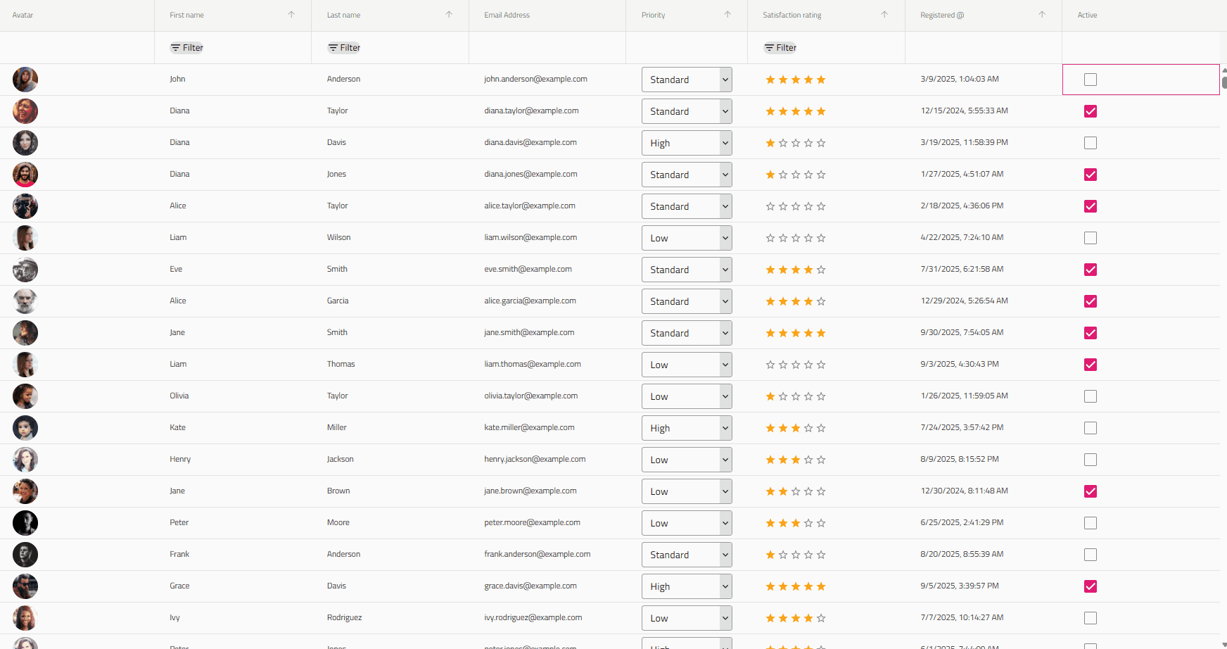
그리드 라이트
Grid Lite Ignite UI 컴포넌트는 MIT 라이선스를 받은 Infragistics 새로운 오픈소스 UI 컴포넌트의 일부로, 적극적으로 지원되고 유지보수됩니다. 웹 컴포넌트로 구축된 오픈소스 JavaScript 데이터 그리드로, 웹 프레임워크 유무 없이 의존성 없이 사용할 수 있습니다.
Angular 데이터그리드 오픈소스 컴포넌트(다른 프레임워크에서도 제공)는 최소한의 오버헤드와 사용자가 기대하는 성능을 갖춘 필수 데이터 표시 기능을 제공합니다. 기업용 그리드의 복잡함 없이 빠르고 가벼운 데이터 표현이 필요한 개발자를 위해 설계되었습니다.
그리드 라이트의 특징:
- 열 필터링
- 숨김
- 크기 조정
- 정렬
- Row Virtualization
- 접근성
- 테마와 스타일링
- 열 데이터 유형
Grid Lite에 대한 문서와 예제는 여기에서 확인할 수 있습니다:
오픈 소스 패키지는 어디서 찾을 수 있나요?
Angular:
- GitHub –IgniteUI/igniteui-angular
React:
- GitHub –IgniteUI/igniteui-react
Web Components:
- GitHub –IgniteUI/igniteui-webcomponents
- Grid Lite –IgniteUI/igniteui-grid-lite
Blazor:
- GitHub –IgniteUI/igniteui-blazor
- Grid Lite –IgniteUI/IgniteUI.Blazor.GridLite
프리미엄 유지: 엔터프라이즈 앱을 위한 고급 제어
UI 라이브러리의 대부분이 이제 오픈 소스이지만, 가장 진보된 구성 요소 중 일부만이 여전히 프리미엄으로 남아 있습니다. 이들은 다음과 같습니다:
여전히 모든 프리미엄 컴포넌트를 로컬에서 테스트하고, 모든 기능에 접근하며, 환경에서 완전히 평가할 수 있습니다. 테스트 목적으로 프로덕션에서도 작동하지만, 워터마킹이 붙어 있습니다. 상업용 라이선스는 고객 대상 운영 애플리케이션에 배포할 준비가 되었을 때만 필요합니다.
이 이중 접근법은 모든 개발자가 무료로 강력한 기반을 갖추는 한편, 고성능 엔터프라이즈급 솔루션을 구축하는 팀이 고급 전문가가 지원하는 구성 요소에 접근할 수 있도록 보장합니다.
모든 프리미엄 구성 요소는 주제 헤더에 다음과 같이 표시되어 있습니다:

기존 고객에게 어떤 의미가 있을까요?
이미 Ignite UI를 사용 중이라면, 현재 경험에는 아무런 변화가 없습니다:
- 모든 부품을 이전과 똑같이 계속 사용하세요.
- 프리미엄 부품은 여전히 완벽하게 지원되고 유지보수됩니다.
- 이제 더 큰 오픈 소스 생태계에 접근할 수 있어 더 빠른 개선과 새로운 기능을 이끌 수 있습니다.
오픈 소스는 구독에 가치를 더합니다. 그것이 그것을 대체하거나 줄이지는 않습니다.
다음은 주요 Ignite UI 오픈소스 구성 요소들입니다
Grid Lite– 이 무료 그리드 컴포넌트는 데이터 기반 애플리케이션을 처리하는 데 사용됩니다. 최소한의 오버헤드와 사용자가 기대하는 성능을 갖춘 필수 데이터 표시 기능을 제공합니다. 주요 기능으로는 열 필터링, 숨기기, 크기 조절, 정렬, 행 가상화, 접근성 지원, 테마 및 스타일링 옵션, 열 데이터 유형 구성 등이 있습니다.
Combobox– 편집 기능과 필터링 기능, 그룹 생성, 맞춤 값 추가를 제공하는 드롭다운 리스트입니다. HTML select 태그의 대안으로 사용할 수 있으며, 데이터 바인딩, 필터링, 그룹화 등 여러 기본 기능을 제공합니다.
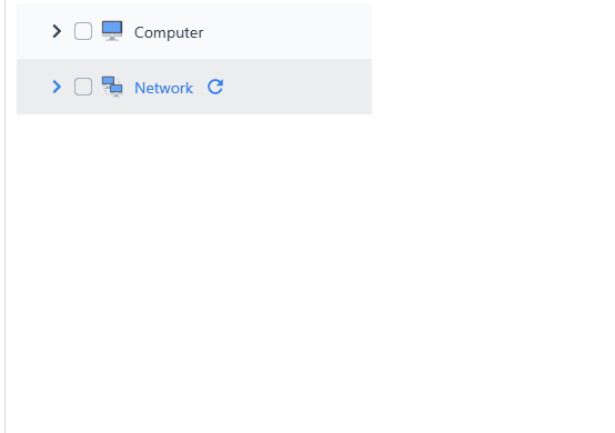
트리– 이 구성 요소는 트리 뷰로 정보를 표시할 수 있게 하며, 부모-자식 관계를 가진 항목을 보여줍니다. 실제 데이터로 사용할 수도 있고, 수동으로 정적 트리를 만들 수도 있습니다. 트리 컨트롤은 주문형 로드 기능, 아이템 활성화, 내장 체크박스를 통한 이중 상태 및 삼중 상태 연쇄 선택 등을 제공합니다.
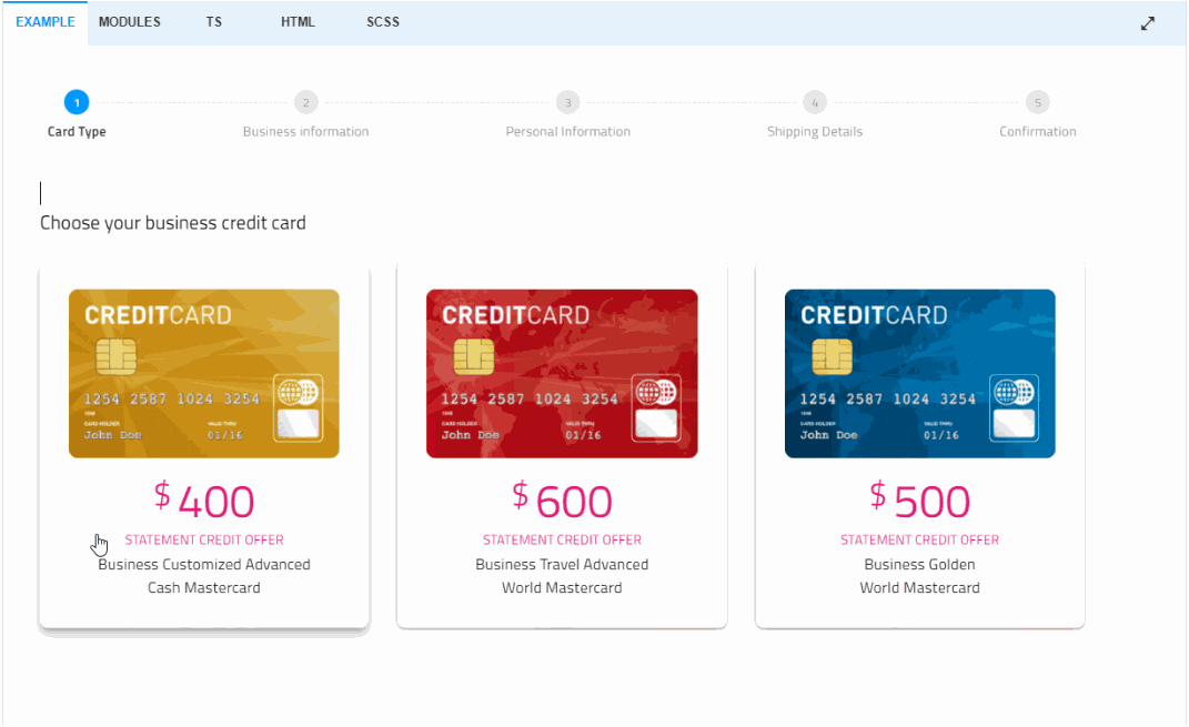
스테퍼– 마법사 같은 워크플로우와 단계별 검증, 스타일링, 방향, 키보드 내비게이션 등 다양한 기능을 제공합니다.
싸다...
수년간 우리는 수백 건의 GitHub 커밋, 주요 프레임워크 업데이트, 그리고 끊임없이 변화하는 웹 생태계에서 Ignite UI을 지속적으로 발전시키는 데 투자해 왔습니다. 우리의 사명은 변함없습니다: 개발자들이 신뢰할 수 있는 견고하고 현대적인 UI 솔루션을 제공하는 것입니다.
Angular, React, Blazor, Web Components 전반에 걸쳐 50개 이상의 핵심 구성 요소를 오픈소스함으로써 우리는 그 약속을 한 단계 더 끌어올리고 있습니다. 이것은 시작에 불과합니다. 우리는 스타트업 혁신가부터 대규모 기업 팀까지 모든 개발자가 적절한 도구로 뛰어난 디지털 경험을 구축할 수 있도록 오픈소스 및 프리미엄 컨트롤을 계속 확장하고 다듬을 것입니다.
전체 문서를 탐색하여 오늘 바로 시작하고 더 나은 앱을 만들어보세요.