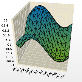

A 3D heat map chart shows the relationship between data items by using gradually changing shades of color. Heat map charts are commonly used in financial analysis to show which stocks are rising, which are falling, and the amount and rate of change between them.
