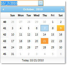
WebDatePicker™ is a control that provides a date editor along with a drop-down calendar and provides various appearance and behavior based properties. WebDatePicker is built using the Ultimate UI for ASP.NET AJAX Framework to leverage a proven code base that promotes a high performance and responsive end-user experience. You can find WebDatePicker in the Infragistics.Web.UI.EditorControls namespace.

Like all Ultimate UI for ASP.NET AJAX controls, WebDatePicker seamlessly integrates into the Infragistics® Application Styling Framework. With CSS based properties you can manually customize the WebDatePicker by leveraging your existing style sheets.
WebDatePicker also exposes a robust model within the client-side Javascript programming environment. The client-side object model (CSOM) consists of full-fledged properties and methods that enable developers to program significant units of functionality without the need of server-side postbacks.
Some of the WebDatePicker control’s features include:
High-Performance — Lightweight markup and optimized code improve performance.
Spin Buttons — End-users can easily spin through a list of values.
Standard Validators support — Supports ASP.NET validator controls.
Min and Max values — You can easily specify the allowable range of dates/times that can be entered into the editor.
ReduceDayOnInvalidDate — If the end-user enters a value which is greater than the maximum day in the month, then the value can be automatically reduced.
ShowPatternOnFocus — In edit mode, the displayed string (input pattern) can be built dynamically with cut-off prompts and literal characters on the right side of the caret.
SelectionOnFocus — You can set different selection types for whenever entering edit mode.
Culture — You can set the CultureInfo object used by the control for localized formatting.
Custom drop-down Calendar — A custom drop-down calendar can be set to the control to use.
UseLastGoodDate — Ability to automatically use the last good date value when the control loses focus and has invalid values of date fields.
CenturyThreshold — Autofills year field to the 20th or 21st century, if only 1 or 2 digits are entered by the end-user.
EnsureSharedCalendar — Ensures you that the shared default calendar is created and added to form.
FindSharedCalendar — Allows you to find the reference to the shared drop-down calendar.