This topic provides information on how to get started with the Control Configurators.
This topic contains the following sections:
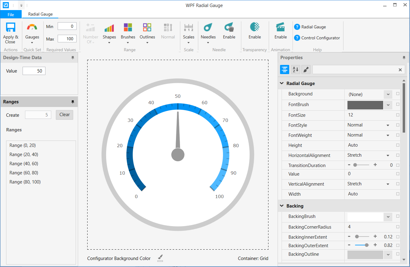
Control Configurators are visual tools that enable the developer to very quickly visually configure an Infragistics WPF control with a real-time preview of the control as it is being configured. The preview is close to how it will appear at runtime on the mobile device.

Get the most from the Control Configurators by viewing these videos.
Control Configurators enable the developer to:
Quickly configure the target control using a Quick Set (applies to gauges).
Visually configure a control using gallery items with preview images.
Learn and master the feature rich Infragistics WPF controls using the property grid that is categorized by feature, making it very easy to focus on one aspect of the control at a time.
After using the Control Configurators for a short time, you’ll be an expert in configuring the rich Infragistics WPF controls.
Control Configurators supports the following controls available in the Infragistics WPF product:
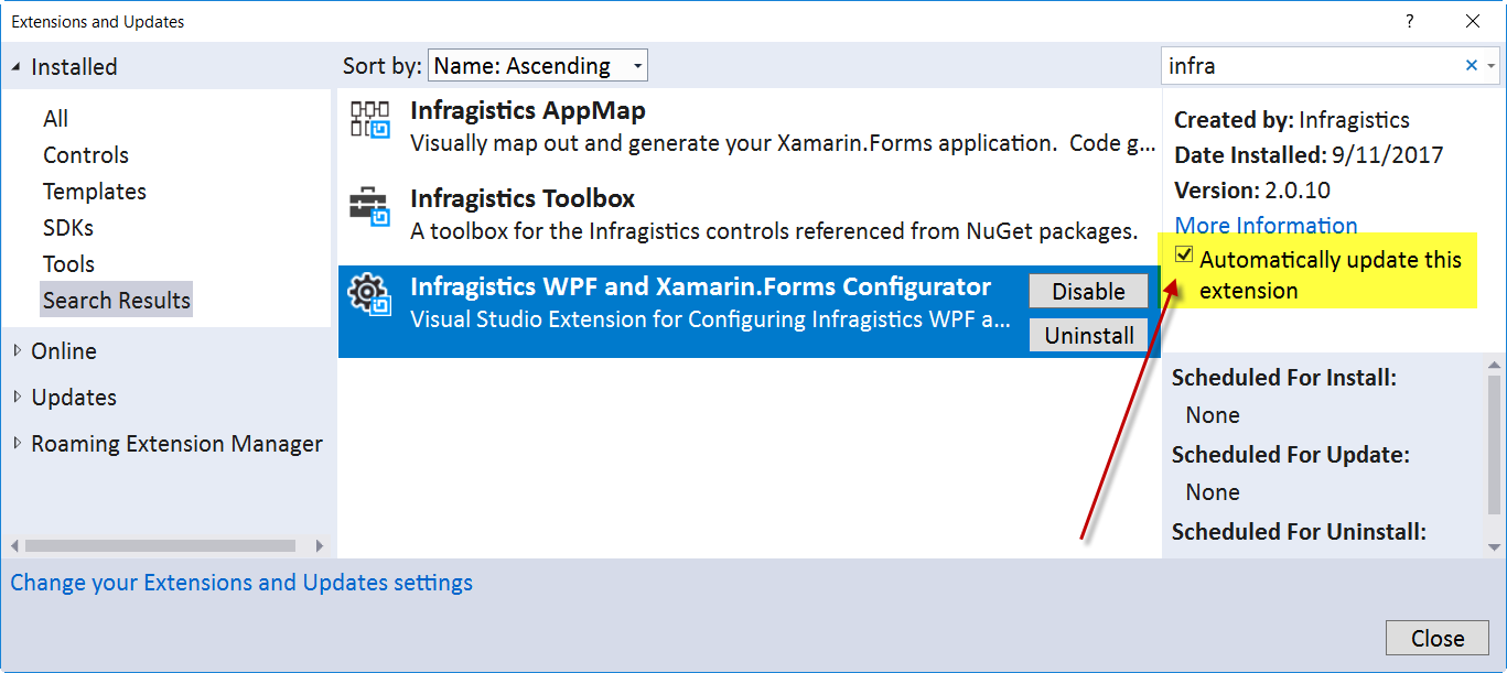
Control Configurators are updated via the Microsoft MarketPlace. Please ensure you have enabled auto updates to get new updates as they are published.

The features are common to all Control Configurators.
Quick Sets (gauges only) enable instantly configuring a control by selecting a pre-configured control from the Quick Sets Ribbon Gallery.
Brushes and Outlines enable selecting a set of brushes or outlines. The number of colors in a set of brushes or outlines are dynamically determined by the target they will be applied to. If 4 are required 4 will be displayed, if 7, 7 will be displayed.
Control Configurators enable developers to configure a control using the same background color that it will be rendered on at runtime.
Brushes and Outlines in the Gallery can be rendered using the configurator background color if desired. This makes it real easy to see how a set of brushes will look on a background color.
A control bounding box outline is provided to show the developer the control’s size relative to the area provided by the parent layout control.
The Data Binding Builder is a visual tool for creating data bindings.
Design-Time Data allows the developer to set values and see the control respond to those values.
The Resource Selector allows assigning a resource defined in App.xaml or the local page to a property on the control.
Rich property grid for setting, inspecting, data binding, setting resources, or resetting property values.
Ribbon button has links to WPF controls and configurator help documents.