The Ultimate UI for WPF 2007 Volume 2 release includes a number of powerful new controls and features to allow you to take even more advantage of our WPF controls.
Below is a list of the controls that we added for the 2007 Volume 2 release. Click the links to see a list of the features being offered.
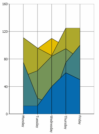
The xamChart™ control is a new visual control that presents data using graphics. The xamChart control displays values using columns, pie wedges, cylinders and more.
The xamChart control supports 25 different chart types, which will allow you to select the perfect look to accent the data in your application.
3D rendering can be turned on to display stunning visualizations of data.
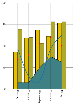
The xamChart control was built with composite chart creation in mind. Creating composite charts has never been so easy. Simply add a couple Series to xamChart and bind them to data. Make each Series render a different chart type to create complex composite charts.
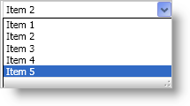
The xamComboEditor™ control is an editor control that provides a drop-down list from which your end user can select a single item.
In the previous release, xamDataGrid™ did not include a drop-down editor that could be used for editing data. With the release of xamComboEditor, you can edit the value of a Cell using a drop-down list populated with items. Using a drop-down list inside of xamDataGrid can help decrease the amount of typographic errors during data entry.
The xamRibbon™ control is a menu control that replicates the Microsoft® Office® 2007 Ribbon functionality in a Microsoft® Windows® Presentation Foundation application. Instead of using the plain, default, drop-down menu of decades past, you can use xamRibbon to give your application a stylish look and feel. Not only can you improve your application’s look and feel, you can also improve usability by using xamRibbon’s many features.
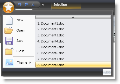
The application menu is the main menu of the application. The application menu is divided into three separate areas:
The left area displays buttons intended for file operations.
The right area displays buttons similarly to the left area. Another use for the right area might be a most recently used list.
The bottom area displays buttons such as application options or an exit button.
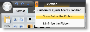
The Quick Access Toolbar (QAT) is a small, user-configurable toolbar that is always visible either above (default) or below the Ribbon. The QAT’s versatility is shown when adding any Ribbon tool to it; in fact, you can add an entire RibbonGroup to the QAT with ease.

If you have ever used a Tab in an application, xamRibbon’s object model will quickly become familiar to you. The xamRibbon control includes a collection of tabs, each with a collection of groups, each group with a collection of tools. This structure allows you to organize tools into functionally-related application tasks that your end users can easily discover.
