<ig:XamBusyIndicator IsBusy="True" Animation="Gears" />This topic summarizes the available pre-built animations in the xamBusyIndicator™ control.
The following topics are prerequisites to understanding this topic:
This topic contains the following sections:
Use the XamBusyIndicator Animation property to set a specific pre-built animation to the xamBusyIndicator control.
By default, the Animation property initial value is “SpinnerBars”.
The following table maps the desired configuration to the property settings that manage it.
You can specify the xamBusyIndicator animation in one of the following ways:
In XAML:
<ig:XamBusyIndicator IsBusy="True" Animation="Gears" />In XAML:
<ig:XamBusyIndicator IsBusy="True" >
    <ig:XamBusyIndicator.Animation>
        <ig:GearsBusyAnimation />
    </ig:XamBusyIndicator.Animation>
</ig:XamBusyIndicator>
In C#:
BusyIndicator.Animation = new GearsBusyAnimation();The following table summarizes the pre-build animations in the xamBusyIndicator control and supported modes – determinate and indeterminate. Additional details are available after the summary table.
The screenshot below demonstrates how the “Azure” animation looks by default:

Following is the code that implements this example.
In XAML:
<ig:XamBusyIndicator IsBusy="True" Animation="Azure" />The screenshot below demonstrates how the “Gears” animation looks by default:

Following is the code that implements this example.
In XAML:
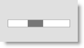
<ig:XamBusyIndicator IsBusy="True" Animation="Gears" />The screenshot below demonstrates how the “ProgressBar” indeterminate animation looks by default:

Following is the code that implements this example.
In XAML:
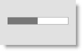
<ig:XamBusyIndicator IsBusy="True" Animation="ProgressBar" IsIndeterminate="True" />The screenshot below demonstrates how the “ProgressBar” determinate animation looks by default:

Following is the code that implements this example.
In XAML:
<ig:XamBusyIndicator IsBusy="True" Animation="ProgressBar" IsIndeterminate=" ProgressValue="0.5" />The screenshot below demonstrates how the “ProgressRing” indeterminate animation looks by default:

Following is the code that implements this example.
In XAML:
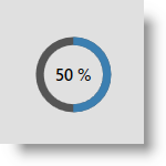
<ig:XamBusyIndicator IsBusy="True" Animation="ProgressRing" IsIndeterminate="True"/>The screenshot below demonstrates how the “ProgressRing” determinate animation looks by default:

Following is the code that implements this example.
In XAML:
<ig:XamBusyIndicator IsBusy="True" Animation="ProgressRing" IsIndeterminate=" ProgressValue=".5"/>The screenshot below demonstrates how the “SpinnerBalls” animation looks by default:

Following is the code that implements this example.
In XAML:
<ig:XamBusyIndicator IsBusy="True" Animation="SpinnerBalls" />The screenshot below demonstrates how the “SpinnerBars” animation looks by default:

Following is the code that implements this example.
In XAML:
<ig:XamBusyIndicator IsBusy="True" Animation="SpinnerBars" />The screenshot below demonstrates how the “SpinnerBarsWave” animation looks by default:

Following is the code that implements this example.
In XAML:
<ig:XamBusyIndicator IsBusy="True" Animation="SpinnerBarsWave" />The screenshot below demonstrates how the “SpinnerSegmented” animation looks by default:

Following is the code that implements this example.
In XAML:
<ig:XamBusyIndicator IsBusy="True" Animation="SpinnerSegmented" />The following topic provides additional information related to this topic.