This topic describes how to programmatically perform a selection in the xamComboEditor™ control.
The following topic is a prerequisite to understanding this topic:
This topic contains the following sections:
The following table briefly explains the configurable aspects of the programmatic selection in the xamComboEditor control and maps them to properties that configure them. Further details are available after the table.
Configure the selected xamComboEditor ComboEditorItem using the bool IsSelected property.
The following table maps the desired configuration to the property settings that manage it.
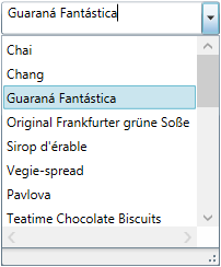
The screenshot below demonstrates how the xamComboEditor would behave as a result of the following settings:

Following is the code that implements this example.
In XAML:
<ig:XamComboEditor x:Name="ComboEditor"
                   ItemsSource="{Binding Path=Products}"
                   DisplayMemberPath="ProductName"
                   Height="30" Width="200">
</ig:XamComboEditor>
In C#:
ComboEditor.Items[2].IsSelected = true;In Visual Basic:
ComboEditor.Items(2).IsSelected = TrueConfigure the selected xamComboEditor item through its index and using the SelectedIndex property.
The default value of the SelectedIndex property is -1, and there is no selected item.
When multiple selection is enabled, the SelectedIndex returns the index of the last user selected combo item.
The following table maps the desired configuration to the property settings that manage it.
The screenshot below demonstrates how the xamComboEditor would behave as a result of the following settings:

Following is the code that implements this example.
In XAML:
<ig:XamComboEditor x:Name="ComboEditor"
                   ItemsSource="{Binding Path=Products}"
                   DisplayMemberPath="ProductName"
                   SelectedIndex="2"
                   Height="30" Width="200">
</ig:XamComboEditor>Configure the selected data item using the xamComboEditor SelectedItem property. This item is a reference to the item within the used data model.
Selecting an item in the xamComboEditor triggers the SelectionChanged event. This event has an event argument SelectionChangedEventArgs which exposes the AddedItems/ RemovedItems In/From the selection.
If the xamComboEditor AllowMultipleSelection property is set to true:
• the SelectedItem returns the last user selected item
• setting the SelectedItem to a new data object clears the existing selected items collection
The following table maps the desired configuration to the property settings that manage it.
Following is the code that implements this example.
In XAML:
<ig:XamComboEditor x:Name="ComboEditor"
                   ItemsSource="{Binding Path=Products}"
                   DisplayMemberPath="ProductName"
                   Height="30" Width="200"
                   SelectionChanged="ComboEditor_OnSelectionChanged"/>
In C#:
private void ComboEditor_OnSelectionChanged(object sender, SelectionChangedEventArgs e)
{
    if (ComboEditor.SelectedItem != null)
    {
        var selectedItem = ComboEditor.SelectedItem as Product;
        System.Diagnostics.Debug.WriteLine(String.Format("Product info: {0} {1}", selectedItem.ProductID, selectedItem.ProductName));
    }
}
In Visual Basic:
Private Sub ComboEditor_OnSelectionChanged(sender As Object, e As SelectionChangedEventArgs)
    If ComboEditor.SelectedItem IsNot Nothing Then
        Dim selectedItem = TryCast(ComboEditor.SelectedItem, Product)
       System.Diagnostics.Debug.WriteLine([String].Format("Product info: {0} {1}", selectedItem.ProductID, selectedItem.ProductName))
      End If
End SubConfigure the selected data items collection using the xamComboEditor SelectedItems property. This property is extremely useful in case multiple selection is enabled in the control.
As this is a Two-Way bindable dependency property, additionally a collection of items can be set to the xamComboEditor . This collection has to be of type ObservableCollection<object>.
The following table maps the desired configuration to the property settings that manage it.
Configure the Selected/Unselected data items using an underlying data model’s property which boolean value determines the items’ current state in the xamComboEditor . The underlying data model’s property name is set to the IsSelectedMemberPath property.
Once the IsSelectedMemberPath is set to a data model property path; the SelectedItems collection is populated with the data items that have the specified property value set to true. If the underlying data model supports the INotifyPropertyChanged interface, modifications over the specified property values reflect over the xamComboEditor items’ selection state.
The following table maps the desired configuration to the property settings that manage it.
The screenshot below demonstrates how the xamComboEditor looks as a result of the following settings:
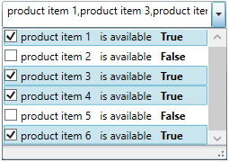
Following is the code that implements this example.
In XAML:
<Grid>
    <Grid.DataContext>
        <local:DataProvider />
    </Grid.DataContext>
    <ig:XamComboEditor x:Name="DataCombo" Height="30" Width="250"
                       ItemsSource="{Binding Path=ProductItems}"
                       CheckBoxVisibility="Visible"
                       AllowMultipleSelection="True"
                       IsSelectedMemberPath="IsAvailable">
        <ig:XamComboEditor.ItemTemplate>
            <DataTemplate>
                <Grid>
                    <Grid.ColumnDefinitions>
                        <ColumnDefinition />
                        <ColumnDefinition />
                    </Grid.ColumnDefinitions>
                    <TextBlock Text="{Binding Path=ProductName}" />
                    <StackPanel Orientation="Horizontal"
                                Margin="10,0,0,0"
                                Grid.Column="1">
                        <TextBlock Text="is available" />
                            <TextBlock Text="{Binding Path=IsAvailable}"
                                       Margin="10,0,0,0"
                                       FontWeight="Bold"/>
                    </StackPanel>
                </Grid>
            </DataTemplate>
        </ig:XamComboEditor.ItemTemplate>
    </ig:XamComboEditor>
</Grid>
The following class is the data model used in the example:
In C#:
public class ProductItem : INotifyPropertyChanged
    {
        public ProductItem(string name, bool isAvailable)
        {
            _productName = name;
            _isAvailable = isAvailable;
        }
        private string _productName;
        public string ProductName
        {
            get { return this._productName; }
            set
            {
                if (this._productName != value)
                {
                    this._productName = value;
                    this.OnPropertyChanged("ProductName");
                }
            }
        }
        private bool _isAvailable;
        public bool IsAvailable
        {
            get { return this._isAvailable; }
            set
            {
                if (this._isAvailable != value)
                {
                    this._isAvailable = value;
                    this.OnPropertyChanged("IsAvailable");
                }
            }
        }
        public event PropertyChangedEventHandler PropertyChanged;
        protected void OnPropertyChanged(object sender, PropertyChangedEventArgs e)
        {
            PropertyChangedEventHandler handler = this.PropertyChanged;
            if (handler != null)
                handler(sender, e);
        }
        protected void OnPropertyChanged(string propertyName)
        {
            OnPropertyChanged(this, new PropertyChangedEventArgs(propertyName));
        }
    }
In C#:
public class DataProvider : INotifyPropertyChanged
    {
        public DataProvider()
        {
            DownloadDataSource();
        }
        private ObservableCollection<ProductItem> _productItems = null;
        public ObservableCollection<ProductItem> ProductItems
        {
            get { return this._productItems; }
            set
            {
                if (this._productItems != value)
                {
                    this._productItems = value;
                    this.OnPropertyChanged("ProductItems");
                }
            }
        }
        private void DownloadDataSource()
        {
            var data = new ObservableCollection<ProductItem>();
            data.Add(new ProductItem("product item 1", true));
            data.Add(new ProductItem("product item 2", false));
            data.Add(new ProductItem("product item 3", true));
            data.Add(new ProductItem("product item 4", true));
            data.Add(new ProductItem("product item 5", false));
            data.Add(new ProductItem("product item 6", true));
            this._productItems = data;
        }
        public event PropertyChangedEventHandler PropertyChanged;
        protected void OnPropertyChanged(object sender, PropertyChangedEventArgs e)
        {
            PropertyChangedEventHandler handler = this.PropertyChanged;
            if (handler != null)
                handler(sender, e);
        }
        protected void OnPropertyChanged(string propertyName)
        {
            OnPropertyChanged(this, new PropertyChangedEventArgs(propertyName));
        }
}Configure the value of the selected item using the xamComboEditor SelectedValue property along with the SelectedValuePath to specify the path to the SelectedItem member used for selection.
If there are several values in the data items collection that are equal to the specified SelectedValue, the item to be selected is the first one discovered.
The following table maps the desired configuration to the property settings that manage it.
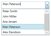
Assume that the xamComboEditor contains a collection of data items of type Person and this data type has two properties – ID and Name. The xamComboEditor can display the people’s names and selection to operate on people’s ids.
The screenshot below demonstrates how the xamComboEditor control behaves as a result of the following settings:
Following is the code that implements this example.
In XAML:
<ig:XamComboEditor x:Name="ComboEditor"
                   ItemsSource="{Binding Path=People}"
                   SelectedValuePath="ID"
                   SelectedValue="4"
                   DisplayMemberPath="Name"
Height="30" Width="200"/>Configure a collection of selected items values using the SelectedValues property. It is extremely useful in case multiple selection is enabled in the control.
The path to the data item property used for selection is specified by the SelectedValuePath.
The following table maps the desired configuration to the property settings that manage it.
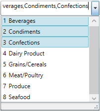
The screenshot below demonstrates how the xamComboEditor looks as a result of the following settings:
Following is the code that implements this example.
In XAML:
<ig:XamComboEditor x:Name="ComboEditor"
                   ItemsSource="{Binding Path=Categories}"
                   AllowMultipleSelection="True"
                   SelectedValuePath="CategoryID"
                   Height="30" Width="200">
    <ig:XamComboEditor.ItemTemplate>
        <DataTemplate>
            <StackPanel Orientation="Horizontal">
                <TextBlock Text="{Binding CategoryID}" Margin="0,0,5,0"/>
                    <TextBlock Text="{Binding CategoryName}" />
            </StackPanel>
        </DataTemplate>
    </ig:XamComboEditor.ItemTemplate>
</ig:XamComboEditor>
In C#:
ComboEditor.SelectedValues = new object[] {1, 2, 3};In Visual Basic:
ComboEditor.SelectedValues = New Object() {1, 2, 3}The following topics provide additional information related to this topic.