Version

Styling Tree Connector Lines (xamDataPresenter)

Styling Tree Connector Lines (xamTreeGrid)

Topic Overview

Purpose

This topic explains how to style the control’s tree connector lines.

Required background

The following topics are prerequisites to understanding this topic:

Topic Purpose

This topic explains the features supported by the control from developer perspective.

This topic provides an overview of the visual elements of the control.

In this topic

This topic contains the following sections:

Styling Tree Connector Lines

Styling tree connector lines summary

The xamTreeGrid control’s connector lines can be styled by providing a Pen to the TreeLinePen property of the ViewSettings object.

Configurable aspect Details Properties

Styling Tree Connector Lines

Set a custom Pen for drawing the connector lines.

Code example

The following code snippet shows how to set a custom Pen for drawing the control’s connector lines:

In XAML:

<Page … >
  <Page.Resources>
    <ResourceDictionary>
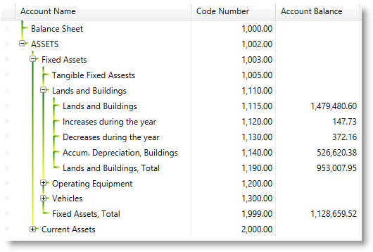
      <Pen x:Key="YellowGreenBrush" Thickness="2">
        <Pen.Brush>
          <LinearGradientBrush>
            <GradientStop Offset="0.0" Color="Green" />
            <GradientStop Offset="1.0" Color="Yellow" />
          </LinearGradientBrush>
        </Pen.Brush>
      </Pen>
    </ResourceDictionary>
  </Page.Resources>
  <Grid x:Name="LayoutRoot">
    <igDP:XamTreeGrid x:Name="xtg" …>
      <igDP:XamTreeGrid.ViewSettings>
        <igDP:TreeViewSettings TreeLinePen="{StaticResource YellowGreenBrush}" />
      </igDP:XamTreeGrid.ViewSettings>
    </igDP:XamTreeGrid>
  </Grid>
</Page>

The following screenshot depicts the result from the code above:

xamTreeGrid 09.png
Note
Note

You can also set a Pen for the tree connector lines by just creating a Pen and set the Key property to:

{x:Static igDP:DataPresenterBrushKeys.TreeLinePen}.

Related Topics

The following topic provides additional information related to this topic.

Topic Purpose

This topic explains how to style the control’s expansion indicators.