Version

General Overview (xamDiagram)

xamDiagram Conceptual Overview

xamDiagram conceptual overview summary

The xamDiagram control is a diagramming component providing user interaction capabilities comparable to those of a stand-alone diagraming tool.

xamDiagram Overview 1.png

The xamDiagram displays two types of items – nodes and connections. A node can be displayed as various shapes such rectangle, ellipse, triangle etc. A connection either connects two nodes, two arbitrary points on the diagram, or a node and a point. Connections are displayed as lines that optionally start and end with a cap such as arrow, circle, dash etc..

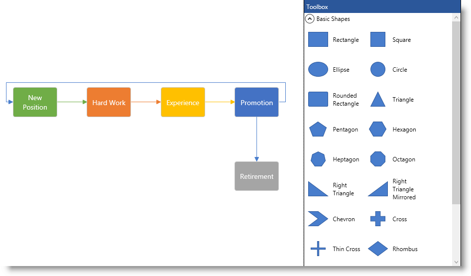
Users can easily interact with the xamDiagram via mouse and keyboard. The most common operations such as Copy/Cut/Paste are accessible through the universally accepted keyboard shourtcuts (Ctrl+C, Ctrl+X, Ctrl+V). In addition to that, a Toolbox ( xamDiagramToolbox control) is available to aid adding new nodes and connection to the diagram surface (See the picture above.).

The following screenshot demonstrates a xamDiagram displaying a simple flow diagram. The xamDiagramToolbox control is visible as well.

xamDiagram Features

xamDiagram features summary

The xamDiagram provides a number of features delivering the functionality required of a diagramming tool. It supports MVVM friendly data binding and commanding along with available multiple navigation modes. Users can select, move, resize and edit diagram items and their visual aspects. Undo/redo functionality built on top of the Infragistics® Undo Redo Framework is available. Additionally, a navigation pane and a toolbox control are provided.

xamDiagram features summary chart

The following table summarizes the main features of the xamDiagram control. Details about each feature are further available in this help content.

Feature Description

A flexible data binding mechanism is available to suit most data models.

Panning and zooming can both be accomplished through code and user interactions.

Supports selection of one or more items and can be modified by either code or user interactions.

Diagram nodes can be moved and resized. Connections’ start and end points can be moved. Allows for editing of the content (label text) of both nodes and connection.

The xamDiagram has built-in commands for all fitting interactions.

The xamDiagram supports undo/redo for all user actions and property changes done in code.

A context options pane is available for modifying the appearance of the selected nodes and connections.

The xamDiagram integrates the xamOverviewPlusDetailsPane control to display an overview of the diagram.

The xamDiagram control provides a toolbox control with the most popular shapes that can be dragged to the diagram surface.

Diagram nodes allow specifying custom shapes.

Both the nodes and connections in the xamDiagram support custom templates for visualizing or editing their content.

The xamDiagram is built for high performance and to be able to handle thousands of items. One of the techniques used is virtualizing the items that are not currently in view.

xamDiagram Visual Elements

Visual elements summary

The xamDiagram control exposes the following basic visual elements:

  • A diagram surface

  • Diagram nodes

  • Diagram nodes’ connections

The nodes and the connections, collectively known as “diagram items” are rendered within the diagram surface.

Additional visual elements are the:

  • Navigation pane – a reduced-size overview of its full content in a separate pane positioned inside the diagram space, by default at its bottom-right corner. The Navigation pane is implemented through an internal control ( xamOverviewPlusDetailPane™)

  • Toolbox – a control that allows adding items to the diagram via drag-and-drop. The Toolbox is implemented through the xamDiagramToolbox™ control.

User Interactions and Usability

User interactions summary chart

The following table summarizes the user interaction capabilities of the xamDiagram control.

The user can… Using… Details Configurable?

Pan the diagram surface

  • Ctrl + mouse drag

  • Keyboard arrow keys

The navigation pane controls

Changes the currently visible portion of the diagram.

Zoom in and out

  • The mouse wheel

  • Mouse drag when the Zoom drag interaction is engaged

  • Ctrl + Shift + mouse drag

The navigation pane navigators

Changes the zoom level.

Select one or more items

  • Mouse drag

  • Click on an item

  • Ctrl + A

When dragging to select, all the items that are entirely in the rectangular selection area are selected.

When clicking an item it is selected and the previous selection is cleared.

Selecting all items is done via the Ctrl + A keyboard shortcut.

Move items

Mouse drag over an item

When the selection is not empty dragging one of the selected items will move all selected items.

Resize nodes

Mouse drag the resize handles

When a single node is selected, resize indicators appear at its edges and sides. Dragging from one of the sides, resizes the node just from that side. Dragging from one of the corners resizes the node proportionally.

If the Shift key is held down, these behaviors are reversed.

Move connections’ start and end points

Mouse drag the start/end point handles

When a single connection is selected, draggable indicators appear at its ends. These can be dragged either to a point on the diagram or to a node.

Draw connection

  • Mouse drag from a connection point on a node

  • Mouse drag from any point on the diagram when the Connector tool is engaged.

Edit the items’ content

  • Mouse double click

  • F2 key

Begins an edit operation of a node or connection’s content.

Confirm current value or add a new line

Enter key

When a node is in editing mode and the user presses the Enter key the control’s behavior will be determined by the value of the EnterKeyBehavior property. The CommitChanges value will cause the control to confirm the current value and exit editing mode. The AddNewLineFeed value will cause the control to insert a new line and remain in editing mode.

Note
Note

The user can still insert a new line when in CommitChanges mode using the Shift+Enter combination.

Show/Hide the options pane

  • Clicking the “settings” icon (xamDiagram_Overview_16.png) next to the selected items

  • Esc/ Mouse click on the diagram’s surface

Shows/hides the context menu providing options for editing the appearance and content of the diagram items.

Undo/Redo a change

  • Ctrl + Z

  • Ctrl + U

Performs an undo/redo operation.

Copy, Cut, Paste, Delete an item

  • Ctrl + C

  • Ctrl + X

  • Ctrl + V

  • Delete

Standard Clipboard-like operations are supported for items in the diagram.

xamDiagram Commands

Commands summary

The xamDiagram control supports a number of commands which can represent an action performed on diagram items or an interaction with the UI of the control or have some impact on its undo/redo operations history. The commands can be invoked using keyboard shortcuts, interactions with other controls, etc.

Most of the commands are associated to keyboard keys and key combinations according to the existing computing interface standards (like using Ctrl+C for copy, etc.). Keyboard shortcuts (or key combinations) can be overriden programmatically. (For details, see Configuring Keyboards Shortcuts).

Configuring xamDiagram

xamDiagram configuration summary

The xamDiagram configuration aspects are divided into the following categories:

  • Diagram configuration

  • Items configuration – the configurations applicable to both nodes and connections

  • Nodes configuration

  • Connections configuration

  • User interactions configuration

xamDiagram configuration summary chart

The following table explains briefly the configurable aspects of the xamDiagram control and maps them to the properties that configure them. Further details are available after the table.

Configurable aspect Details Properties

The positioning of the nodes.

Which part of the diagram is visible.

xamDiagram items configuration summary chart

The following table explains briefly the configurable aspects of the diagram items (nodes and connections) of the xamDiagram control and maps them to the properties that configure them. Further details are available after the table.

Configurable aspect Details Properties

The Look- and-Feel related configuration aspects of diagram nodes and connections.

The template used for presenting and editing the diagram items’ content.

xamDiagram nodes configuration summary chart

The following table explains briefly the configurable aspects of the diagram nodes and maps them to the properties that configure them. Further details are available after the table.

Configurable aspect Details Properties

The position and size of diagram nodes.

The shape of diagram nodes

The connection points where connections associated with a node can start and end.

xamDiagram connections configuration summary chart

The following table explains briefly the configurable aspects of the diagram connections and maps them to the properties that configure them. Further details are available after the table.

xamDiagram user interactions configuration summary chart

The following table explains briefly the configurable aspects of the diagram nodes and maps them to the properties that configure them. Further details are available after the table.

Configurable aspect Details Properties

The xamDiagram provides a number of built-in commands.

The xamDiagram provides a context menu for editing properties of items.

The way users can interact with the xamDiagram via the mouse.

The xamDiagram provides an navigation pane of the whole diagram.

The xamDiagram provides functionality for selecting items.

The keyboard shortcuts used for interacting with the xamDiagram .

The xamDiagram provides an additional toolbox control for drag-and-dropping items.

The xamDiagram provides undo/redo functionality

Optimizing for Large Data

xamDiagram performance optimization suggestions reference chart

The following table summarizes the possible configurations related to optimizing the xamDiagram ’s performance.

Optimization Aspect Description

Layout

Using the Layout property of the xamDiagram causes an additional iteration over all the nodes. If the Layout applied performs heavy calculations this would additionally impact performance. If that is the case, where possible, consider setting the DiagramNode.Position property to a pre-calculated position.

Number of visible items

Try to limit the number of items visible at one time, for example, increase the MinimumZoomLevel.

Navigation pane

Displaying the navigation pane involves some additional overhead for displaying the items in it; consider setting the NavigationPaneVisibility to Collapsed.

Selection

If there is latency in item interactions, consider setting the SelectionMode to Single or None in order to prevent interactions with large numbers of items.

Items templates

In order to reduce the rendering time, use lighter `DataTemplate`s for the DiagramItem.DisplayTemplate. The data templates should contain as few elements and bindings as possible.

Nodes shape

Use the DiagramNode.Geometry property as opposed to the DiagramNode.DisplayTemplate for creating custom node shapes.

Connection type

Connections with DiagramConnection.ConnectionType set to Straight perform better than the ones with RightAngle.

Connection caps

Custom caps set through the DiagramConnection.StartCapStyle and EndCapStyle properties attach a new control in the visual tree for each cap. For data intensive applications, consider using one of the predefined cap types through the DiagramConnection.StartCapType and EndCapType. If possible do not use caps at all by setting the cap type to None.

Connections start/end points

Consider setting the DiagramConnection.StartNodeConnectionPointName and EndNodeConnectionPointName properties in order to associate a connection’s ends with a specific point on its target nodes, skipping the routine of determining the closest connect point.

Related Topics

The following topics provide additional information related to this topic.

Topic Purpose

This topic explains in detail the main features of the xamDiagram control.

This topic provides an overview of the visual elements of the xamDiagram control.

This topic explains the operational logic of the commands available in the xamDiagram control.