Version

About xamOutlookBar

The xamOutlookBar™ control emulates the navigation bar found in Microsoft® Outlook®. Just as Outlook separates email-related functionality from calendar-related functionality, you can organize your own application tasks into subsets of related tasks. The xamOutlookBar control has the following features:

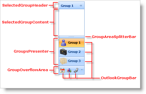
  • Groups - Each group is a headered content control that can host a diverse set of controls.

  • Collapsible - Your end users can collapse xamOutlookBar to maximize screen real estate.

xamOutlookBar About xamOutlookBar 01.png

xamOutlookBar Smart Tag

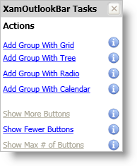
The xamOutlookBar™ control is equipped with a Smart Tag. By simply selecting xamOutlookBar, a Smart Tag anchor appears. When you click this anchor, a pop-up panel appears, providing you with quick and easy access to the most common properties and settings of xamOutlookBar. See the table below for a description of each item (e.g., field, drop-down list, link) in the smart tag, as well as the item’s corresponding property in the properties window.

xamOutlookBar xamOutlookBar Smart Tag 01.png
Item Description Corresponding Property

Add Group With Grid

Clicking this link will add an OutlookBarGroup object to xamOutlookBar. The group’s content will be set to a Grid panel.

None

Add Group With Tree

Clicking this link will add an OutlookBarGroup object to xamOutlookBar. The groups content will be set to a TreeView control.

None

Add Group With Radio

Clicking this link will add an OutlookBarGroup object to xamOutlookBar. The group’s content will be set to two ListBox controls. The first ListBox control contains three TextBlock controls and the second ListBox control contains three RadioButton controls.

None

Add Group With Calendar

Clicking this link will add an OutlookBarGroup object to xamOutlookBar. The group’s content will be set to a xamMonthCalendar™ control. You have to add a reference to the Infragistics.WPF.Editors NuGet package to your project if you have not added it already.

None

Show More Buttons

Clicking this link will show more groups in the groups presenter.

None

Show Fewer Buttons

Clicking this link will show fewer groups in the groups presenter.

None

Show Max # of Buttons

Clicking this link will show the maximum number of groups in the groups presenter based on the height of the xamOutlookBar control.

None

OutlookBarGroup Smart Tag

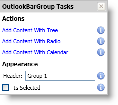
The OutlookBarGroup object is equipped with a Smart Tag. By simply selecting a group in xamOutlookBar, a Smart Tag anchor appears. When you click this anchor, a pop-up panel appears, providing you with quick and easy access to the most common properties and settings of an OutlookBarGroup object. See the table below for a description of each item (e.g., field, drop-down list, checkbox, link) in the smart tag, as well as the item’s corresponding property in the properties window.

xamOutlookBar OutlookBarGroup Smart Tag 01.png
Item Description Corresponding Property

Add Content With Tree

Clicking this link will add an OutlookBarGroup object to xamOutlookBar. The groups content will be set to a TreeView control.

Add Content With Radio

Clicking this link will add an OutlookBarGroup object to xamOutlookBar. The group’s content will be set to two ListBox controls. The first ListBox control contains three TextBlock controls and the second ListBox control contains three RadioButton controls.

Content

Add Content With Calendar

Clicking this link will add an OutlookBarGroup object to xamOutlookBar. The group’s content will be set to a xamMonthCalendar™ control. You have to add a reference to the Infragistics.WPF.Editors NuGet package to your project if you have not added it already.

Content

Header

This is the text that appears in a group’s header.

Is Selected

Clicking this link will select the group.