Version

xamToolbar [Beta]

The Toolbar component is a companion conainer for UI operations to interact both standalone or with the XamDataChart & XamCategoryChart components. This allows you to easily choose from a preset of properites on the eg. XamDataChart with predefined SVG icons, but it also gives you the ability to create custom tools for your project. Benefiting from a number of attributes, you can define or change the icon in use or apply different actions to it. The Toolbar will display it’s own SVG icons.

toolbar_01.png

The Toolbar contains a Target property. This is used to link another component such as the DataChart.

In XAML:

<Grid Grid.Row="0">
    <ig:XamToolbar
        Name="Toolbar"
        Target="{Binding ElementName=chart}"
        Orientation="Horizontal">
    </ig:XamToolbar>
</Grid>
<Grid Grid.Row="2">
    <ig:XamDataChart  Name="chart">
    ...
    </ig:XamDataChart>
 </Grid>

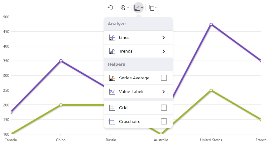
Several pre-existing ToolAction items and menus become available when the chart is linked with the Toolbar. The following names are a list of Tool/Tool OverlayId names necessary for further customization such as adding, editing, toggling visibility of tools. These names can be assinged to the OverlayId, BeforeId and AfterId.

Here is a list of the provided DataChart Tool Actions and their associated OverlayId:

Zooming Actions

  • ZoomReset: A ToolActionLabel that invokes the ResetZoom method on the chart to reset the zoom level to it’s default position.

  • ZoomMenu: A ToolActionIconMenu that exposes two ToolActionLabel items to invoke the ZoomIn and ZoomOut methods on the chart for increasing/decreasing the chart’s.

Trend Actions

  • AnalyzeMenu: A ToolActionIconMenu that contains several options for configuring different options of the chart.

    • AnalyzeHeader: sub section header.

      • LinesMenu: A sub menu containing various tools for showing different dashed horizontal lines on the chart.

        • LinesHeader: A sub menu section header for the following three tools:

          • MaxValue: A ToolActionCheckbox that displays a dashed horizontal line along the yAxis at the maximum value of the series.

          • MinValue: A ToolActionCheckbox that displays a dashed horizontal line along the yAxis at the minimum value of the series.

          • Average: A ToolActionCheckbox that displays a dashed horizontal line along the yAxis at the average value of the series.

      • TrendsMenu: A sub menu containing tools for applying various trendlines to the XamDataChart plot area.

        • TrendsHeader: A sub menu section header for the following three tools:

          • Exponential: A ToolActionRadio that sets the TrendLineType on each series in the chart to ExponentialFit.

          • Linear: A ToolActionRadio that sets the TrendLineType on each series in the chart to LinearFit.

          • Logarithmic: A ToolActionRadio that sets the TrendLineType on each series in the the chart to LogarithmicFit.

          • None: A ToolActionRadio for removing all trendlines.

    • HelpersHeader: A sub section header.

      • SeriesAvg: A ToolActionCheckbox that adds or removes a ValueLayer to the chart’s series collection using the ValueLayerValueMode of type Average.

      • ValueLabelsMenu: A sub menu containing varous tools for showing different annotations on the `XamDataChart’s plot area.

        • ValueLabelsHeader: A sub menu section header for the following tools:

          • ShowValueLabels: A ToolActionCheckbox that toggles data point values by using a CalloutLayer.

          • ShowLastValueLabel: A ToolActionCheckbox that toggles final value axis annotations by using a FinalValueLayer.

    • ShowCrosshairs: A ToolActionCheckbox that toggles mouse-over crosshair annotations via the chart’s CrosshairsDisplayMode property.

    • ShowGridlines: A ToolActionCheckbox that toggles extra gridlines by applying a MajorStroke to the X-Axis.

Copy Actions

  • Copy as Image: This menu provides an option to copy an image of the chart to the clipboard.

Tool Actions

The following is a list of ToolAction items you can add to the Toolbar.

  • ToolActionButton

  • ToolActionCheckbox

  • ToolActionIconButton

  • ToolActionIconMenu

  • ToolActionLabel

  • ToolActionNumberInput

  • ToolActionRadio

Each of these tools exposes an OnCommand event that can be triggered upon interacting with them as a mouse click.

New and existing tools can be repositioned and marked hidden using the OverlayId, BeforeId and AfterId properties on the ToolAction object. ToolActions also expose a Visibility property.

Custom Tool Actions

In XAML:

<ig:ToolActionLabel
    IconName="MyCustomIcon"
    IconCollectionName="MyCustomCollection"
    CommandId="MyCustomAction"
    OnCommand="myTool_OnCommand"
    Name="toolActionLabel2">
</ig:ToolActionLabel>

In C#:

SvgIconRegistry.Instance.AddSvgPathString("MyCustomCollection", "MyCustomIcon",
@"
<svg>Custom Icon</svg>
");


private void myTool_OnCommand(object sender, ToolCommandEventArgs e)
{
    switch (e.Command.CommandId)
    {
        case "MyCustomAction":
           //Custom Action Logic Here
    }
}

Vertical Orientation

By default the Toolbar is shown in the horizontal Orientation position but also has the ability to shown vertically.

Styling/Theming

The icon component can be styled by using it’s BaseTheme property directly to the Toolbar.