This topic explains how data is presented in the XamScheduler's month view.
The month view of the XamScheduler is visualizing the days of an entire month. Each day is represented by a cell which may contain up to three activities. The month view also supports the concept of the "selected date" which is displayed using different styling (foreground color, background color, font size or font style). Initially the selected date is the device’s current date but you can set or obtain the selected date using the SelectedDate property.
You can navigate through the months by swiping over the month’s days. The scrolling direction is configurable using the MonthViewScrollDirection property. The range of months accessible by the control is defined using the MinimumDate and MaximumDate properties. These above properties can be set in any order and even illogically (for example the MinimumDate property may have greater value than the MaximumDate property). The control will normalize the dates before they are used internally. The default values for these properties is a date range that spans from 5 years prior to the current date to 5 years after the current date.
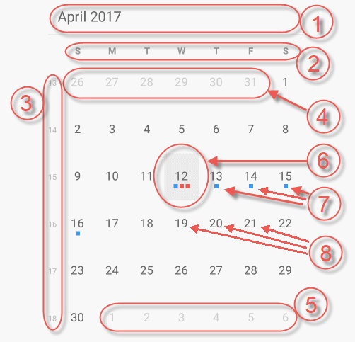
The following screenshot shows the month view along with its visual elements:

Month header (containing current month and year)
Day of week header
Week number
Leading days (from previous month)
Trailing days (from next month)
Current day (displayed with different style)
Activity indicators. These indicators are rendered on days occupied with activities. Up to three activity indicators are rendered. The indicators are drawn using the color scheme set on the associated resource.
Current month days
When the control displays the month view the space occupied can be split and an agenda view can be shown along with the month view. The agenda view shows the activities of the currently selected day or all days' activities depending on the value set on the AgendaViewAppointmentScope property. The agenda view can be rendered under the month view, at the right side of the month view or completely hidden to allow the month view to occupy all the space available to the control. By default the control positions the two views automatically based on its size:
If the control’s width is bigger than its height the two views are rendered side by side.
If the control’s height is bigger than its width the agenda view is rendered under the month view.
You have the option to turn off this automatic repositioning and sets a static views layout which is described in the table below.
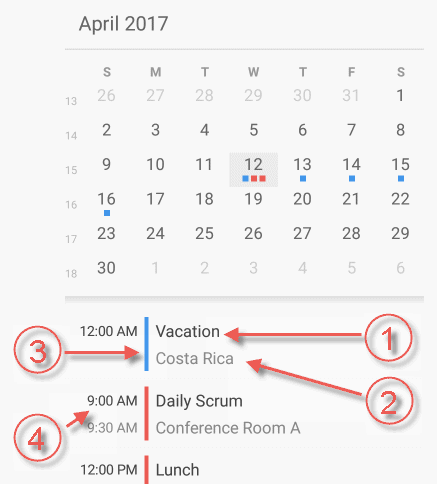
The following screenshot shows visual elements of the month view combined with an agenda view:

Activity’s subject
Activity’s location
The resource’s color associated with this activity
Start and end time associated with this activity
The following table maps some configurable aspect/behavior of the month view to the property/method that is responsible for:
The following table maps some of the user interactions to the events that are raised by the control:
The month view is highly configurable in terms of fonts, sizes and colors. There are a lot of properties at your disposal to configure this view and all of their names are prefixed with MonthView so that it is easier for you to find them. For example:
The properties for controlling the foreground and background colors are of type Brush. For example: MonthViewBackgroundBrush or MonthViewDayOfWeekHeaderTextBrush.
The properties for controlling the font sizes are of type double. For example: MonthViewDayFontSize.
The properties for controlling the font family are of type string. For example: MonthViewDayFontFamily.
The properties for controlling the font styling are of type FontAttributes. For example: MonthViewDayFontAttributes
The following topics provide additional information related to this topic.