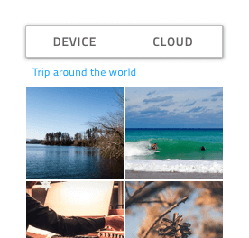
Button Group
Use the Button Group Component to combine the triggers for a few related features into one interface element. The Button Group is visually identical to the Ignite UI for Angular Button Group Component
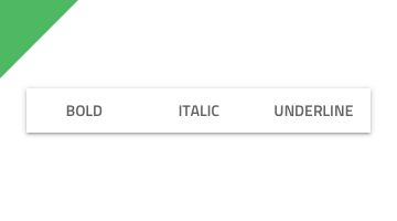
Button Group Demo
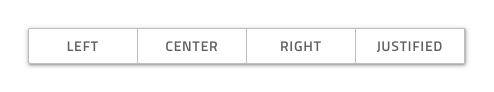
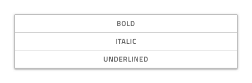
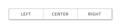
Layout
The Button Group supports two layout directions: horizontal, where items are laid out left to right, and vertical, where their order is top to bottom.
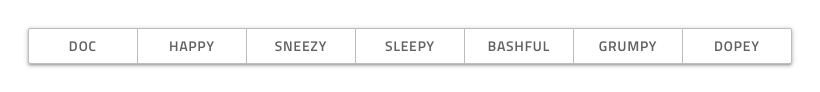
Buttons Amount
In Figma, the Button Group uses an auto layout allowing it to adjust accordingly when you choose the exact amount of buttons you need and hide the extra nested ones in the layers panel.
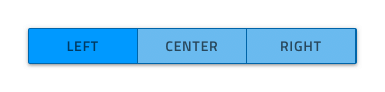
Interaction States
Each button from the Button Group component supports both Enabled and Disabled variants that can also be Selected or not. In Figma you can switch between Enabled and Disabled and between Selected and not Selected variants using boolean operations from the properties panel.

States
In Figma the Enabled buttons in the Button Group component support Idle, Hover and Focused states which can be switched between by changing the State property.

Button Group Layout Template
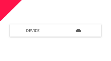
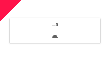
Each button from the button group supports flexible icon and label templates. In Figma, to show or hide an icon, you should select the Text & Icon Content type from the property panel and then use the Left Icon and Right Icon boolean properties. If you want to have an Icon Button, you can set the Content property to Icon.
Styling
The Button Group comes with styling flexibility through the various options for the border and background color, as well as the individual buttons' outline, background, text, and icon colors.
Usage
Always use Buttons with consistent style and avoid combining Text Buttons with Icon Buttons within the same Button Group. Size the Button Group according to its content to avoid leaving too much empty space in the Buttons. Use the Button Group only to display simple and related actions, as it is not suitable for even simple navigation. If you're looking beyond these actions, Tabs are much more appropriate.
| Do | Don't |
|---|---|
 |
 |
 |
 |
 |
 |
Additional Resources
Related topics:
Our community is active and always welcoming to new ideas.
 GitHub