 <ig:XamBulletGraph x:Name="bulletGraph"
                           ...
                           ShowToolTip="True"
                           />
This topic explains, with code examples, how to enable the tooltips in the XamBulletGraph™ control and configure the delay with which they are displayed.
The following topics are prerequisites to understanding this topic:
This topic contains the following sections:
The XamBulletGraph control supports tooltips. They are pre-configured to show the values indicated by the performance bar, comparative marker, and comparative ranges. The tooltip for each of these visual elements is configured individually by a property setting.
Tooltips are configurable in terms of visibility (can be enabled/disabled), delay (the timeout with which the tooltip appears is configurable), and value. Because the value of the tooltips can be set to a template, string, or a UI element, you have a wide array of possibilities to present the information relevant for the specific use case in the most appropriate manner.
By default, tooltips are disabled.
The following table maps the configurable aspects of the XamBulletGraph control related to tooltips to the properties that manage them.
You can show or hide (default setting) the tooltips on a XamBulletGraph.
The following table maps the desired behavior to property settings.
The following code example enables the tooltips:
In XAML:
<ig:XamBulletGraph x:Name="bulletGraph"
...
ShowToolTip="True"
/>It is possible to specify a delay by which a tooltip is displayed after the respective visual element has been hovered. The default value is 500 milliseconds.
The following table maps the desired behavior to property settings.
The following code example sets the tooltip delay to 2000 milliseconds:
In XAML:
 <ig:XamBulletGraph x:Name="bulletGraph"
                           ...
                           ShowToolTip="True"
                           ShowToolTipTimeout="2000"
/>The default value of the tooltip is pre-configured depending on whether the ValueName property has been initialized.
If the ValueName property has been initialized, the default format of the tooltip property would be: <ValueName> : <Value>
If the ValueName property has not been initialized, the default format of the tooltip would be: <Value>
To change the data (and/or its look-and-feel) presented by the tooltip, you can set it to a custom template, a UI element, or a string.
The following table maps the desired behavior to its respective property settings.
The screenshot below demonstrates how the tooltip of the igBulletGraph ’s performance bar looks as a result of the following settings:
In XAML:
            <DataTemplate>
                <Border BorderThickness="1" Background="Coral" CornerRadius="4">
                    <TextBlock>
                        <Run Text="The value is:"/>
                        <Run Text="{Binding Path=Item}"/>
                    </TextBlock>
                </Border>
            </DataTemplate>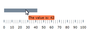
Following is the code that implements this example.
In XAML:
<Grid.Resources>
            <DataTemplate x:Key="actValueTmpl">
                <Border BorderThickness="1" Background="Coral" CornerRadius="4">
                    <TextBlock>
                        <Run Text="The value is:"/>
                        <Run Text="{Binding Path=Item}"/>
                    </TextBlock>
                </Border>
            </DataTemplate>
        <ig:XamBulletGraph x:Name="bulletGraph"
                           Height="100"
                           Width="300"
                           ShowToolTip="True"
                           Value="42"
ValueToolTip="{StaticResource actValueTmpl}"/>The tooltip for the comparative marker displays the value set for the marker using the default system font and styled by default in accordance with the look of the control. To specify custom settings, set the tooltip value to a string, UI element, or data template.
The following table maps the desired behavior to its respective property settings.
The code below illustrates displaying the value presented in the tooltip of the comparative marker in square brackets as a result of the following settings:
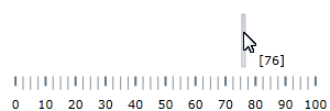
Following is the code that implements this example.
In XAML:
 <ig:XamBulletGraph x:Name="bulletGraph"
                           Height="100"
                           Width="300"
                           ShowToolTip="True"
                           TargetValue="76"
TargetValueToolTip="[{Item}]"/>By default, the tooltips for the comparative ranges display the starting and ending values of the range, separated by a hyphen (i.e. 0 - 34), no matter where exactly over the range the mouse is being hovered. To change these pre-configured settings, you can set a custom format for the tooltip, assign a UI element to it or apply a data template.
The following table maps the desired behavior to its respective property settings.
The screenshot below demonstrates displaying the value presented in the tooltip of the comparative range in square brackets as a result of the following settings:
In XAML:
                  <StackPanel Orientation="Horizontal">
                    <TextBlock>
                        <Run Text="["/>
                        <Run Text="{Binding Item.StartValue}"/>
                        <Run Text="]"/>
                    </TextBlock>
                    <TextBlock>
                        <Run Text=" - "/>
                    </TextBlock>
                    <TextBlock>
                        <Run Text="["/>
                        <Run Text="{Binding Item.EndValue}"/>
                        <Run Text="]"/>
                    </TextBlock>
                </StackPanel>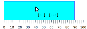
Following is the code that implements this example.
In XAML:
 <ig:XamBulletGraph x:Name="bulletGraph"
                           Height="100"
                           Width="300"
                           ShowToolTip="True"
                    >
            <ig:XamBulletGraph.RangeToolTip>
                <StackPanel Orientation="Horizontal">
                    <TextBlock>
                        <Run Text="["/>
                        <Run Text="{Binding Item.StartValue}"/>
                        <Run Text="]"/>
                    </TextBlock>
                    <TextBlock>
                        <Run Text=" - "/>
                    </TextBlock>
                    <TextBlock>
                        <Run Text="["/>
                        <Run Text="{Binding Item.EndValue}"/>
                        <Run Text="]"/>
                    </TextBlock>
                </StackPanel>
            </ig:XamBulletGraph.RangeToolTip>
            <ig:XamBulletGraph.Ranges>
                <ig:XamLinearGraphRange Brush="Cyan"
                                        EndValue="89"
                                        Outline="Blue"
                                        StartValue="0"
                                        />
            </ig:XamBulletGraph.Ranges>
</ig:XamBulletGraph>The following topics provide additional information related to this topic.