This topic explains the features supported by the control from a developer’s perspective.
The following table lists the concept and topic required as a prerequisite to understanding this topic.
This topic contains the following sections:
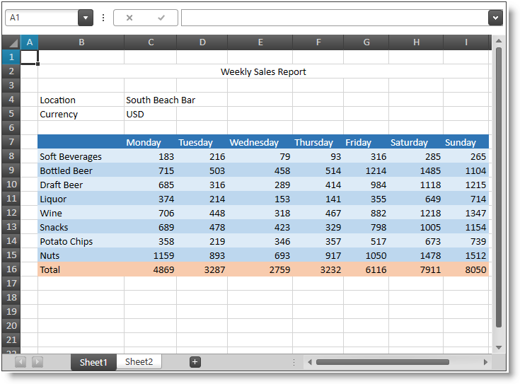
The following screenshot shows the XamSpreadsheet control displaying some spreadsheet data:
The XamSpreadsheet control allows visualizing and editing of spreadsheet data, represented by the data model supported by the Infragistics Excel Engine comprising of Workbooks, Worksheets, Cells, Formulas and more.
The following screenshot shows the XamSpreadsheet control displaying some spreadsheet data:

The following table summarizes the main features of the XamSpreadsheet control. Additional details are available after the summary table.
The control supports many horizontal and vertical cell content alignments. Indentation, text wrap, shrink to fit and cell merging are also supported.
The control supports cell borders and edges with different styles and colors. Diagonal borders are also supported. The control does not scale border lines when zooming.
The control supports different cell fills like solid fill, gradient effect fill, pattern color and pattern style.
The control supports fully featured "in-place" cell editing using an editor positioned over cell which is being edited. The user may edit cell’s formatted string or formula.
The control provides a lot of commands for activating different features.
The control provides contextual menus allowing the user to perform different operations depending on the selected visual element.
The control supports clipboard copying of information between cells, sheets and also between external applications (like MS Excel).
The control supports a data validation feature which allows validation of the user input based on validation rules set on the cells. Your rules configuration also includes an input message and an error message dialog shown when the user input does not pass the validation.
The control supports the following text properties - font family, font size, bold, italic, underline, double underline, strikethrough and color. The control renders superscript and subscript based on the entire line height and not based on the font height.
The control allows the user to edit cell text and formulas. The name box of the formula bar allows the user to define named references (to cell or cell ranges) and quickly navigate to the appropriate cell or cell range(s). The formula bar also supports multiple line content editing.
The control allows freezing of top row(s) and/or left column(s). Frozen row(s) and/or column(s) remain visible at all time while the user is scrolling.
The control can show or hide the grid lines used to separate the worksheet’s cells. Dotted lines are drawn when a custom color is used for the grid line color. Grid lines are not rendered for cells where borders or background are present.
The control can show or hide the columns’ and rows’ headers.
The control supports hiding of columns and rows. The user can start resizing a column or row and shrink it to a point where it is no longer visible. A special indicator will be rendered at the place of the hidden column or row allowing it to be made visible again.
The control supports hyperlinks defined in both the underlying object model and as a worksheet cell formula.
The control supports cells, columns and rows managing programmatically.
The control supports resizing of columns and rows. The user can resize columns and rows by dragging the mouse at the border between two columns headers or two row headers and resize the column or row. Auto-sizing is also supported by double-clicking on the right border of a column header or double-clicking on the bottom border of a row header.
The control supports different kind of objects (like shapes and images). The objects are rendered in a separate (from the cell content) layer and they may move and/or resize based on the cells they are positioned over. Object rotation and different transformations (such as horizontal and vertical flipping) are supported.
The control supports several selection modes which may be switched programmatically or by the user. The currently selected cells can be set and obtained programmatically.
The control supports splitting the worksheet view into panes. Each scrollable pane row and column has its own scrollbar.
The control supports dedicated tabs area for switching between worksheets.
The control uses the IG Undo/Redo Framework to provide unlimited undo and redo operations. You can enable/disable the undo and redo and also use separate or shared undo managers for each XamSpreadsheet control.
The control supports displaying a worksheet background image. The image is tiled in the worksheet’s background. The zooming feature affects the background image and the background image scrolls as panes scroll.
The control supports content zooming. The entire workbook content (text, images, shapes, shape borders, etc.) is scaled.
Note:
The following topics provide additional information related to this topic.