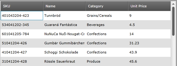
Version

What’s New in 2012 Volume 1

Topic Overview

Purpose

The Ultimate UI for WPF 2012 Volume 1 release includes a number of powerful new features and controls to allow you to take even more advantage of our WPF controls.

Controls and Features

Features Overview

The following table summarizes the new features of the Ultimate UI for WPF 2012 Volume 1. Additional details are available after the following the summary table.

Control Feature Description

A new touch-friendly theme for the controls.

A touch-friendly support of the controls.

A new map control with support for plotting data in a geographic context.

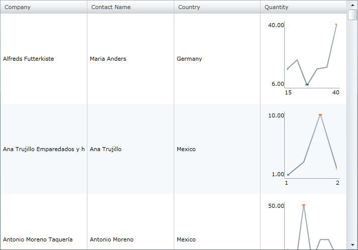
The Sparkline column type allows the display of a Sparkline chart in a grid cell by inserting the xamSparkline™ control.

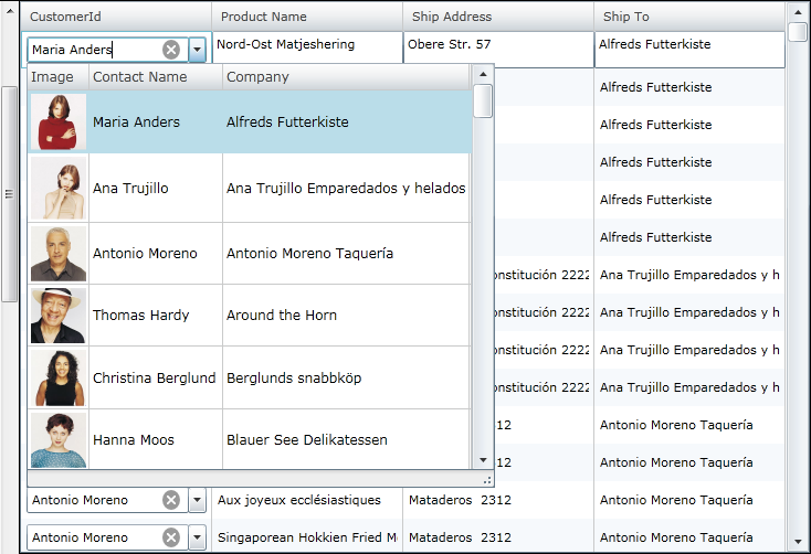
The MultiColumnCombo column is column type that displays multiple columns in a drop down list.

The DateTimeColumn displays dates using the xamDateTimeInput control.

The copy and paste helper methods facilitate the data copying and pasting in the xamGrid™ control.

The xamGrid supports applying implicit data templates on specific data type in a TemplateColumn.

The dialog interface can be used by the end user to create complex filters on data in a column.

Designed to render one or more series objects of type PointSeries in xamDataChart to display the data points that look like small markers.

A new feature that provides an overview of chart content and it allows navigation of content in the xam DataChart control.

Allows rendering OLAP data with PieChart.

Filtering capabilities that allow the xamPivotGrid to filter values using filters such as top and bottom.

Allows defining calculated measures and displaying it on a separate column.

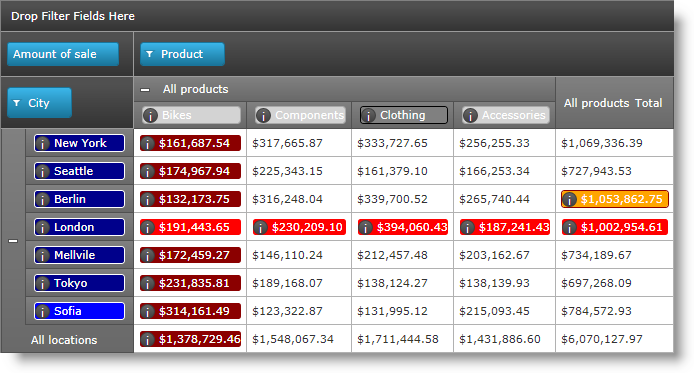
Allows you to define custom data templates for header and data cells of the pivot grid that are selectively applied according to predefined criteria.

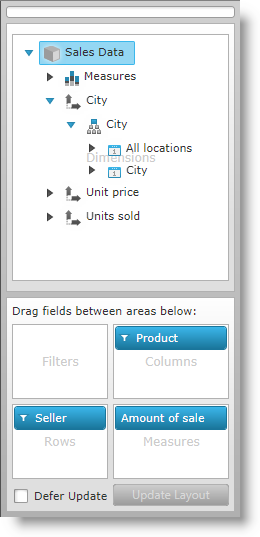
Allows you to specify which items are included in the meta data tree of the data selector.

As of this release, the xamTree™ control is no longer internally used in the xamPivotGrid and it is replaced by the xamDataTree™.

Allows users to quickly select columns, rows, filters and measures.

In xamPivotGrid, the rows, columns, filters or measure areas of the xamPivotGrid or xamPivotDataSelector can be locked and unlocked from editing.

Allows highlighting the row state by selecting the header cell of the row.

The xamSparkline control has several visual elements and corresponding features through which these elements can be configured and customized.

Using Color Tuner you can color tune a control theme.

You can share your custom color tuning configurations.

Excel library now supports accessing built-in styles, parent styles, format options, numerous Microsoft Excel behaviors regarding styles, and possibility for determining resolved cell formats.

This release introduces an updated color object model. Using Excel 2007 Color model you can specify a color, work with Workbook palette and use new Fill property for filing a cells.

The Excel Engine library now supports the ability to access and create named Tables with data from the worksheet. The tables can be sorted, filtered, and aggregated.

Excel Engine supports table filtering.

Excel Engine supports table sorting.

Here an explanation on how to determine the text that would be displayed in a Microsoft Excel cell is provided.

Provides support for undo\redo functionality. The framework is cross-platform and can be used either in WPF or Silverlight applications.

The xamBarcode control allows hiding and showing the human-readable barcode text.

Metro Theme

Metro Theme

This release introduces a new theme – Metro, that can be applied to all controls. This theme is using white, gray and black colors, with cyan as a highlight/accent color. Since this is a theme made especially for touch environment, the controls have larger touch areas for easier use.

Controls using IG theme and Metro theme
Metro Theme 1.png

Figure 1: xamGrid using IG theme

Metro Theme 2.png

Figure 2: xamGrid using Metro theme

Metro Theme 3.png

Figure 3: xamDialogWindow using IG theme

Metro Theme 4.png

Figure 4: xamDialogWindow using Metro theme

Metro Theme 5.png

Figure 5: xamTileManager using IG theme

Metro Theme 6.png

Figure 6: xamTileManager using Metro theme

Metro Theme 7.png

Figure 7: xamInputs using IG theme

Metro Theme 8.png

Figure 8: xamInputs using Metro theme

Metro Theme 9.png

Figure 9: xamOrgChart using IG theme

Metro Theme 10.png

Figure 10: xamOrgChart using Metro theme

Metro Theme 11.png

Figure 11: xamMap using IG theme

Metro Theme 12.png

Figure 12: xamMap using Metro theme

Touch Gesture Support

Touch Gesture Support

Starting from the 12.1 release the Ultimate UI for WPF controls supports touch gestures. The following topic explains the touch gesture support, the usage of the controls in touch environment and the limitations you can face while using the controls.

xamGeographicMap

xamGeographicMap

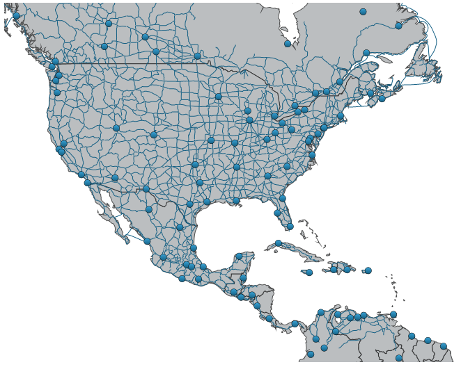
The xamGeographicMap control allows you to display data that contains geographic locations from view models or geospatial data loaded from shape files on geographic imagery maps.
Whats_New_xamGeographicMap_1.png

Figure 1: xamGeographicMap with geographic imagery from Open Street Maps.

Whats_New_xamGeographicMap_2.png

Figure 2: xamGeographicMap with geographic imagery from Map Quest©.

Whats_New_xamGeographicMap_3.png

Figure 3: xamGeographicMap with geographic imagery from Bing™ Maps.

Whats_New_xamGeographicMap_4.png

Figure 4: xamGeographicMap with geographic imagery from CloudMade© Maps.

Whats New xamGeographicMap 5.png

Figure 5: xamGeographicMap with multiple geographic series.

Related Topics:

xamGrid

xamSparkline column

The Sparkline column type allows the display of a Sparkline chart in a grid cell by inserting the xamSparkline™ control.
Sparkline Column 1.png

xamMultiColumnCombo column

The MultiColumnCombo column is column type that displays multiple columns in a drop-down list. It allows users to edit the cell value of the xamGrid control by selecting a value from a pre-populated drop-down list of items.
xamGrid MultiColumnCombo 01.png

DateTimeColumn Column

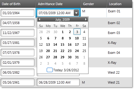
The DateTimeColumn displays dates in the xamGrid control using the xamDateTimeInput™ control. You can determine the format of the date by setting the SelectedDateMask property to a specific mask.
WhatsNew DateTimeColumn.png

Copy and Paste Helper Methods

The copy and paste helper methods provide functionality for:

  • Pasting data in a xamGrid control

  • Verifying a valid rectangular cell selection that can be pasted in an Microsoft Office Excel document or in the xamGrid control

  • Handling errors that may occur while pasting data in the xamGrid control

Support for implicit data templates

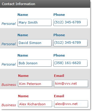
The implicit data templates are applied on a specific data type. Instead of an x:Key property, a DataType property is set to the data template. This feature is introduced in Silverlight 5, it is also available in Windows Presentation Foundation.
WhatsNew ImplicitDataTemplates1.png

Custom Filter Dialog

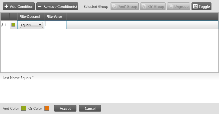
The xamGrid custom filter dialog provides a convenient end-user interface for creating and editing complex filtering logic for a column.
WhatsNew CustomFilterDialog.png

xamDataChart

Displaying Point Series

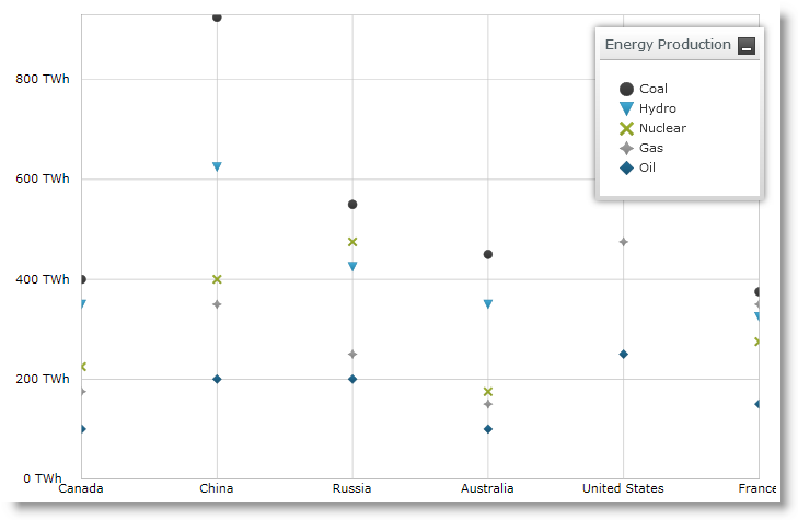
The xamDataChart has introduced another type of series called PointSeries. It intends to display the data points as markers or points using small shaped icons identifying them.

The following is the preview of multiple PointSeries in view with xamDataChart .
WhatsNew Displaying PointSeries 01.png

Overview Plus Detail Pane

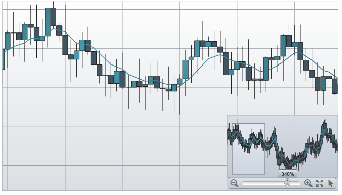
The xamDataChart has introduced an overview of chart content is represented by the xamOverviewPlusDetailPane control. This control provides preview of all types of supported series as well as navigation functionalities.

The following is the preview of the FinancialPriceSeries in the Overview pane in the xamDataChart .
Whats New xamDataChart OPD.png

xamPieChart

Visualizing OLAP Data

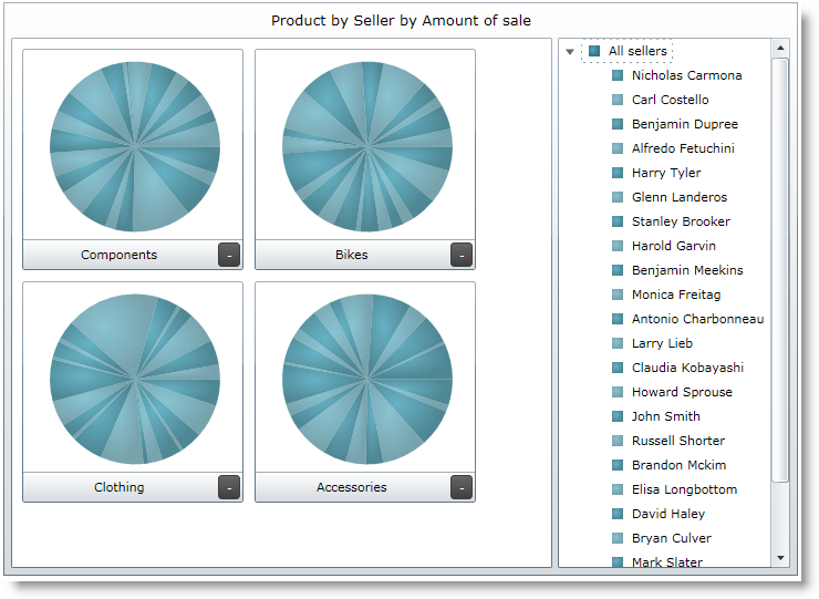
The recent enhancement that is introduced in xamPieChart is the new axis type called OlapAxis, which helps visualizing the OLAP data with PieChart.
WhatsNew VisualizingOlapData 01.png

xamPivotGrid

Advanced Filtering

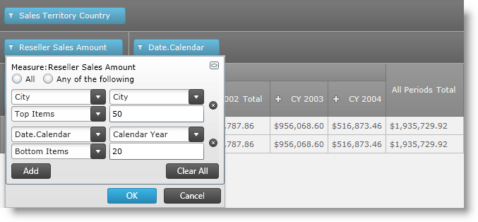
The advanced filtering feature allows filtering the xamPivotGrid values and includes filters for top and bottom value filtering for sum, count, or percent.
xamPivotGrid Advanced Filtering.png

Calculated measures

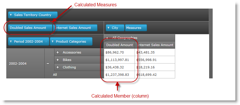
This feature offers a way to create measures with some expression of calculation, and represent it with a separate column, known as a Calculated Member, which represent the result of the defined measures in calculation.
WhatsNew Calculated Measures 01.png

Customizing cell and header templates

The xamPivotGrid™ control provides the ability to specify custom DataTemplates for data and header cells. You can specify different templates for different cells based on what hierarchy, level, etc. the cell is in.
xamPivotGrid Custom Cell Templates.png

Dynamic Metadata Tree

When you assign a data source to the xamPivotDataSelector™ it will automatically add all items (Measures, Dimensions, Hierarchies, etc.) in the data source to the metadata tree. The Dynamic Metadata Tree feature enables you to specify exactly which items are included and whether they should be expanded by default.
xamPivotGrid Dynamic MetaData Tree.png

Enhanced performance of the xamPivotGrid

As of this release instead of xamTree, the xamDataTree control is used in filter drop-downs and in the data selector’s metadata tree. Because the xamDataTree uses virtualization for displaying its items, this greatly enhances performance and the user experience of the xamPivotGrid. An additional benefit is that it becomes simpler to restyle the data selector.

Note
Note:

You will need to replace the reference to the xamTree assembly in your project with a reference to xamDataTree.