Version

Configuring the Toolbox (xamDiagram)

Topic Overview

Purpose

This topic explains how to configure and use the xamDiagram™ diagram toolbox.

Required background

The following topics are prerequisites to understanding this topic:

Topic Purpose

This topic provides a conceptual overview of the xamDiagram control and its main features and capabilities.

This topic explains how to add the xamDiagram control to a WPF application.

Introduction

Toolbox configuration summary

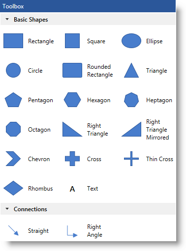
The xamDiagram control provides functionality, which allows for dragging and dropping diagram items from a predefined set of shapes, directly on the diagram surface. This functionality is represented by the xamDiagramToolbox control. By default, it has two pre-configured shape categories: Basic Shapes and Connections which contain all currently supported diagram node types, including a node representing a label, and the two types of diagram connections.

xamDiagram Configuring the Toolbox 1.png

The shape categories of the diagram toolbox can be overridden or extended. The default size dimensions of the shapes displayed in the toolbox is 30, 30 (width in pixels, height in pixels) or 30, 40 depending on the type of the shape.

The toolbox exposes two events – CategoryAdding and CategoryAdded which can be used to implement application-related logic.

Toolbox configuration summary chart

The following table explains briefly the configurable aspects of the diagram toolbox and maps them to the properties that configure them.

Configurable aspect Details Properties / Events

Header

The heading appears above the categories in the toolbox and is configurable in visual terms such as visibility, background, foreground or entirely overridden using the Header property.

Toolbox Categories

The categories in which the diagram item shapes appear. They can be overridden or extended.

Filtering the set of predefined shapes in the toolbox

By handling the CategoryAdding event, you can cancel the adding operation or filter the shapes to display in the pre-configured or custom created categories.

Modify an already created category

Modification of a category, such as collapsing its view for ex., can be done after it has been created by handling the CategoryAdded event.

Extending Toolbox Categories

Overview

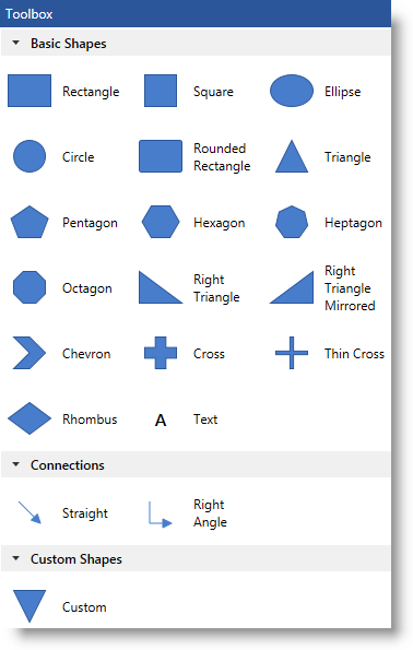
In order to add a new category to the diagram toolbox, you should create one and add it to the CustomCategories collection of xamDiagramToolbox . The new category should be populated with items by adding instances of the DiagramToolboxItem class. These items must have their size dimensions explicitly configured in order to appear properly in the toolbox. The following example demonstrates extending the existing set of toolbox shapes by adding a new category containing a reversed triangle shape.

Note
Note:

If you want to override the existing categories collection of the xamDiagramToolbox control, you should create a new DiagramToolboxCategoryCollection instance and assign it to the Categories property of the toolbox.

Property settings

The following table maps the desired configuration to the property settings that manage it.

In order to: Use this property: And set it to:

Configure a new category to be added to the toolbox

An instance of the DiagramToolboxCategoryCollection class.

Example

The screenshot below demonstrates options pane visibility configuration as a result of the following settings:

Property Value

In XAML:

<ig:DiagramToolboxCategory Name="Custom Shapes"
                           IsExpanded="True">
    <ig:DiagramToolboxCategory.Items>
        <ig:DiagramToolboxItem Title="Custom">
            <ig:DiagramToolboxItem.Item>
                <ig:DiagramNode Width="30" Height="30">

                    <ig:DiagramNode.ConnectionPoints>
                        <ig:DiagramConnectionPointCollection>
                            <ig:DiagramConnectionPoint
                                Name="Point" Position="0.5,0.5" />
                        </ig:DiagramConnectionPointCollection>
                    </ig:DiagramNode.ConnectionPoints>

                    <ig:DiagramNode.Geometry>
                        <PathGeometry>
                            <PathGeometry.Figures>
                                <PathFigure
                                    IsClosed="True" StartPoint="0,0">
                                    <PathFigure.Segments>
                                        <PathSegmentCollection>
                                            <LineSegment Point="100,0" />
                                            <LineSegment Point="50,100" />
                                        </PathSegmentCollection>
                                    </PathFigure.Segments>
                                </PathFigure>
                            </PathGeometry.Figures>
                        </PathGeometry>
                    </ig:DiagramNode.Geometry>

                </ig:DiagramNode>
            </ig:DiagramToolboxItem.Item>
        </ig:DiagramToolboxItem>
    </ig:DiagramToolboxCategory.Items>
</ig:DiagramToolboxCategory>
xamDiagram Configuring the Toolbox 2.png

Following is the code that implements this example.

In XAML:

<ig:XamDiagramToolbox x:Name="Toolbox">
    <ig:XamDiagramToolbox.CustomCategories>
        <ig:DiagramToolboxCategory Name="Custom Shapes"
                                   IsExpanded="True">
            <ig:DiagramToolboxCategory.Items>
                <ig:DiagramToolboxItem Title="Custom">
                    <ig:DiagramToolboxItem.Item>
                        <ig:DiagramNode Width="30" Height="30">
                            <ig:DiagramNode.ConnectionPoints>
                                <ig:DiagramConnectionPointCollection>
                                    <ig:DiagramConnectionPoint Name="Point" Position="0.5,0.5" />
                                        </ig:DiagramConnectionPointCollection>
                                    </ig:DiagramNode.ConnectionPoints>
                                    <ig:DiagramNode.Geometry>
                                        <PathGeometry>
                                            <PathGeometry.Figures>
                                                <PathFigure IsClosed="True" StartPoint="0,0">
                                                    <PathFigure.Segments>
                                                        <PathSegmentCollection>
                                                            <LineSegment Point="100,0" />
                                                            <LineSegment Point="50,100" />
                                                        </PathSegmentCollection>
                                                    </PathFigure.Segments>
                                                </PathFigure>
                                            </PathGeometry.Figures>
                                        </PathGeometry>
                                    </ig:DiagramNode.Geometry>
                                </ig:DiagramNode>
                            </ig:DiagramToolboxItem.Item>
                        </ig:DiagramToolboxItem>
                    </ig:DiagramToolboxCategory.Items>
            </ig:DiagramToolboxCategory>
      </ig:XamDiagramToolbox.CustomCategories>
</ig:XamDiagramToolbox>

Related Topics

The following topic provides additional information related to this topic.

Topic Purpose

This topic provides a summary of all user interaction tasks in the xamDiagram control.