funnel.AllowSliceSelection = true;The purpose of this topic is to demonstrate how to configure and use the various key features and functionalities of the XamFunnelChart™ control.
This section contains important conceptual and task-based information that will help you identify the features and show the usage with examples.
You need to first read the following topic:
The table below lists the configurable elements and behaviors of the XamFunnelChart control.
The table below maps the desired configurations/behaviors to the corresponding property settings.
In order to enable slice selection the AllowSliceSelection property must be set to true.
In C#:
funnel.AllowSliceSelection = true;In XAML:
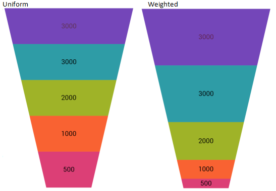
<ig:XamFunnelChart AllowSliceSelection="True"/>The XamFunnelChart control exposes two display format types:
Uniform where all slices have the same height (default).
Weighted where the heights of the slices are based on the calculated percentage value of the underlying data.
In C#:
funnel.FunnelSliceDisplay = FunnelSliceDisplay.Uniform;In XAML:
<ig:XamFunnelChart FunnelSliceDisplay="Uniform" />
Figure 1: FunnelChart Display format
The table below maps the desired configurations/behaviors to the corresponding property settings.
In order to invert the slices on the control the IsInverted property must be set to true (default is false) Inverting the slices can also be triggered by a button click.
In C#:
funnel.IsInverted = true;In XAML:
<ig:XamFunnelChart IsInverted="True"/>The table below maps the desired configurations/behaviors to the corresponding property settings.
Displaying the labels is involved with setting the visibility first, and then specifying the path with the appropriate target.
In C#:
funnel.InnerLabelVisibility = Infragistics.Core.Visibility.Visible;
funnel.OuterLabelVisibility = Infragistics.Core.Visibility.Visible;
funnel.InnerLabelMemberPath = "Value";
funnel.OuterLabelMemberPath = "Label";
In XAML:
<ig:XamFunnelChart
     InnerLabelVisibility="Visible"
     OuterLabelVisibility="Visible"
     InnerLabelMemberPath="Value"
OuterLabelMemberPath="Label"/>The table below maps the desired configurations/behaviors to the corresponding property settings.
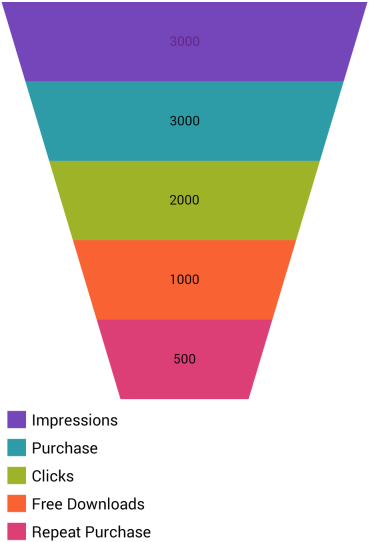
Displaying the legend requires you to create an instance of ItemLegend and then set the Legend property of the funnel chart control to the element name of the ItemLegend instance.
In XAML:
<Grid>
    <Grid.RowDefinitions>
        <RowDefinition Height="*"/>
        <RowDefinition Height="Auto"/>
    </Grid.RowDefinitions>

    <ig:ItemLegend x:Name="Legend" Grid.Row="1"
                    VerticalOptions="CenterAndExpand"
                    HorizontalOptions="StartAndExpand" />
    <ig:XamFunnelChart x:Name="funnel" Grid.Row="0"
                       ItemsSource="{Binding}"
                       ValueMemberPath="Value"
                       UseOuterLabelsForLegend="True"
                       InnerLabelMemberPath="Value"
                       OuterLabelMemberPath="Label"
                       OuterLabelVisibility="Collapsed"
                       Legend="{x:Reference Legend}">
        </ig:XamFunnelChart>
    </Grid>
Figure 2: FunnelChart Legend
The table below maps the desired configurations/behaviors to the corresponding property settings.
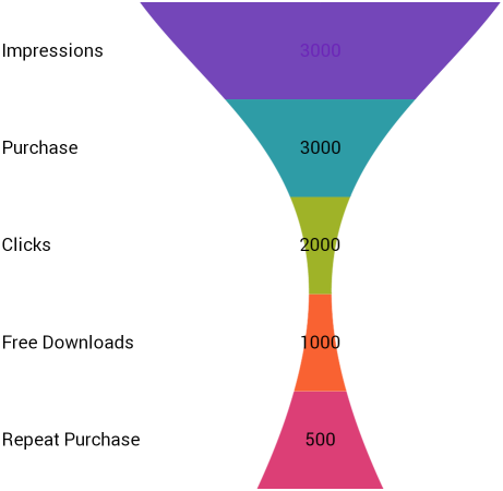
The idea of using the Bezier curve is to give smooth-line appearance to the funnel chart control. The XamFunnelChart exposes two properties of type Point for Bezier curve settings. When the control is set up to use the Bezier curve, the lines on both sides of the funnel will use the control points to move towards the control points forming the curves. For more information see Bezier Curve.
UpperBezierControlPoint and LoweBezierControlPoint properties take X/Y coordinates as the control points in the Bezier curve. The following code example shows the property settings and the result is in the accompanying screenshot.
In XAML:
<ig:XamFunnelChart
     UseBezierCurve="True"
     UpperBezierControlPoint="0.25, 0.25"
     LowerBezierControlPoint="0.7, 0.4" />
Figure 3: FunnelChart using Bezier curve
Data Binding demonstrates how to bind to the funnel Chart.
API Overview contains the list of namespaces and several key classes to know while programming with the control.