Angular Chip Component Overview
The Angular Chip component is a visual element that displays information in an oval container. The component has various properties - it can be templated, deleted, and selected. Multiple chips can be reordered and visually connected to each other, using the chip area as a container.
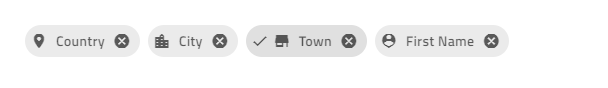
Angular Chip Example
Getting Started with Ignite UI for Angular Chip
To get started with the Ignite UI for Angular Chip component, first you need to install Ignite UI for Angular. In an existing Angular application, type the following command:
ng add igniteui-angular
For a complete introduction to the Ignite UI for Angular, read the getting started topic.
The next step is to import the IgxChipsModule in the app.module.ts file:
// app.module.ts

import { IgxChipsModule } from 'igniteui-angular/chips';
// import { IgxChipsModule } from '@infragistics/igniteui-angular'; for licensed package

@NgModule({
    ...
    imports: [..., IgxChipsModule],
    ...
})
export class AppModule {}
Alternatively, as of 16.0.0 you can import the IgxChipComponent as a standalone dependency, or use the IGX_CHIPS_DIRECTIVES token to import the component and all of its supporting components and directives.
// home.component.ts

import { IGX_CHIPS_DIRECTIVES } from 'igniteui-angular/chips';
import { NgFor } from '@angular/common';
// import { IGX_CHIPS_DIRECTIVES } from '@infragistics/igniteui-angular'; for licensed package

@Component({
  selector: 'app-home',
  template: `
    <igx-chip *ngFor="let chip of chipList" [id]="chip.id">
      {{ chip.text }}
    </igx-chip>
  `,
  styleUrls: ['home.component.scss'],
  standalone: true,
  imports: [IGX_CHIPS_DIRECTIVES, NgFor],
})
export class HomeComponent {
  public chipList = [
    { text: 'Country', id: '1', icon: 'place' },
    { text: 'City', id: '2', icon: 'location_city' },
    { text: 'Address', id: '3', icon: 'home' },
    { text: 'Street', id: '4', icon: 'streetview' },
  ];
}
Now that you have the Ignite UI for Angular Chips module or directives imported, you can start using the igx-chip component.
Using the Angular Chip Component
The IgxChipComponent has an id input property so that the different chip instances can be easily distinguished. If an id is not provided, it will be automatically generated.
<igx-chip *ngFor="let chip of chipList" [id]="chip.id">
  {{chip.text}}
</igx-chip>
Selection
Selection can be enabled by setting the selectable input property to true. When selecting a chip, the selectedChanging event is fired. It provides the new selected value so you can get the new state and the original event in originalEvent that triggered the selection change. If this is not done through user interaction but instead is done by setting the selected property programmatically, the originalEvent argument has a value of null.
<igx-chip *ngFor="let chip of chipList" [selectable]="true">
  <igx-icon igxPrefix>{{chip.icon}}</igx-icon>
  {{chip.text}}
</igx-chip>
Note
This component uses Material Icons. Add the following link to your index.html: <link href="https://fonts.googleapis.com/icon?family=Material+Icons" rel="stylesheet">
Removing

Removing can be enabled by setting the removable input to true. When enabled, a remove button is rendered at the end of the chip. When removing a chip, the remove event is emitted.
By default, the chip doesn't get automatically removed from the DOM tree upon clicking on the remove icon. Removal needs to be handled manually.
<igx-chip *ngFor="let chip of chipList" [id]="chip.id" [removable]="true" (remove)="chipRemoved($event)">
  <igx-icon igxPrefix>{{chip.icon}}</igx-icon>
  {{chip.text}}
</igx-chip>
public chipRemoved(event: IBaseChipEventArgs) {
    this.chipList = this.chipList.filter((item) => {
        return item.id !== event.owner.id;
    });
    this.changeDetectionRef.detectChanges();
}
Dragging
Dragging can be enabled by setting the draggable input to true. When enabled, you can click and drag the chip around.
<igx-chip *ngFor="let chip of chipList" [id]="chip.id" [draggable]="true">
  <igx-icon igxPrefix>{{chip.icon}}</igx-icon>
  {{chip.text}}
</igx-chip>
Note
To reorder the chips you need to handle the event using the IgxChipsAreaComponent.
To create the demo sample, we will use the features above:
<igx-chip *ngFor="let chip of chipList" [id]="chip.id" [selectable]="true" [removable]="true" (remove)="chipRemoved($event)">
  <igx-icon igxPrefix>{{chip.icon}}</igx-icon>
   {{chip.text}}
</igx-chip>
Then, we need to add the chipList and the function, that handles the remove event:
import { IBaseChipEventArgs } from 'igniteui-angular/chips';
// import { IBaseChipEventArgs } from '@infragistics/igniteui-angular'; for licensed package
...
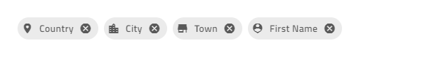
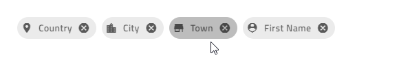
public chipList = [
{
text: 'Country',
id: '1',
icon: 'place'
},
{
text: 'City',
id: '2',
icon: 'location_city'
},
{
text: 'Town',
id: '3',
icon: 'store'
},
{
text: 'First Name',
id: '4',
icon: 'person_pin'
}
];
private changeDetectionRef: any;
public chipRemoved(event: IBaseChipEventArgs) {
this.chipList = this.chipList.filter((item) => {
return item.id !== event.owner.id;
});
this.changeDetectionRef.detectChanges();
}
If everything went well, you should see this in your browser:
Chip Templates
All of the IgxChipComponent's elements are templatable.
You can template the prefix and the suffix of the chip, using the IgxPrefix and the IgxSuffix directives:

<igx-chip>
  <igx-icon igxPrefix>insert_emoticon</igx-icon>
  <igx-icon igxSuffix style="transform: rotate(180deg)">insert_emoticon</igx-icon>
  <span>Why not both?</span>
</igx-chip>
You can customize the size of the chip, using the [--ig-size] CSS variable. By default it is set to var(--ig-size-large). It can also be set to var(--ig-size-medium) or var(--ig-size-small), while everything inside the chip retains its relative positioning:
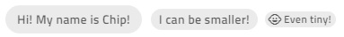
<igx-chip>Hi! My name is Chip!</igx-chip>

<igx-chip style="--ig-size: var(--ig-size-medium)">
  I can be smaller!
</igx-chip>

<igx-chip style="--ig-size: var(--ig-size-small)">
  <igx-icon igxPrefix>child_care</igx-icon>
  Even tiny!
</igx-chip>
You can customize the select icon, using the selectIcon input. It accepts values of type TemplateRef and overrides the default icon while retaining the same functionality.
<igx-chip *ngFor="let chip of chipList" [selectable]="true" [selectIcon]="mySelectIcon">
  <igx-icon igxPrefix>{{chip.icon}}</igx-icon>
  {{chip.text}}
</igx-chip>

<ng-template #mySelectIcon>
  <igx-icon>check_circle</igx-icon>
</ng-template>
You can customize the remove icon, using the removeIcon input. It takes a value of type TemplateRef and renders it instead of the default remove icon.
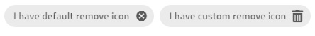
<igx-chip *ngFor="let chip of chipList" [removable]="true" [removeIcon]="myRemoveIcon">
  <igx-icon igxPrefix>{{chip.icon}}</igx-icon>
  {{chip.text}}
</igx-chip>

<ng-template #myRemoveIcon>
  <igx-icon>delete</igx-icon>
</ng-template>
Demo
To create the demo sample below, we will use the features above:
<igx-chip
*ngFor="let chip of chipList"
[id]="chip.id"
[selectable]="true"
[removable]="true"
(remove)="chipRemoved($event)"
>
    <igx-icon igxPrefix>{{chip.icon}}</igx-icon>
    {{chip.text}}
</igx-chip>
Then, we need to add the chipList and the function, that handles the remove event:
import { IBaseChipEventArgs } from 'igniteui-angular/chips';
// import { IBaseChipEventArgs } from '@infragistics/igniteui-angular'; for licensed package
...
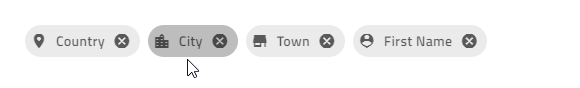
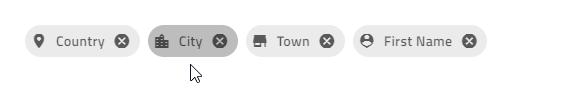
public chipList = [
{
text: 'Country',
id: '1',
icon: 'place'
},
{
text: 'City',
id: '2',
icon: 'location_city'
},
{
text: 'Town',
id: '3',
icon: 'store'
},
{
text: 'First Name',
id: '4',
icon: 'person_pin'
}
];
private changeDetectionRef: any;
public chipRemoved(event: IBaseChipEventArgs) {
this.chipList = this.chipList.filter((item) => {
return item.id !== event.owner.id;
});
this.changeDetectionRef.detectChanges();
}
If everything went well, you should see this in your browser:
Chip Area
The IgxChipsAreaComponent is used when handling more complex scenarios that require interaction between chips (dragging, selection, navigation, etc.).
Reorder Chips

The chip can be dragged by the end-user in order to change its position. The dragging is disabled by default but can be enabled using the draggable input property. You need to handle the actual chip reordering manually. This is where the chip area comes in handy since it provides the reorder event that returns the new order when a chip is dragged over another chip.
<igx-chips-area (reorder)="chipsOrderChanged($event)">
  <igx-chip *ngFor="let chip of chipList" [draggable]="'true'">
    <igx-icon igxPrefix>{{chip.icon}}</igx-icon>
    {{chip.text}}
  </igx-chip>
</igx-chips-area>
public chipsOrderChanged(event: IChipsAreaReorderEventArgs) {
    const newChipList = [];
    for (const chip of event.chipsArray) {
        const chipItem = this.chipList.filter((item) => {
            return item.id === chip.id;
        })[0];
        newChipList.push(chipItem);
    }
    this.chipList = newChipList;
}
Keyboard Navigation
The chip can be focused using the Tab key or by clicking on it. When the chips are in a chip area, they can be reordered using keyboard navigation:
Keyboard controls when the chip is focused:
LEFT - Moves the focus to the chip on the left.
RIGHT - Moves the focus to the chip on the right.
SPACE - Toggles chip selection if it is selectable.
DELETE - Triggers the
removeevent for theigxChipso the chip deletion can be handled manually.SHIFT + LEFT - Triggers
reorderevent for theigxChipAreawhen the currently focused chip should move position to the left.SHIFT + RIGHT - Triggers
reorderevent for theigxChipAreawhen the currently focused chip should move one position to the right.
Keyboard controls when the remove button is focused:
- SPACE or ENTER Fires the
removeoutput so the chip deletion can be handled manually.
- SPACE or ENTER Fires the
Here's an example of the chip area using IgxAvatar as prefix and custom icons for all chips:
<igx-chips-area (reorder)="chipsOrderChanged($event)">
  <igx-chip
    *ngFor="let chip of chipList"
    [id]="chip.id"
    [selectable]="true"
    [selectIcon]="mySelectIcon"
    [removable]="true"
    [removeIcon]="myRemoveIcon"
    (remove)="chipRemoved($event)"
    [draggable]="'true'">
    <igx-avatar
      class="chip-avatar-resized"
      igxPrefix
      [src]="chip.photo"
      shape="circle">
    </igx-avatar>
    {{chip.name}}
  </igx-chip>
</igx-chips-area>

<ng-template #mySelectIcon>
  <igx-icon>check_circle</igx-icon>
</ng-template>

<ng-template #myRemoveIcon>
  <igx-icon>delete</igx-icon>
</ng-template>
Resize the avatar to fit the chip:
.chip-avatar-resized {
  width: 2em;
  height: 2em;
  min-width: 2em;
}
Add the chipList and the functions that handle the events:
import { IBaseChipEventArgs, IChipsAreaReorderEventArgs } from 'igniteui-angular/chips';
// import { IBaseChipEventArgs, IChipsAreaReorderEventArgs } from '@infragistics/igniteui-angular'; for licensed package

...
public chipList = [
    {
        id: '770-504-2217',
        name: 'Terrance Orta',
        photo: 'https://ko.infragistics.com/angular-demos/assets/images/men/27.jpg'
    },
    {
        id: '423-676-2869',
        name: 'Richard Mahoney',
        photo: 'https://ko.infragistics.com/angular-demos/assets/images/men/13.jpg'
    },
    {
        id: '859-496-2817',
        name: 'Donna Price',
        photo: 'https://ko.infragistics.com/angular-demos/assets/images/women/50.jpg'
    }
];

private changeDetectionRef: any;

public chipRemoved(event: IBaseChipEventArgs) {
    this.chipList = this.chipList.filter((item) => {
        return item.id !== event.owner.id;
    });
    this.changeDetectionRef.detectChanges();
}

public chipsOrderChanged(event: IChipsAreaReorderEventArgs) {
    const newChipList = [];
    for (const chip of event.chipsArray) {
        const chipItem = this.chipList.filter((item) => {
            return item.id === chip.id;
        })[0];
        newChipList.push(chipItem);
    }
    this.chipList = newChipList;
}
If everything's set up correctly, you should see this in your browser:
Demo
Styling
Chip Theme Property Map
When you modify a primary property, all related dependent properties are updated automatically:
| Primary Property | Dependent Property | Description |
|---|---|---|
$background |
$text-color | The chip text color. |
| $border-color | The chip border color. | |
| $hover-background | The chip hover background color. | |
| $hover-border-color | The chip hover border color. | |
| $hover-text-color | The chip hover text color. | |
| $focus-background | The chip focus background color. | |
| $selected-background | The chip selected background color. | |
$focus-background |
$focus-text-color | The chip text focus color. |
| $focus-border-color | The chip focus border color. | |
| $focus-outline-color (bootstrap & indigo variants only) | The chip focus outline color. | |
$selected-background |
$selected-text-color | The selected chip text color. |
| $selected-border-color | The selected chip border color. | |
| $hover-selected-background | The selected chip hover background color. | |
$hover-selected-background |
$hover-selected-text-color | The selected chip hover text color. |
| $hover-selected-border-color | The selected chip hover border color. | |
| $focus-selected-background | The selected chip focus background color. | |
$focus-selected-background |
$focus-selected-text-color | The selected chip text focus color. |
| $focus-selected-border-color | The selected chip focus border color. | |
| $focus-selected-outline-color (bootstrap & indigo variants only) | The chip focus outline color in selected state. |
To get started with styling the chip, we need to import the index file, where all the theme functions and component mixins live:
@use "igniteui-angular/theming" as *;

// IMPORTANT: Prior to Ignite UI for Angular version 13 use:
// @import '~igniteui-angular/lib/core/styles/themes/index';
Following the simplest approach, we create a new theme that extends the chip-theme and accepts some parameters that style the chip's items. By specifying the $background or the $selected-background, the theme automatically calculates appropriate state colors and contrast foregrounds. You can still override any other parameter with custom values as needed.
$custom-chip-theme: chip-theme(
    $background: #57a5cd,
    $selected-background: #ecaa53,
    $remove-icon-color: #d81414,
    $border-radius: 5px,
);
Finally, include the custom theme in your application:
:host {
  @include tokens($custom-chip-theme);
}
In the sample below, you can see how using the chip component with customized CSS variables allows you to create a design that visually resembles the chip used in the Ant design system.
Styling with Tailwind
You can style the chip using our custom Tailwind utility classes. Make sure to set up Tailwind first.
Along with the tailwind import in your global stylesheet, you can apply the desired theme utilities as follows:
@import "tailwindcss";
...
@use 'igniteui-theming/tailwind/utilities/material.css';
The utility file includes both light and dark theme variants.
- Use
light-*classes for the light theme. - Use
dark-*classes for the dark theme. - Append the component name after the prefix, e.g.,
light-chip,dark-chip.
Once applied, these classes enable dynamic theme calculations. From there, you can override the generated CSS variables using arbitrary properties. After the colon, provide any valid CSS color format (HEX, CSS variable, RGB, etc.).
You can find the full list of properties in the chip-theme. The syntax is as follows:
<igx-chip
  class="!light-chip
  ![--background:#99BAA6]
  ![--remove-icon-color:#C92828]"
  ...
>
  {{chip.text}}
</igx-chip>
Note
The exclamation mark(!) is required to ensure the utility class takes precedence. Tailwind applies styles in layers, and without marking these styles as important, they will get overridden by the component’s default theme.
At the end your chips should look like this:
Custom sizing
You can either use the --size variable, targeting the igx-chip directly:
igx-chip {
  --size: 50px;
}
Or you can use the universal --ig-chip-size variable to target all instances:
<div class="my-app">
  <igx-chip></igx-chip>
</div>
.my-app {
  --ig-chip-size: 50px;
}
You can also use one of the predefined sizes, assigning it to the --ig-size variable. The available values for --ig-size are --ig-size-small, --ig-size-medium, and --ig-size-large:
igx-chip {
  --ig-size: var(--ig-size-small);
}
Learn more about it in the Size article.
API
Theming Dependencies
References
Our community is active and always welcoming to new ideas. GitHub