Angular 칩 구성 요소 개요
The Angular Chip component타원형 컨테이너 안에 정보를 표시하는 시각적 요소입니다. 컴포넌트는 다양한 속성을 가지고 있는데, 템플릿 제작, 삭제, 선택 등이 가능합니다. 여러 칩을 재정렬하여 서로 시각적으로 연결할 수 있으며, 칩 영역을 컨테이너로 활용합니다.
Angular Chip Example
Getting Started with Ignite UI for Angular Chip
Ignite UI for Angular Chip 구성 요소를 시작하려면 먼저 Ignite UI for Angular 설치해야 합니다. 기존 Angular 애플리케이션에서 다음 명령을 입력합니다.
ng add igniteui-angular
Ignite UI for Angular에 대한 전체 소개는 시작 항목을 참조하십시오.
다음 단계는 app.module.ts 파일에서 IgxChipsModule을 가져오는 것입니다.
// app.module.ts

import { IgxChipsModule } from 'igniteui-angular/chips';
// import { IgxChipsModule } from '@infragistics/igniteui-angular'; for licensed package

@NgModule({
    ...
    imports: [..., IgxChipsModule],
    ...
})
export class AppModule {}
또는16.0.0 독립 실행형 의존성으로 가져오IgxChipComponent 거나, 토큰을IGX_CHIPS_DIRECTIVES 사용해 컴포넌트와 그 지원 컴포넌트, 명령어를 가져올 수도 있습니다.
// home.component.ts

import { IGX_CHIPS_DIRECTIVES } from 'igniteui-angular/chips';
import { NgFor } from '@angular/common';
// import { IGX_CHIPS_DIRECTIVES } from '@infragistics/igniteui-angular'; for licensed package

@Component({
  selector: 'app-home',
  template: `
    <igx-chip *ngFor="let chip of chipList" [id]="chip.id">
      {{ chip.text }}
    </igx-chip>
  `,
  styleUrls: ['home.component.scss'],
  standalone: true,
  imports: [IGX_CHIPS_DIRECTIVES, NgFor],
})
export class HomeComponent {
  public chipList = [
    { text: 'Country', id: '1', icon: 'place' },
    { text: 'City', id: '2', icon: 'location_city' },
    { text: 'Address', id: '3', icon: 'home' },
    { text: 'Street', id: '4', icon: 'streetview' },
  ];
}
이제 Ignite UI for Angular 칩스 모듈이나 디렉티브를 가져왔으니, 컴포넌트igx-chip 사용을 시작할 수 있습니다.
Using the Angular Chip Component
는IgxChipComponent 입력 속성을 가지고id 있어 서로 다른 칩 인스턴스를 쉽게 구분할 수 있습니다. 만약 aid가 제공되지 않으면 자동으로 생성됩니다.
<igx-chip *ngFor="let chip of chipList" [id]="chip.id">
  {{chip.text}}
</igx-chip>
선택
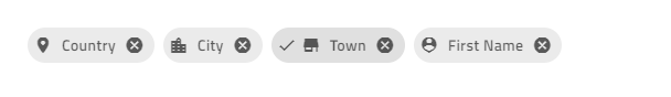
선택은 다음 설정을 통해 활성화할 수 있습니다.selectable 입력 속성은true. 칩을 선택할 때,selectedChanging 이벤트가 해고됩니다. 새로운 것을 제공합니다selected 값으로 새 상태와 원래 이벤트를 입력할 수 있습니다.originalEvent 그것이 선택 변경을 촉발시켰습니다. 만약 이것이 사용자 상호작용을 통해서가 아니라selected 프로그래밍적으로 다음과 같은 속성은originalEvent 인항의 값은null.
<igx-chip *ngFor="let chip of chipList" [selectable]="true">
  <igx-icon igxPrefix>{{chip.icon}}</igx-icon>
  {{chip.text}}
</igx-chip>
Removing

제거는 입력을removable 설정하여 활성화true 할 수 있습니다. 활성화되면 칩 끝에 제거 버튼이 렌더링됩니다. 칩을 제거할 때 이remove 이벤트가 발생한다.
기본적으로 제거 아이콘을 클릭해도 칩은 DOM 트리에서 자동으로 제거되지 않습니다. 제거는 수동으로 처리해야 합니다.
<igx-chip *ngFor="let chip of chipList" [id]="chip.id" [removable]="true" (remove)="chipRemoved($event)">
  <igx-icon igxPrefix>{{chip.icon}}</igx-icon>
  {{chip.text}}
</igx-chip>
public chipRemoved(event: IBaseChipEventArgs) {
    this.chipList = this.chipList.filter((item) => {
        return item.id !== event.owner.id;
    });
    this.changeDetectionRef.detectChanges();
}
질질 끄는
드래그는 입력을draggable로true 설정하면 활성화할 수 있습니다. 활성화되면 칩을 클릭하고 드래그할 수 있습니다.
<igx-chip *ngFor="let chip of chipList" [id]="chip.id" [draggable]="true">
  <igx-icon igxPrefix>{{chip.icon}}</igx-icon>
  {{chip.text}}
</igx-chip>
Note
칩을 재주문하려면 이벤트를 처리해야 합니다.IgxChipsAreaComponent
데모 샘플을 만들기 위해 위의 기능을 사용합니다.
<igx-chip *ngFor="let chip of chipList" [id]="chip.id" [selectable]="true" [removable]="true" (remove)="chipRemoved($event)">
  <igx-icon igxPrefix>{{chip.icon}}</igx-icon>
   {{chip.text}}
</igx-chip>
그다음, 다음을 추가해야 합니다.chipList 그리고 다음을 처리하는 함수remove 사건:
import { IBaseChipEventArgs } from 'igniteui-angular/chips';
// import { IBaseChipEventArgs } from '@infragistics/igniteui-angular'; for licensed package
...
public chipList = [
    {
        text: 'Country',
        id: '1',
        icon: 'place'
    },
    {
        text: 'City',
        id: '2',
        icon: 'location_city'
    },
    {
        text: 'Town',
        id: '3',
        icon: 'store'
    },
    {
        text: 'First Name',
        id: '4',
        icon: 'person_pin'
    }
];

private changeDetectionRef: any;

public chipRemoved(event: IBaseChipEventArgs) {
    this.chipList = this.chipList.filter((item) => {
        return item.id !== event.owner.id;
    });
    this.changeDetectionRef.detectChanges();
}
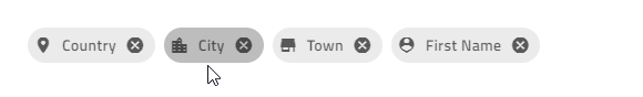
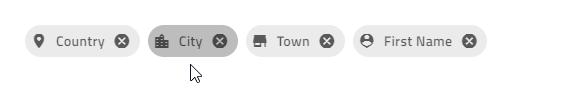
모든 것이 제대로 진행되었다면 브라우저에 다음과 같은 내용이 표시됩니다.
Chip Templates
모든IgxChipComponent 원소는 템플라타 가능합니다.
칩의 와prefix를suffix 템플릿으로 만들 수 있습니다. 와 명령어를 사용IgxPrefixIgxSuffix 하세요:

<igx-chip>
  <igx-icon igxPrefix>insert_emoticon</igx-icon>
  <igx-icon igxSuffix style="transform: rotate(180deg)">insert_emoticon</igx-icon>
  <span>Why not both?</span>
</igx-chip>
[] CSS 변수를 사용--ig-size 해 칩 크기를 맞춤 설정할 수 있습니다. 기본값은 다음과 같습니다.var(--ig-size-large) 또는 로 설정할var(--ig-size-medium)var(--ig-size-small) 수도 있지만, 칩 내부의 모든 것은 상대적 위치를 유지합니다:
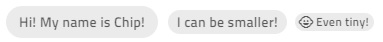
<igx-chip>Hi! My name is Chip!</igx-chip>

<igx-chip style="--ig-size: var(--ig-size-medium)">
  I can be smaller!
</igx-chip>

<igx-chip style="--ig-size: var(--ig-size-small)">
  <igx-icon igxPrefix>child_care</igx-icon>
  Even tiny!
</igx-chip>
커스터마이징할 수 있습니다.select icon, 를 사용하여selectIcon 입력. 이 도구는 타입의 값을 받아들입니다TemplateRef 기본 아이콘을 덮어쓰면서도 기능은 동일하게 유지합니다.
<igx-chip *ngFor="let chip of chipList" [selectable]="true" [selectIcon]="mySelectIcon">
  <igx-icon igxPrefix>{{chip.icon}}</igx-icon>
  {{chip.text}}
</igx-chip>

<ng-template #mySelectIcon>
  <igx-icon>check_circle</igx-icon>
</ng-template>
커스터마이징할 수 있습니다.remove icon, 를 사용하여removeIcon 입력. 타입 값을 가져갑니다TemplateRef 그리고 기본 제거 아이콘 대신 렌더링합니다.
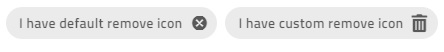
<igx-chip *ngFor="let chip of chipList" [removable]="true" [removeIcon]="myRemoveIcon">
  <igx-icon igxPrefix>{{chip.icon}}</igx-icon>
  {{chip.text}}
</igx-chip>

<ng-template #myRemoveIcon>
  <igx-icon>delete</igx-icon>
</ng-template>
Demo
아래 데모 샘플을 만들려면 위의 기능을 사용합니다.
<igx-chip
*ngFor="let chip of chipList"
[id]="chip.id"
[selectable]="true"
[removable]="true"
(remove)="chipRemoved($event)"
>
    <igx-icon igxPrefix>{{chip.icon}}</igx-icon>
    {{chip.text}}
</igx-chip>
그다음, 다음을 추가해야 합니다.chipList 그리고 다음을 처리하는 함수remove 사건:
import { IBaseChipEventArgs } from 'igniteui-angular/chips';
// import { IBaseChipEventArgs } from '@infragistics/igniteui-angular'; for licensed package
...
public chipList = [
    {
        text: 'Country',
        id: '1',
        icon: 'place'
    },
    {
        text: 'City',
        id: '2',
        icon: 'location_city'
    },
    {
        text: 'Town',
        id: '3',
        icon: 'store'
    },
    {
        text: 'First Name',
        id: '4',
        icon: 'person_pin'
    }
];

private changeDetectionRef: any;

public chipRemoved(event: IBaseChipEventArgs) {
    this.chipList = this.chipList.filter((item) => {
        return item.id !== event.owner.id;
    });
    this.changeDetectionRef.detectChanges();
}
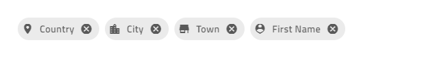
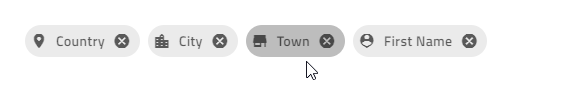
모든 것이 제대로 진행되었다면 브라우저에 다음과 같은 내용이 표시됩니다.
Chip Area
칩IgxChipsAreaComponent 간 상호작용이 필요한 복잡한 시나리오(드래그, 선택, 내비게이션 등)를 처리할 때 사용됩니다.
Reorder Chips

최종 사용자가 칩을 드래그하여 위치를 변경할 수 있습니다. 드래그는 기본적으로 비활성화되어 있지만 입력 속성으로draggable 활성화할 수 있습니다. 실제 칩 재정렬은 수동으로 처리해야 합니다. 이 부분에서 칩 영역이 유용합니다. 칩이 다른 칩 위로 끌려갈 때 새 주문을 반환하는 이벤트를 제공하기reorder 때문입니다.
<igx-chips-area (reorder)="chipsOrderChanged($event)">
  <igx-chip *ngFor="let chip of chipList" [draggable]="'true'">
    <igx-icon igxPrefix>{{chip.icon}}</igx-icon>
    {{chip.text}}
  </igx-chip>
</igx-chips-area>
public chipsOrderChanged(event: IChipsAreaReorderEventArgs) {
    const newChipList = [];
    for (const chip of event.chipsArray) {
        const chipItem = this.chipList.filter((item) => {
            return item.id === chip.id;
        })[0];
        newChipList.push(chipItem);
    }
    this.chipList = newChipList;
}
Keyboard Navigation
칩은 키를 사용Tab 하거나 클릭해서 집중할 수 있습니다. 칩이 칩 영역에 있을 때는 키보드 내비게이션을 사용해 재정렬할 수 있습니다:
칩에 초점이 맞춰졌을 때 키보드 제어:
LEFT- 포커스를 왼쪽 칩으로 이동합니다.
RIGHT- 포커스를 오른쪽 칩으로 이동합니다.
SPACE- 선택 가능한 경우 칩 선택을 토글합니다.
SHIFT + LEFT- 현재 집중된 칩이 왼쪽으로 이동해야 할 때 트리거 이벤트
reorder를 트리거igxChipArea합니다.SHIFT + RIGHT- 현재 집중된 칩이 오른쪽으로 한 위치를 이동해야 할 때 이벤트
reorder를 트리거합니다igxChipArea.
제거 버튼에 포커스가 있을 때 키보드 컨트롤:
- SPACE 또는 ENTER 칩 삭제를 수동으로 처리할 수 있도록 출력을
remove실행합니다.
- SPACE 또는 ENTER 칩 삭제를 수동으로 처리할 수 있도록 출력을
다음은 IgxAvatar를 모든 칩의 접두사 및 사용자 정의 아이콘으로 사용하는 칩 영역의 예입니다.
<igx-chips-area (reorder)="chipsOrderChanged($event)">
  <igx-chip
    *ngFor="let chip of chipList"
    [id]="chip.id"
    [selectable]="true"
    [selectIcon]="mySelectIcon"
    [removable]="true"
    [removeIcon]="myRemoveIcon"
    (remove)="chipRemoved($event)"
    [draggable]="'true'">
    <igx-avatar
      class="chip-avatar-resized"
      igxPrefix
      [src]="chip.photo"
      shape="circle">
    </igx-avatar>
    {{chip.name}}
  </igx-chip>
</igx-chips-area>

<ng-template #mySelectIcon>
  <igx-icon>check_circle</igx-icon>
</ng-template>

<ng-template #myRemoveIcon>
  <igx-icon>delete</igx-icon>
</ng-template>
칩에 맞게 아바타 크기를 조정합니다.
.chip-avatar-resized {
  width: 2em;
  height: 2em;
  min-width: 2em;
}
이벤트를 처리하는 함수들과chipList를 추가하세요:
import { IBaseChipEventArgs, IChipsAreaReorderEventArgs } from 'igniteui-angular/chips';
// import { IBaseChipEventArgs, IChipsAreaReorderEventArgs } from '@infragistics/igniteui-angular'; for licensed package

...
public chipList = [
    {
        id: '770-504-2217',
        name: 'Terrance Orta',
        photo: 'https://ko.infragistics.com/angular-demos/assets/images/men/27.jpg'
    },
    {
        id: '423-676-2869',
        name: 'Richard Mahoney',
        photo: 'https://ko.infragistics.com/angular-demos/assets/images/men/13.jpg'
    },
    {
        id: '859-496-2817',
        name: 'Donna Price',
        photo: 'https://ko.infragistics.com/angular-demos/assets/images/women/50.jpg'
    }
];

private changeDetectionRef: any;

public chipRemoved(event: IBaseChipEventArgs) {
    this.chipList = this.chipList.filter((item) => {
        return item.id !== event.owner.id;
    });
    this.changeDetectionRef.detectChanges();
}

public chipsOrderChanged(event: IChipsAreaReorderEventArgs) {
    const newChipList = [];
    for (const chip of event.chipsArray) {
        const chipItem = this.chipList.filter((item) => {
            return item.id === chip.id;
        })[0];
        newChipList.push(chipItem);
    }
    this.chipList = newChipList;
}
모든 것이 올바르게 설정되면 브라우저에 다음이 표시됩니다.
Demo
스타일링
Chip Theme Property Map
주요 속성을 수정하면 관련된 모든 종속 속성이 자동으로 업데이트됩니다:
| 기본 속성 | 종속 속성 | 설명 |
|---|---|---|
$background |
$text색 | 칩 텍스트 색상. |
| $border색 | 칩 테두리 색상. | |
| $hover 배경 | 칩 호버 배경색. | |
| $hover-테두리 색상 | 칩 호버 테두리 색상. | |
| $hover-텍스트-컬러 | 칩 호버 텍스트 색상. | |
| $focus 배경 | 칩 포커스 배경색. | |
| $selected 배경 | 칩이 배경색을 선택했습니다. | |
$focus 배경 |
$focus-텍스트-컬러 | 칩 텍스트는 초점 색입니다. |
| $focus-테두리 색상 | 칩 포커스 테두리 색상. | |
| $focus-아웃라인-컬러 (부트스트랩 및 인디고 변형만) | 칩 포커스 윤곽선 색상. | |
$selected 배경 |
$selected-텍스트-컬러 | 선택한 칩 텍스트 색상. |
| $selected-테두리 색상 | 선택한 칩 테두리 색상. | |
| $hover-선택-배경 | 선택한 칩은 배경색을 떠납니다. | |
$hover-선택-배경 |
$hover-선택-텍스트-컬러 | 선택한 칩은 텍스트 색상을 마우스로 표시합니다. |
| $hover-선택-테두리-컬러 | 선택한 칩의 호버 테두리 색상. | |
| $focus-선택-배경 | 선택한 칩은 배경색에 초점을 맞추는 것입니다. | |
$focus-선택-배경 |
$focus-선택-텍스트-컬러 | 선택한 칩 텍스트는 초점 색상입니다. |
| $focus-선택-테두리 색상 | 선택한 칩의 초점 테두리 색상. | |
| $focus-selected-outline-color(부트스트랩 및 인디고 변형만) | 칩 포커스 윤곽선 색상은 선택 상태에서 표시됩니다. |
칩 스타일링을 시작하려면, 모든 테마 기능과 컴포넌트 믹신이 있는 파일을 가져와index야 합니다:
@use "igniteui-angular/theming" as *;

// IMPORTANT: Prior to Ignite UI for Angular version 13 use:
// @import '~igniteui-angular/lib/core/styles/themes/index';
가장 간단한 방법을 따라, 칩의 아이템을 스타일링하는 매개변수를 확장chip-theme 하고 수용하는 새로운 테마를 만듭니다. 또는 the$background를 지정$selected-background 하면 테마가 자동으로 적절한 상태 색상과 대비 전경을 계산합니다. 필요에 따라 다른 매개변수를 맞춤 값으로 덮어쓸 수 있습니다.
$custom-chip-theme: chip-theme(
    $background: #57a5cd,
    $selected-background: #ecaa53,
    $remove-icon-color: #d81414,
    $border-radius: 5px,
);
마지막으로 애플리케이션에 사용자 지정 테마를 포함 합니다.
:host {
  @include tokens($custom-chip-theme);
}
아래 샘플에서는 칩 컴포넌트와 맞춤형 CSS 변수를 사용하면 디자인 시스템에 사용되는Ant 칩과 시각적으로 유사한 디자인을 만들 수 있음을 알 수 있습니다.
Styling with Tailwind
저희의 맞춤형 Tailwind 유틸리티 클래스를 사용해 칩을 스타일링할 수 있습니다. 먼저 Tailwind를 꼭 설정 하세요.
전역 스타일시트의 순풍 가져오기와 함께 다음과 같이 원하는 테마 유틸리티를 적용할 수 있습니다.
@import "tailwindcss";
...
@use 'igniteui-theming/tailwind/utilities/material.css';
유틸리티 파일에는 테마 변형 두 가지light가dark 모두 포함되어 있습니다.
- 라이트 테마에는 클래스를 사용
light-*하세요. - 어두운 테마에는 클래스를 사용
dark-*하세요. - 접두사 뒤에 컴포넌트 이름을 덧붙이세요,
light-chipdark-chip예: .
이 클래스들이 적용되면 동적 테마 계산이 가능합니다. 그 다음에는 생성된 CSS 변수를 무arbitrary properties 시할 수 있습니다. 콜론 다음에는 유효한 CSS 색상 형식(HEX, CSS 변수, RGB 등)을 입력하세요.
칩 테마에서 전체 속성 목록을 확인할 수 있습니다. 문법은 다음과 같습니다:
<igx-chip
  class="!light-chip
  ![--background:#99BAA6]
  ![--remove-icon-color:#C92828]"
  ...
>
  {{chip.text}}
</igx-chip>
Note
느낌표(!)는 유틸리티 클래스가 우선순위가 되도록 보장하기 위해 필요합니다. Tailwind는 레이어에 스타일을 적용하는데, 이 스타일을 중요하게 표시하지 않으면 컴포넌트의 기본 테마에 의해 덮어쓰여집니다.
끝에 칩은 이렇게 생겨야 합니다:
Custom sizing
변수를--size 사용하여 직접 다음을 타겟팅igx-chip 할 수 있습니다:
igx-chip {
  --size: 50px;
}
또는 모든 인스턴스를 타겟팅하는 유버설--ig-chip-size 변수를 사용할 수도 있습니다:
<div class="my-app">
  <igx-chip></igx-chip>
</div>
.my-app {
  --ig-chip-size: 50px;
}
또한 미리 정의된 크기 중 하나를 변수에--ig-size 할당할 수도 있습니다. 에 대한 사용 가능한 값--ig-size은 다음과 같습니다--ig-size-small:--ig-size-medium--ig-size-large
igx-chip {
  --ig-size: var(--ig-size-small);
}
크기 문서에서 자세히 알아보세요.
API
Theming Dependencies
References
우리 커뮤니티는 활동적이며 항상 새로운 아이디어를 환영합니다. GitHub