Customizing Ignite UI for Angular Theming
이 문서에서는 Ignite UI for Angular 사용자 지정하고 생성된 스타일시트의 크기를 최적화하는 방법에 대해 자세히 설명합니다. 이 문서에서는 Ignite UI for Angular 작동 방식을 자세히 설명하고 고급 사용법을 제시합니다. 이 문서는 구성 요소 스타일을 완전히 사용자 지정하여 Angular 애플리케이션이 원하는 모양과 느낌에 맞게 조정되고, 스타일 크기를 앱에서 사용하는 크기로 줄여 배포에 최적화된 애플리케이션을 만드는 데 매우 유용합니다.
Note
이 문서에서는 Ignite UI for Angular의 테마 시스템을 버전 15부터 설명합니다. 테마 엔진에서 제공하는 Sass API와 노출된 CSS 변수를 사용하는 것이 모두 예시입니다.
Getting Started
App Builder 사용하여 Angular 애플리케이션을 생성한 다음 생성된 저장소에서 해당 애플리케이션의 스타일을 수정합니다. 먼저 App Builder의 "헤더 + 미니 탐색 + 콘텐츠 + 측면 창" 템플릿에서 새 앱을 만들고 디자인 화면에 몇 가지 구성 요소를 추가합니다.
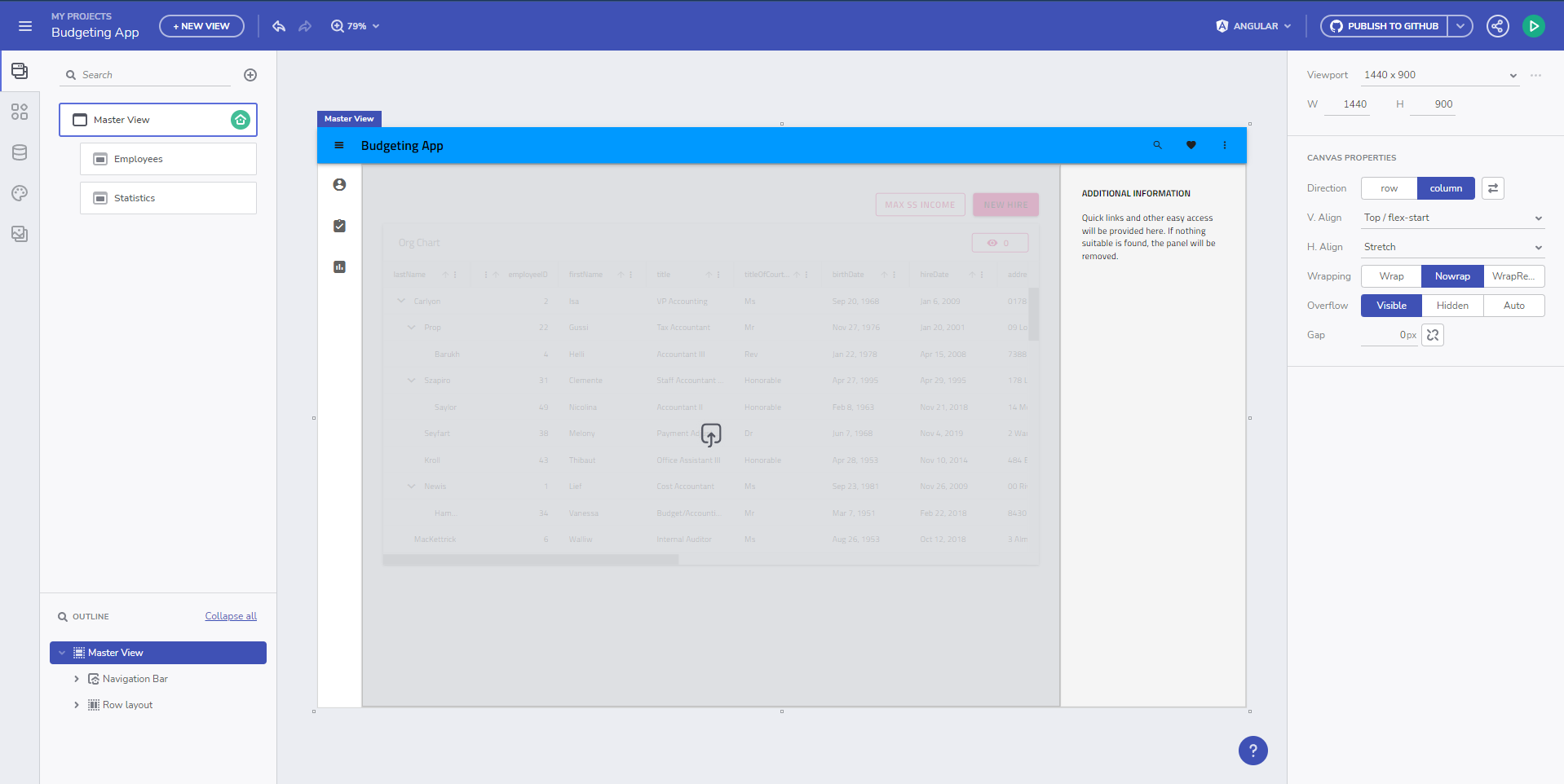
그런 다음 Angular를 대상으로 사용하여 GitHub 저장소에 앱을 생성하고, 그 위에 App Builder에서 작업하고 생성된 코드 자체를 수정합니다. 저장소를 복제하고 프로젝트를 빌드한 후 초기 상태에서 실행중인 Angular 애플리케이션을 얻습니다.
보시다시피, 애플리케이션은 기본 테마링인 Material Light 변형을 적용했습니다. 생성된styles.scss 파일은 다음과 같습니다:
/* You can add global styles to this file, and also import other style files */

// Standard CSS normalize, comment out if not required or using a different module
@use "minireset.css/minireset";
@use "@infragistics/igniteui-angular/theming" as *;

@include core();
@include typography();
@include light-theme($light-material-palette);

body {
  background: hsla(var(--ig-surface-500));
  color: var(--ig-surface-500-contrast);
}

html, body {
  height: 100%;
}

.ig-typography {
  h1, h2, h3, h4, h5, h6, p, .ig-typography__body-1 {
    margin: 0;
  }
}

.outer-wrapper > *:not(router-outlet) {
  width: 100%;
}
Theme Customization
같은 테마의 어두운 색상 변형을 원하고, 브랜드에 맞는 자체 색상 팔레트를 추가하며, 기본Poppins 폰트 대신 폰트Titillium Web를 변경할 수 있습니다. 이 모든 것은 App Builder에서 직접 변경할 수 있고, App Builder에서 풀 리퀘스트로 변경 사항을 저장소로 푸시할 수 있습니다.
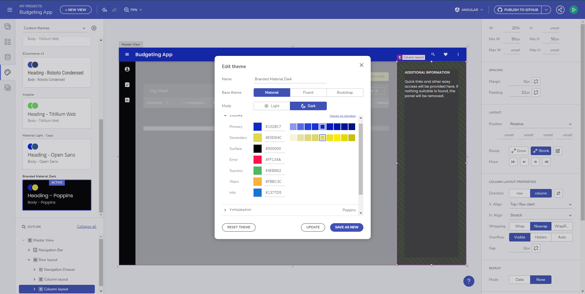
업데이트styles.scss 된 내용은 다음과 같습니다:
@include core();
@include typography($font-family: "Poppins");

$custom-palette: palette(
  $primary: #1028c7,
  $secondary: #e0d94c,
  $surface: #000,
  $gray: #fff
);

@include theme(
    $palette: $custom-palette,
    $schema: $dark-material-schema
);
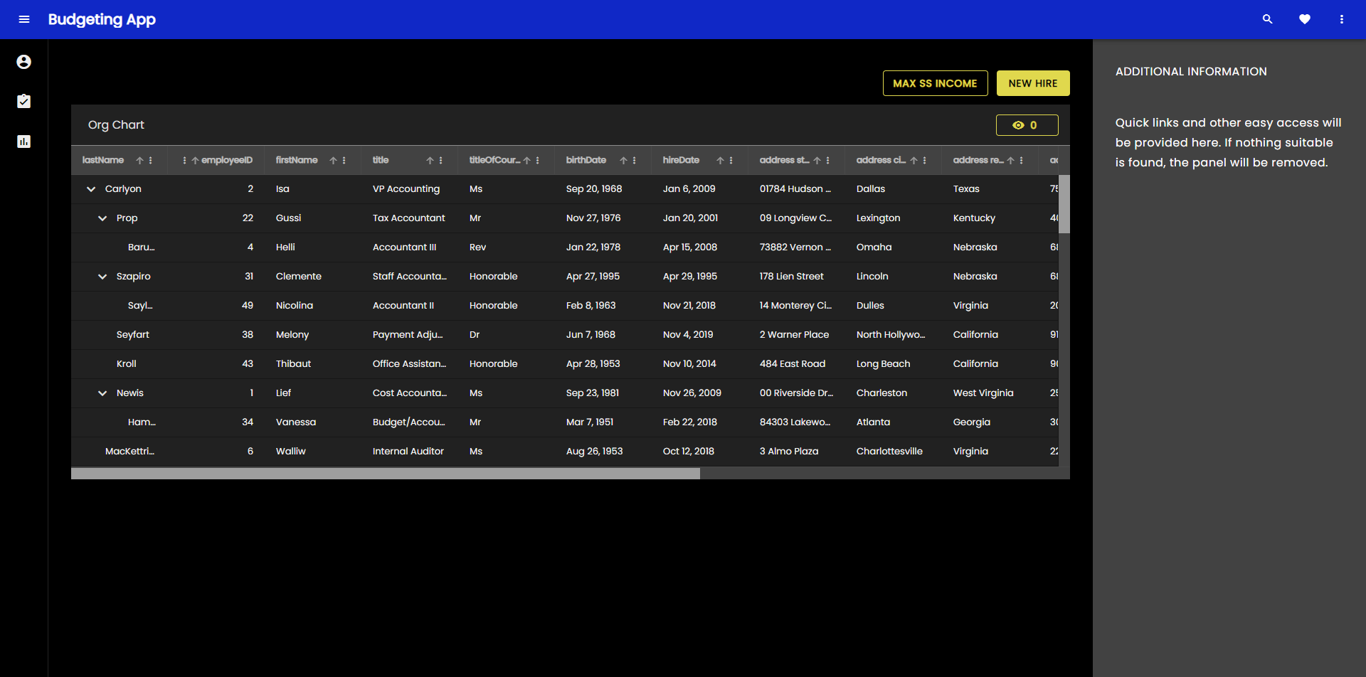
보시다시피, 코드 생성 방식이 특정 코드와 달라졌습니다@include light-theme($light-material-palette);, 이는 기본 테마 그리고 색상 팔레트, 일반theme() include는 매개변수로서 우리의 맞춤 색상 팔레트와 다크 머티얼 스키마 테마 구조 때문에요. 실행 중인 Angular 앱 결과는 이제 다음과 같습니다:
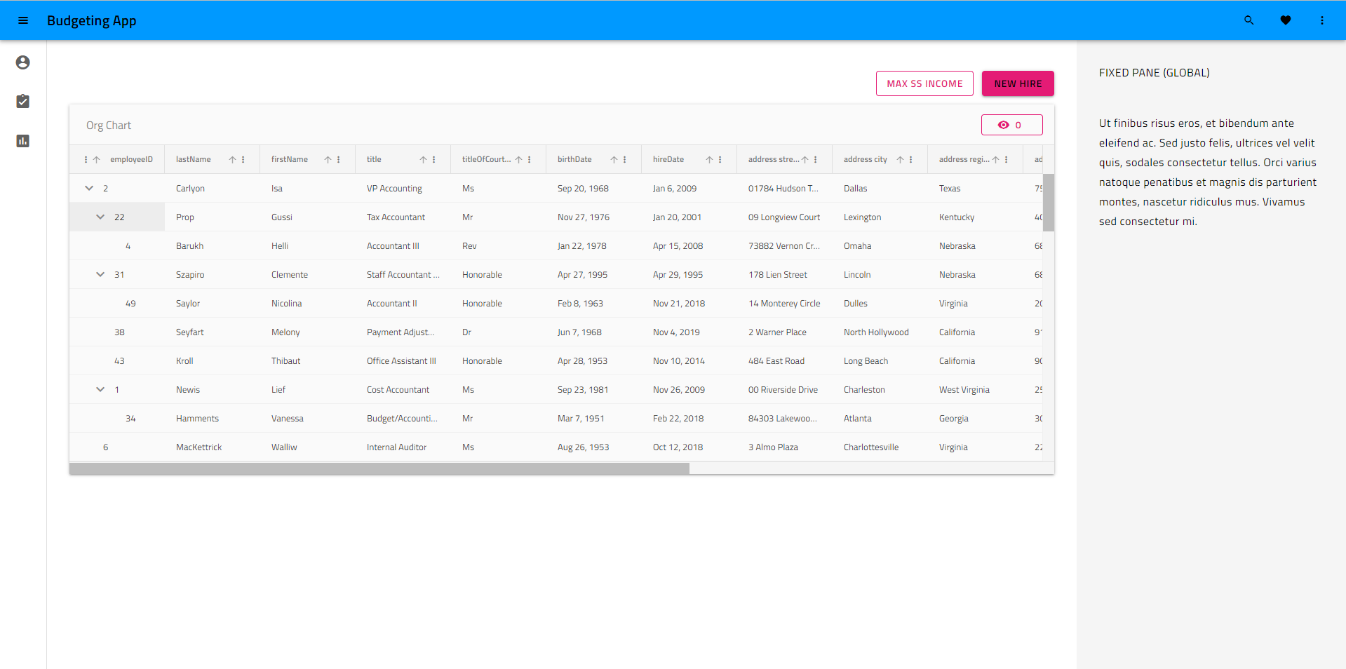
우리는 애플리케이션에서 더 깊이 파고들어 특정 구성 요소 테마를 사용자 정의하고 싶고 개별 구성 요소 테마(이 경우 그리드 도구 모음 테마)에 대한 CSS 변수를 가져와 이를 수행할 것입니다.
@include core();
@include typography($font-family: "Poppins");

$primary: #1028c7;

/* All of the components will use this custom color palette */
$custom-palette: palette(
  $primary: $primary,
  $secondary: #e0d94c,
  $surface: #000,
  $gray: #fff
);

@include theme(
    $palette: $custom-palette,
    $schema: $dark-material-schema
);

/* Grid Toolbar */
/* All grid toolbars will have custom background and elevations */
$toolbar-theme: grid-toolbar-theme(
  $background-color: $primary
);

@include css-vars($toolbar-theme);
/* END Grid Toolbar */
이제 우리 앱의 결과는 다음과 같습니다.
동일한 프로세스를 적용하여 구성 요소 테마를 개별적으로 재정의하고 사용자 정의할 수 있습니다.
Switching custom themes at runtime
이제 더 깊이 파고들어 런타임에 전환할 수 있는 테마의 두 가지 사용자 정의 버전을 만들어 보겠습니다. 사용자 제어/기본 설정을 사용하여 이 작업을 수행하고 언제든지 전환하도록 할 수 있습니다. 그러나 예에서는 현재 OS 설정과 일치하는 테마를 적용하기 위해 OS 정의 사용자 기본 설정(밝음 또는 어두움)을 사용합니다. 이를 위해서는 두 가지 색상 팔레트가 필요합니다.
@use "minireset.css/minireset";
@use "@infragistics/igniteui-angular/theming" as *;

@include core();
@include typography($font-family: "Poppins");

$primary-dark: #1028c7;
$primary-light: #3c55f1;
$secondary-dark: #e0d94c;
$secondary-light: #b4a904;

$custom-palette-dark: palette(
  $primary: $primary-dark,
  $secondary: $secondary-dark,
  $surface: #000,
  $gray: #ccc
);

$custom-palette-light: palette(
  $primary: $primary-light,
  $secondary: $secondary-light,
  $surface: #fff,
  $gray: #222
);
그 다음 테마 정의는 일반 범위에 들어가 빛 변화에 사용할 것이며, 어두운 색상 스키마 OS 선호도가 감지되면 쿼리에서@media 팔레트 오버라이드를 만듭니다:
@include theme(
  $palette: $custom-palette-light,
  $schema: $light-material-schema
);

@media (prefers-color-scheme: light) {
  /* Grid Toolbar override for light color scheme */
  igx-grid-toolbar {
    --background-color: #{$primary-light};
    --title-text-color: #{text-contrast($primary-light)};
  }
  /* END Grid Toolbar */
}

@media (prefers-color-scheme: dark) {
  // changes native element schema (scrollbars, select, etc.)
  :root {
    color-scheme: dark;
  }

  @include palette($custom-palette-dark);

  /* Grid Toolbar override for dark color scheme */
  igx-grid-toolbar {
    --background-color: #{$primary-dark};
    --title-text-color: #{text-contrast($primary-dark)};
  }
  /* END Grid Toolbar */
}
Note
저는igx-grid-toolbar 테마 오버라이드를 모든 주제 변수를 다시 포함하는 대신, 두 변수만 오버라이드하는 방식입니다.css-vars(). 모든 테마 변수는 다음에서 찾을 수 있습니다. 대응하는 SASS API 문서와 는 SAS 변수와 동등하지만, 접두사가 붙어 있습니다.-- 대신에$.
결과는 이제 밝은 OS 테마에서 다음과 같습니다.
어두운 OS 테마에서는 다음과 같이 보입니다.
Note
Ignite UI 테마 스키마 사전 설정 스위치를 포함한 전체 런타임 스위치는 두 개의 전체 테마가 빌드된 경우에만 가능합니다. 위의 예에서 색상 팔레트를 전환하지만 테마 스키마는 $light-material-schema로 유지되므로 어두운 색상 팔레트로 전환할 때 색상 팔레트의 모든 올바른 음영이 사용되지 않습니다.
What can be customized
Ignite UI 테마는 테마의 여러 차원을 추상화하고 매우 강력한 리테마 기능을 제공합니다. 개발자와 디자이너는 테마 엔진 API를 활용하여 애플리케이션에 맞는 맞춤형 시각적 디자인을 만들 수 있으며, 이를 통해 Ignite UI for Angular 사용할 때 고유한 모양과 느낌을 얻을 수 있습니다. 테마 엔진은 또한 각 차원의 변수를 노출하여 Ignite UI for Angular 구성 요소를 UI로 직접 빌드하지 않는 나머지 애플리케이션 구조에 테마를 적용하는 데 사용할 수 있습니다. 수정을 위해 노출된 차원은 다음과 같습니다.
- Colors (color palette)
- Shape (borders and radiuses)
- Elevations (shadows)
- 타이포그래피 (글꼴 및 글꼴 크기)
- 크기 (화면에 표시되는 정보의 크기)
Note
완전히 사용자 정의된 시각적 디자인을 정말로 원한다면 지원되는 모든 테마 차원을 수정해야 하며 Sass API를 최대한 활용하게 될 것입니다. 글꼴이나 몇 가지 색상 등을 변경해야 한다면 팔레트 및 타이포그래피 섹션을 살펴보세요. 대부분의 경우 CSS 변수 몇 개만 변경하면 전체 Sass API가 필요하지 않습니다. 우리는 이것을 최대한 세분화하여 애플리케이션의 시각적 디자인에 예상치 못한 부작용 없이 수정 사항을 적용할 수 있도록 했습니다.
Theme Optimization
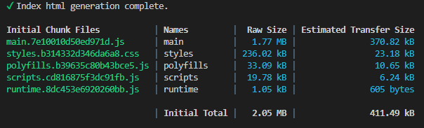
몇 가지 사용자 정의를 수행한 후 생성하고 수정한 애플리케이션을 빌드하여 애플리케이션 테마가 크기 측면에서 어떻게 보이는지 확인하겠습니다.
보시다시피, 애플리케이션 테마는 400kb를 약간 넘는데, 압축 후 전송하면 ~40kb로 줄어듭니다. 규모는 크지 않지만, 더 최적이 될 수 있을까요? 답은 예입니다. Ignite UI for Angular 스위트의 모든 구성 요소를 사용하지 않는 한요. 호출은@include theme() 모든 구성 주제를 포함하지만, 함수에 무엇을 제외할지 지시하는 메커니즘도 있습니다. 테마 믹스인에는 컴포넌트 이름을 배열로 받아 빌드 시 테마에서 제외하는 매개변수가 있습니다$exclude. 패키지 내 모든 부품을 찾고 목록화하는 것이 쉽지 않으니, 사용하는 모든 부품을 그냥 나열하는 것이 더 좋습니다. 전체 컴포넌트 리스트를 변수로 공개하는데, 한 번 접근할 수 있습니다
@use "@infragistics/igniteui-angular/theming" as *;
컴포넌트 배열은 에서$components 찾을 수 있으며, 이 리스트를 사용하는 컴포넌트들로 줄이고 나머지는 제외할 수 있습니다. 이 예시처럼:
$include: (
  igx-navbar,
  igx-ripple,
  igx-icon,
  igx-button,
  igx-input-group,
  igx-combo,
  igx-nav-drawer,
  igx-grid,
  igx-grid-toolbar
);

@include theme(
  $palette: $custom-palette,
  $schema: $dark-material-schema,
  /* Removing all included components from the full list and excluding the rest  */
  $exclude: map.keys(map.remove($components, $include...))
);
Note
일부 구성 요소 테마는 다른 구성 요소 테마에 따라 달라집니다.
특정 테마를 제외하더라도 제외된 테마에 따라 달라지는 구성 요소 테마를 사용하는 경우 빌드에서 해당 테마를 유지합니다.
특정 테마를 제외하면 빌드는 어떤 모습일까요?
보시다시피, 저희 스타일 크기는 원래 크기의 거의 절반으로 줄어들었습니다. 현재로서는 꽤 괜찮아 보이지만, 이 현상을 더 줄일 수 있을까요? 사실, 우리는 할 수 있습니다. 스타일 크기의 대부분은 스위트에서 가장 큰 컴포넌트, 즉IgxTreeGridComponent 뷰 중 하나에 있는 컴포넌트에서 차지합니다. 하지만 이 구성 요소는 다른 뷰에서는 사용하지 않습니다. 우리는 lazy-loaded 경로로igx-tree-grid 뷰를 만들 수 있고, 그리드용 테마는 해당 경로에만 포함할 수 있어, 최상위 CSS를 더욱 작게 만들 수 있습니다. 이건 어떻게 하는 거죠?
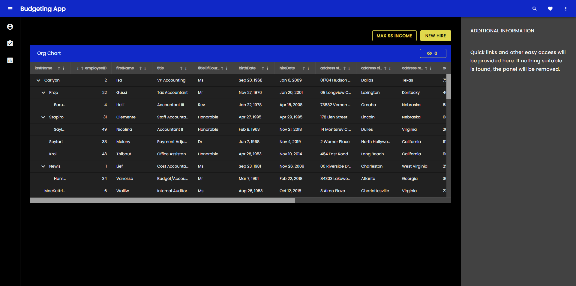
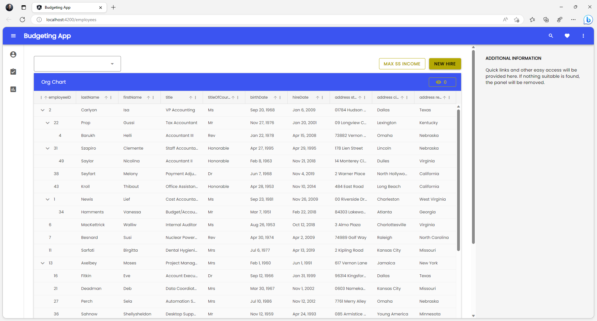
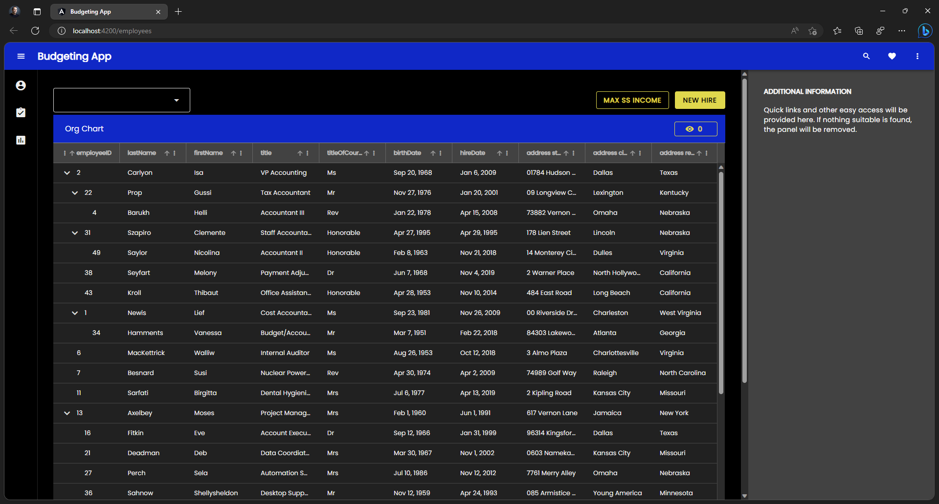
앱의 직원 구성 요소가 있는 폴더에 새 모듈과 새 라우팅 모듈을 만드는 것부터 시작하겠습니다.
// employees.module.ts
import { NgModule } from '@angular/core';
import { CommonModule } from '@angular/common';

import { EmployeesRoutingModule } from './employees-routing.module';
import { EmployeesComponent } from './employees.component';
import { IgxButtonModule, IgxComboModule, IgxTreeGridModule } from '@infragistics/igniteui-angular';


@NgModule({
  declarations: [
    EmployeesComponent
  ],
  imports: [
    CommonModule,
    EmployeesRoutingModule,
    IgxComboModule,
    IgxTreeGridModule,
    IgxButtonModule
  ]
})
export class EmployeesModule { }
// employees-routing.module.ts
import { NgModule } from '@angular/core';
import { RouterModule, Routes } from '@angular/router';
import { EmployeesComponent } from './employees.component';

const routes: Routes = [{ path: '', component: EmployeesComponent }];

@NgModule({
  imports: [RouterModule.forChild(routes)],
  exports: [RouterModule]
})
export class EmployeesRoutingModule { }
// Updated top-level app-routing.module.ts
import { NgModule } from '@angular/core';
import { Routes, RouterModule } from '@angular/router';

import { PageNotFoundComponent } from './error-routing/not-found/not-found.component';
import { UncaughtErrorComponent } from './error-routing/error/uncaught-error.component';
import { ErrorRoutingModule } from './error-routing/error-routing.module';
import { StatisticsComponent } from './statistics/statistics.component';

export const routes: Routes = [
  { path: '', redirectTo: 'statistics', pathMatch: 'full' },
  { path: 'error', component: UncaughtErrorComponent },
  // { path: 'employees', component: EmployeesComponent, data: { text: 'Employees' } },
  // lazy-loading the employees route
  { path: 'employees', loadChildren: () => import('./employees/employees.module').then(m => m.EmployeesModule) },
  { path: 'statistics', component: StatisticsComponent, data: { text: 'Statistics' } },
  { path: '**', component: PageNotFoundComponent } // must always be last
];

@NgModule({
  imports: [RouterModule.forRoot(routes), ErrorRoutingModule],
  exports: [RouterModule, ErrorRoutingModule]
})
export class AppRoutingModule {
}
이제 우리는 importIgxTreeGridModule와 import를 제거하고, our에서도IgxComboModule importEmployeesComponent를 제거app.module.ts 합니다. 왜냐하면 imports를 다른 뷰에서는 사용하지 않고, 모든 모듈에서 하나의 컴포넌트 선언만 가질 수 있기 때문입니다.
그 다음에는 주제에서 포함된 것들을 제거igx-gridigx-grid-toolbarigx-combo 하고, 그것들을 수준에서 포함employees.component.scss 할 것입니다.
/* employees.component.scss */
@use "@infragistics/igniteui-angular/theming" as *;

:host ::ng-deep {
  height: 100%;
  display: flex;
  justify-content: flex-start;
  align-items: stretch;
  align-content: flex-start;

  $primary: #1028c7;
  @include core();

  @include grid(grid-theme());

  @include combo(combo-theme());

  @include grid-toolbar(
    grid-toolbar-theme(
        $background-color: $primary,
    );
}
/* Updated styles.scss */
@use "sass:map";
@use "minireset.css/minireset";
@use "@infragistics/igniteui-angular/theming" as *;

@include core();
@include typography($font-family: "Poppins");

$primary: #1028c7;

$custom-palette: palette(
  $primary: $primary,
  $secondary: #e0d94c,
  $surface: #000,
  $gray: #fff
);

$include: (
  igx-navbar,
  igx-ripple,
  igx-icon,
  igx-button,
  igx-nav-drawer
);

@include theme(
  $palette: $custom-palette,
  $schema: $dark-material-schema,
  $exclude: map.keys(map.remove($components, $include...),)
);
Note
아마도 색상 팔레트 값 같은 모든 변수를 별도의_variables.scss 파일에 넣어 여러 컴포넌트에서 변수를 재사용할 수 있도록 하는 것이 좋습니다.
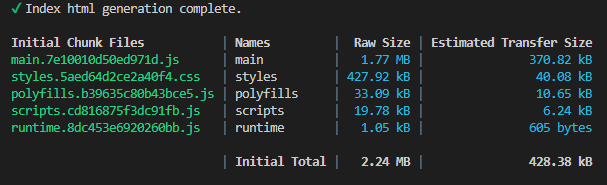
빌드 측면에서 결과는 다음과 같습니다.
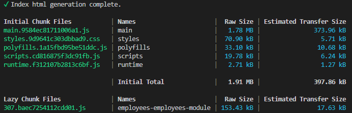
보시다시피, 최상위 레벨styles.css은 70kb가 조금 넘는 수준으로 내려갔는데, 압축 시 6kb보다 조금 안 되는 용량입니다. 우리는 ~428kb, ~40kb 압축 상태에서 시작해 압축 크기를 약 7배 정도 줄일 수 있었습니다. 나머지는 와igx-tree-grid 컴포넌트가 포함된igx-combo 뷰가 로드될 때만 전달됩니다.
Additional Resources
관련 주제:
우리 커뮤니티는 활동적이며 항상 새로운 아이디어를 환영합니다.
 GitHub