페이지 레이아웃
WPF에서는 애플리케이션에서 요소들을 배치하려면 해당 요소들을 aPanel. 안에 넣어야 합니다. 패널은 자식 요소들의 배열을 제어하는 컨테이너 요소입니다. Angular 에서는 페이지 레이아웃과 자식 요소를 커스터마이즈하려면 CSS를 사용해야 합니다. WPF에서 가장 인기 있는 패널들을 살펴보고 CSS로 비슷한 레이아웃을 구현하는 방법을 살펴보겠습니다.
StackPanel
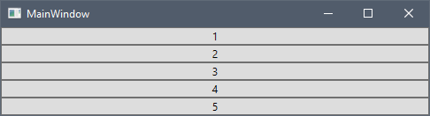
자StackPanel 식 요소들을 수평 또는 수직으로 배치할 수 있는 단일 선으로 배열합니다. StackPanel에 여러 버튼을 추가하고 WPF에서 어떻게 보이는지 살펴보겠습니다:
<StackPanel>
    <Button>1</Button>
    <Button>2</Button>
    <Button>3</Button>
    <Button>4</Button>
    <Button>5</Button>
</StackPanel>
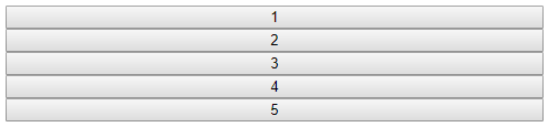
Angular에서 유사한 레이아웃을 원한다면 CSS Flexbox 레이아웃을 사용할 수 있습니다. 유연한 박스 배치 모듈은 유연한 반응형 배치 구조를 설계할 수 있는 강력한 메커니즘입니다. Flexbox 레이아웃을 사용하려면 다음 컨테이너를 정의해야 합니다.display 속성은 다음과 같이 설정되었습니다flex. 또한 아이템을 수직으로 쌓으려면 다음을 설정해야 합니다.flex-direction 속성은column.
<div class="flex-container">
    <button>1</button>
    <button>2</button>
    <button>3</button>
    <button>4</button>
    <button>5</button>
</div>
.flex-container {
    display: flex;
    flex-flow: column;
}
브라우저의 최종 결과는 다음과 같습니다.
속성의flex-direction 기본 값은 이며row, 이는 WPF에서 수평 방향을 가진 스택 패널과 동등합니다. 플렉스박스는 또한 아이템을 오른쪽에서 왼쪽으로, 아래에서 위로 각각 쌓는 방향row-reversecolumn-reverse과 지지 방향도 제공합니다.
WrapPanel
WrapPanel자식 요소들을 왼쪽에서 오른쪽 순차적으로 배치하며, 내용을 포함하는 상자 가장자리의 다음 줄로 나눕니다. 이후 순서는 방향성 성질의 값에 따라 위에서 아래, 또는 오른쪽에서 왼쪽으로 순차적으로 이루어집니다. WrapPanel에 여러 버튼을 추가하고 WPF에서 어떻게 보이는지 살펴보겠습니다:
<WrapPanel>
    <WrapPanel.Resources>
        <Style TargetType="Button">
            <Setter Property="Width" Value="150"></Setter>
        </Style>
    </WrapPanel.Resources>
    <Button>1</Button>
    <Button>2</Button>
    <Button>3</Button>
    <Button>4</Button>
    <Button>5</Button>
</WrapPanel>
Angular에서 비슷한 결과를 얻기 위해 다시 Flexbox 레이아웃을 사용할 것입니다. StackPanel의 경우처럼, 우리는 다음을 설정해야 합니다.display 속성은flex, 하지만 우리는 또한 다음을 설정해야 한다.flex-wrap 속성은wrap.
<div class="flex-container">
    <button>1</button>
    <button>2</button>
    <button>3</button>
    <button>4</button>
    <button>5</button>
</div>
.flex-container {
    display: flex;
    flex-wrap: wrap;
}

button {
    width: 150px;
}
브라우저의 최종 결과는 다음과 같습니다.
Orientation="Vertical"인 WrapPanel과 비슷한 결과를 얻고 싶다면, 속성을 를 설정flex-direction 해야 합니다.column 속성은flex-flow와flex-direction 속성을 모두 설정flex-wrap 하는 약어적 속성입니다.
.flex-container {
    display: flex;
    flex-flow: row wrap;
}
Flexbox는 항목 정렬을 위해 몇 가지 추가 CSS 속성을 지원합니다. 이 튜토리얼에서 이에 대해 자세히 알아볼 수 있습니다.
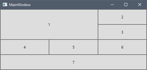
Grid
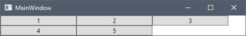
이 방법은Grid 열과 행으로 이루어진 유연한 격자 영역을 정의합니다. 그리드에 여러 버튼을 추가해 WPF에서 어떻게 보이는지 살펴보겠습니다:
<Grid>
    <Grid.ColumnDefinitions>
        <ColumnDefinition />
        <ColumnDefinition />
        <ColumnDefinition />
    </Grid.ColumnDefinitions>
    <Grid.RowDefinitions>
        <RowDefinition Height="50" />
        <RowDefinition Height="50" />
        <RowDefinition Height="50" />
        <RowDefinition Height="50" />
    </Grid.RowDefinitions>
    <Button Grid.RowSpan="2" Grid.ColumnSpan="2">1</Button>
    <Button Grid.Column="2">2</Button>
    <Button Grid.Row="1" Grid.Column="2">3</Button>
    <Button Grid.Row="2">4</Button>
    <Button Grid.Row="2" Grid.Column="1">5</Button>
    <Button Grid.Row="2" Grid.Column="2">6</Button>
    <Button Grid.Row="3" Grid.ColumnSpan="3">7</Button>
</Grid>
Angular 에서는 행과 열이 있는 격자 기반 레이아웃 시스템을 제공하는 CSS 그리드 레이아웃 모듈을 사용할 수 있습니다. 그리드 레이아웃을 사용하려면 그 속성을 또는display 또는 로 설정gridinline-grid 한 컨테이너를 정의해야 합니다.
<div class="grid-container">
    <button class="button1">1</button>
    <button>2</button>
    <button>3</button>
    <button>4</button>
    <button>5</button>
    <button>6</button>
    <button class="button7">7</button>
</div>
.grid-container {
    display: grid;
}
Note
CSS 그리드 레이아웃은 Internet Explorer 11과 같은 이전 브라우저에서는 지원되지 않습니다.
이제 격자의 열을 다음 속성으로grid-template-columns 정의해 봅시다.
.grid-container {
    display: grid;
    grid-template-columns: auto auto auto;
}
우리는 세auto 개의 열을 너비로 정의했는데, 이는 두 열의 너비가 같다는 뜻입니다. WPF의 스타 크기 비율과 비슷하게 공간을 분배하고 싶다면 CSS의 플렉스 사이징 유닛fr을 사용할 수 있습니다. 다음 코드 스니펫은 두 개의 열을 정의하며, 첫 번째 열은 사용 가능한 공간의 1배를, 두 번째 열은 사용 가능한 공간의 2배를 받습니다:
.grid-container {
    display: grid;
    grid-template-columns: 1fr 2fr;
}
이제 각 50px 높이의 행을 속성을 사용해grid-template-rows 추가합니다.
.grid-container {
    display: grid;
    grid-template-columns: auto auto auto;
    grid-template-rows: 50px 50px 50px 50px;
}
이제 애플리케이션을 열면 다음과 같습니다.
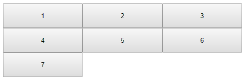
WPF와 CSS 그리드 사이의 한 가지 중요한 차이점을 볼 수 있습니다. WPF에서 Grid.Row 및 Grid.Column의 기본값은 0인 반면 CSS 그리드 레이아웃은 자동으로 사용 가능한 다음 행과 열을 하위 항목에 할당합니다.
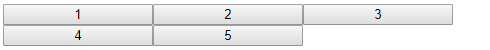
이제 첫 번째와 일곱 번째 버튼에 열과 행 스팬을 적용해 보겠습니다. 우리는 그 목적을 위해 와grid-row 속성을 사용할grid-column 것입니다.
.button1 {
    grid-column: 1 / 3;
    grid-row: 1 / 3;
}

.button7 {
    grid-column: 1 / span 3;
}
먼저 시작 행/열을 지정하고, 기호 다음/에 끝 행/열이나 아이템이 몇 행/열을 가질지 지정할 수 있습니다. WPF와 달리 CSS 격자 열 번호는 0 기반이 아니며 첫 행/열은 1입니다.
다음은 전체 CSS와 브라우저의 최종 결과입니다.
.grid-container {
    display: grid;
    grid-template-columns: auto auto auto;
    grid-template-rows: 50px 50px 50px 50px;
}

.button1 {
    grid-column: 1 / 3;
    grid-row: 1 / 3;
}

.button7 {
    grid-column: 1 / span 3;
}
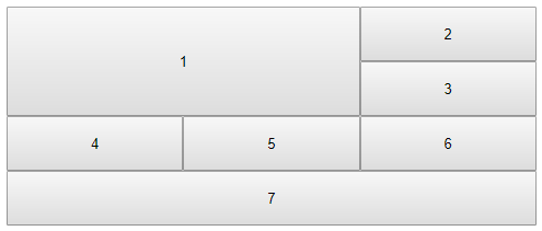
그grid-row 그리고grid-column 속성은 다음과 같은 축약형 속성입니다.grid-row-start,grid-row-end,grid-column-start 그리고grid-column-end 부동산. CSS 그리드 컨테이너와 아이템 속성에 대해 더 배우려면 튜토리얼을 참고하세요. 추가 자료 섹션.
Additional Resources
우리 커뮤니티는 활동적이며 항상 새로운 아이디어를 환영합니다. GitHub