Web Components 대시보드 타일
The Web Components Dashboard Tile is a automatic data visualization component which determines via analysis of a DataSource collection/array or single data point what would be the most appropriate visualization to display. It then also provides a further suite of tools in its embedded IgcToolbarComponent that let you alter the visualization that is presented in a variety of ways.
범주 차트, 방사형 및 극좌표 차트, 분산형 차트, 지리 지도, 방사형 및 선형 게이지, 재무 차트 및 누적 차트를 포함하되 이에 국한되지 않는 제공된 데이터의 모양에 따라 다양한 시각화를 선택하여 표시할 수 있습니다.
도구 모음의 차트 유형 메뉴와 상호 작용하면 가능한 후보 목록에서 다른 시각화를 선택할 수 있습니다.
Web Components Dashboard Tile Example
Dependencies
Ignite UI for Web Components 도구 집합에 다음 패키지를 설치합니다.
npm install igniteui-webcomponents-charts
npm install igniteui-webcomponents-core
npm install igniteui-webcomponents-dashboards
npm install igniteui-webcomponents-gauges
npm install igniteui-webcomponents-data-grids
npm install igniteui-webcomponents-inputs
npm install igniteui-webcomponents-layouts
npm install igniteui-webcomponents-maps
다음 모듈은 Dashboard Tile 구성 요소를 사용할 때 제안됩니다.
import { IgcDashboardTileModule, IgcDataChartDashboardTileModule, IgcRadialGaugeDashboardTileModule,
         IgcLinearGaugeDashboardTileModule, IgcGeographicMapDashboardTileModule,
         IgcPieChartDashboardTileModule } from "igniteui-angular-dashboards";

ModuleManager.register(
    IgcDataChartDashboardTileModule,
    IgcRadialGaugeDashboardTileModule,
    IgcLinearGaugeDashboardTileModule,
    IgcGeographicMapDashboardTileModule,
    IgcPieChartDashboardTileModule,
    IgcDashboardTileModule
);
Usage
Depending on what you bind the Dashboard Tile's DataSource property to will determine which visualization you see by default, as the control will evaluate the data you bind and then choose a visualization from the Ignite UI for Web Components toolset to show. The data visualization controls that are included to be shown in the Dashboard Tile are the following:
기본적으로 선택하는 데이터 시각화는 주로 스키마와 당신이 바인딩한 수의DataSource 수에 따라 달라집니다. 예를 들어, 하나의 숫자 값을 결합하면 aIgcRadialGaugeComponent가 나오지만, 서로 쉽게 구별할 수 있는 값-라벨 쌍들의 집합을 결합하면 aXamDataPieChart가 나올 가능성이 높습니다. 더 많은 값 경로를 가진 aDataSource를 결합하면, 주로 컬렉션 수에 따라 여러 열이나 선 연열을 가진 항목을 받게IgcDataChartComponent 됩니다. 지리적 지점이 포함된 것으로 보이는 데이터나ShapeDataSource 데이터에 결합하여 aIgcGeographicMapComponent를 받을 수도 있습니다.
를 묶DataSource을 때 단일 시각화에 묶이지 않으며, 컨트롤의 속성을 설정VisualizationType 해 특정 시각화를 보고 싶다고 지정할 수 있습니다. 예를 들어, 선도(line chart)를 보고 싶다면, 대시보드 타일을 다음과 같이 정의할 수 있습니다:
시각화의 속성이나 시각화 기능도 컨트롤 상단의 를IgcToolbarComponent 통해 구성할 수 있습니다. 이 도구는IgcToolbarComponent 현재 시각화의 기본 도구와 대시보드 타일 전용 네 가지 도구들이 추가되었으며, 아래에 강조되어 있습니다:
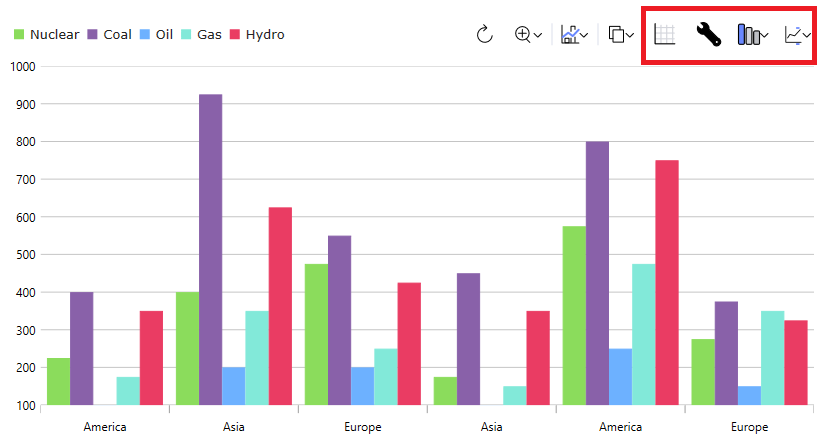
왼쪽에서 오른쪽으로:
- 첫 번째 도구는 제어 장치에 제공되는 데이터 그리드
DataSource를 보여줍니다. 이건 토글 도구라서, 그리드를 보여준 후 다시 클릭하면 시각화로 되돌아갑니다. - 두 번째 도구를 사용하면 현재 데이터 시각화의 설정을 구성할 수 있습니다.
- 세 번째 도구는 현재 시각화를 변경할 수 있게 해주어, 다른 시리즈 유형을 그래프로 그리거나 전혀 다른 유형의 시각화를 보여줄 수 있습니다. 이 기능은 위에서 언급한 속성을 설정
VisualizationType하여 컨트롤에 설정할 수 있습니다. - 마지막 도구는 기본 데이터 항목의 어떤 속성을 컨트롤에 포함할지 설정할 수 있게 해줍니다. 컨트롤에서 OR
includedProperties컬렉션을 설정excludedProperties하면 이 기능을 설정할 수 있습니다.
이 데모는 Web Components 파이 차트와 대시보드 타일 통합을 보여줍니다. 오른쪽 상단의 툴바 옵션은 스타일링 및 데이터 시각화 변경에 대한 액세스를 제공합니다.
이 데모에서는 대시보드 타일과 Web Components Geographic Map의 통합을 보여 줍니다. 오른쪽 위에 있는 도구 모음 옵션을 사용하면 데이터 시각화의 스타일을 지정하고 변경할 수 있습니다.
API References
IgcToolbarComponentIgcCategoryChartComponentIgcDataChartComponentIgcDataPieChartComponentIgcGeographicMapComponentIgcLinearGaugeComponentIgcRadialGaugeComponent