This topic gives a brief overview of the new controls and features introduced in the Ultimate UI for WPF 2014 Volume 1 Release.
The following table summarizes the new features of the Ultimate UI for WPF 2014 Volume 1. Additional details follow the summary table.
This feature provides you the ability to work with password encrypted/protected workbooks.
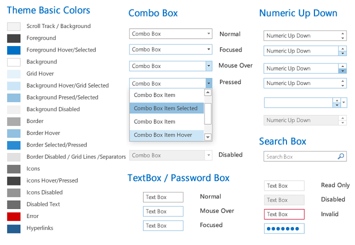
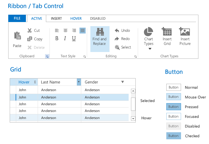
The new “Office 2013” theme inspired by the new MS Office 2013 presents a nice and clean look and feel. Not only does this new Office 2013 theme apply to all Infragistics controls, but also on the common Microsoft controls.

This feature provides the developer with the following new properties to set/get the selected value or selected values collection in the controls:
SelectedValue
SelectedValues
SelectedValuePath
This feature provides the developer with the enhanced SelectedItems property to set/get the selected data items collection in the controls.
This feature provides the developer with a new IsSelectedMemberPath property to configure the data model property name which boolean value defines the selected/unselected state of a data item in the controls.
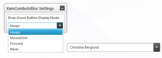
This feature provides the developer with a new DropDownButtonDisplayMode property to configure when the control’s Drop-Down button is displayed. The options are – always visible (default), on mouse over, when focused and never visible.
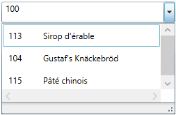
This feature provides the developer with the following new properties to configure the control’s Drop-Down maximum and minimum width:
MinDropDownWidth
MaxDropDownWidth
This feature provides the developer with functionality for customizing the item filtering. Now, it is possible to create more complex filters, to specify multiple data fields to be filtered or add multiple filter conditions per data field.
This feature provides the developer with additional information about the selected/unselected items preserved in the SelectionChanged event’s argument AddedItems and RemovedItems collections.
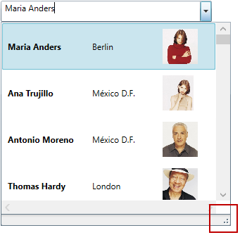
A resize handle is added in the xamComboEditor Drop-Down so the users can easily resize the Drop-Down at runtime.
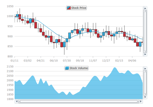
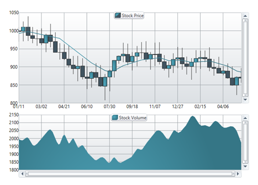
A new xamDataChart style featuring multiple visual changes and new property settings improving the overall look and feel of the chart is now available.
The following screenshots compare the chart new default style to the previous style.
New Default Style:
Previous Default Style:
The Record Numbering feature allows you to display one of several different numbering types in the xamDataGrid’s record selector column.
This feature introduce a new SelectedDataItems property allowing you to operate with the currently selected items of the xamDataGrid while using the Model-View-ViewModel (MVVM) architecture.
This feature provides the developer with a new ActiveDataItem property to identify and manipulate the currently active xamDataTree data item while using the Model-View-ViewModel (MVVM) architecture.

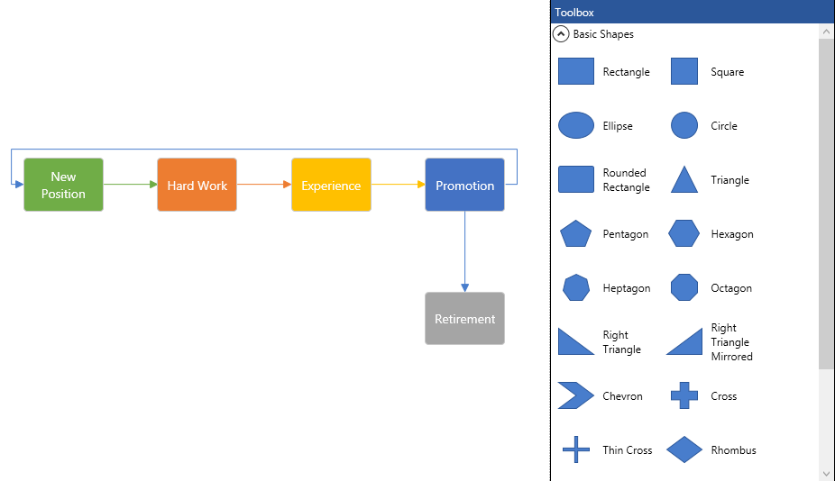
The WPF xamDiagram allows you to create your very own diagramming solution, with all of the features that you would expect in a diagramming tool such as Visio. The xamDiagram ships with all the features you will need to start writing anything from simple flow charts and activity diagrams, to complex LinqToSQL relationship diagrams.
This feature provides the developer with a new IsUndoEnabled property for turning on/off undo/redo operations in the input controls.
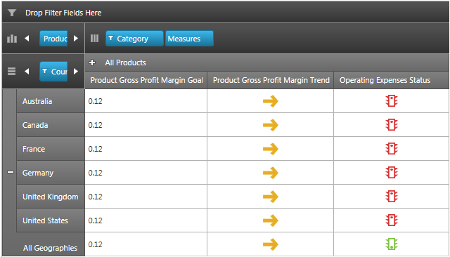
KPIs data can be visualized graphically through the combined use of the xamPivotDataSelector and the xamPivotGrid control. The xamPivotDataSelector control displays a separate folder, containing the KPI members calculated on the server. The xamPivotGrid displays a graphical representation of a KPI or its actual value. Custom KPIs cell templates are supported as well.
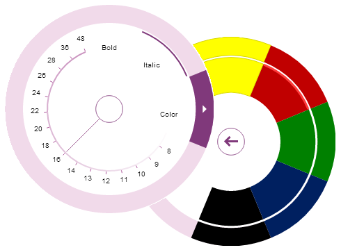
The xamRadialMenu control is essentially a context menu presenting its items in a circular arrangement around a center button. The circular arrangement of the items speeds up items selection, because each item is equally positioned in relation to the center. The xamRadialMenu supports different item types for choosing numerical values, color values or performs actions. Sub-Items are also supported.
The feature introduce a new look of xamRibbon’s backstage when the new “Office 2013” theme is used.
This feature allows you to create a toolbar located next to the xamRibbon’s tabs.
The feature allows you to import or export HTML data from and to the xamRichTextEditor control by invoking HTML serializer’s methods or by binding an HTML document adapter.
This feature allows you to input Asian languages directly in the xamRichTextEditor control’s editing area using input method compositions and candidate lists.
This feature allows you to input Asian languages directly in the xamSyntaxEditor control’s editing area using input method compositions and candidate lists.