This topic explains in detail the main features of the xamDiagram™ control.
The following topic is a prerequisites to understanding this topic:
This topic contains the following sections:
The xamDiagram provides a number of features delivering the functionality required of a diagramming tool. It supports MVVM friendly data binding and commanding along with available multiple navigation modes. Users can select, move, resize and edit diagram items and their visual aspects. Undo/redo functionality built on top of the Infragistics® Undo Redo Framework is available. Additionally, a navigation pane and a toolbox control are provided.
The following table summarizes the main features of the xamDiagram control. Details about each feature are further available in this help content.
The xamDiagram supports the following data binding schemes:
Nodes only – the data objects contain the information about how they are interconnected. Each data object is represented as a node in the diagram. Connections are automatically displayed for the logical connections defined through the data objects.
Nodes and Connections – two types of data objects are provided – one representing nodes and the other connections. The node objects do not contain information about how they are interconnected. For each of the data objects a node or a connection is displayed in the diagram.
Mixed – a combination of the previous two where node data objects contain the information about how they are interconnected, but additional connection data objects can be specified as well.
Users can navigate and zoom in and out the diagram with the mouse or the keyboard. All aspects of the navigation and zooming can be controlled through code as well.
By default, the xamDiagram allows users to select one or more nodes and connections by either clicking them or by selecting a rectangular area on the diagram surface. Programmatically, selection can be controlled through the SelectedItems and SelectedDataItems (when using data binding) properties of the XamDiagram or through the IsSelected property of the DiagramItem class (the base class for DiagramNode and DiagramConnection).
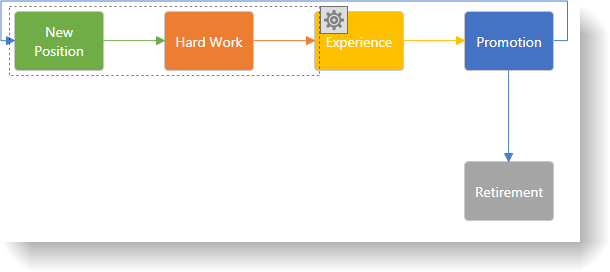
The following screenshot shows selected items in the xamDiagram :

With the selection of one or more than one item, all items can be moved simultaneously as a group by the user. Programmatically the position of nodes can be changed by their Position property. For connections, achieve this by setting their StartNode/ StartNodeKey or EndNode/ EndNodeKey properties to the string identifiers of nodes or by setting the StartPosition and EndPosition properties, to draw a connection between two specific points.
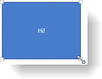
Selecting a single node allows users to resize it. Both proportional and free resizing are supported. When a single connection is selected, users can change its start and end points to either point to other nodes or to any place on the diagram.
The following screenshot demonstrates a node being resized.
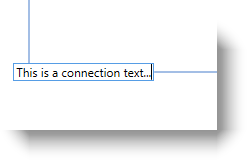
When a diagram item is selected its content can be modified by the users by either double click or by pressing F2.
The following screenshot demonstrates a connection in edit mode.
In complance with WPF standards, the xamDiagram exposes commands that can be used in the views. Where appropriate, these are bound to the respective ApplicationCommands members. Below is a list of the commands exposed by the xamDiagram :
SelectAll
Copy
Paste
Cut
Delete
Edit
Undo
Redo
ShowOptionsPane
CloseOptionsPane
BringForward
BringToFront
SendBackward
SendToBack
The xamDiagram keeps its own undo/redo stack in order to provide support for restoring the state of its items made either by user interactions or code. The undo/redo functionality uses the Infragistics Undo Redo Framework allowing easy integration into any existing application using the undo/redo framework. Disable the undo/redo functionality if not needed.
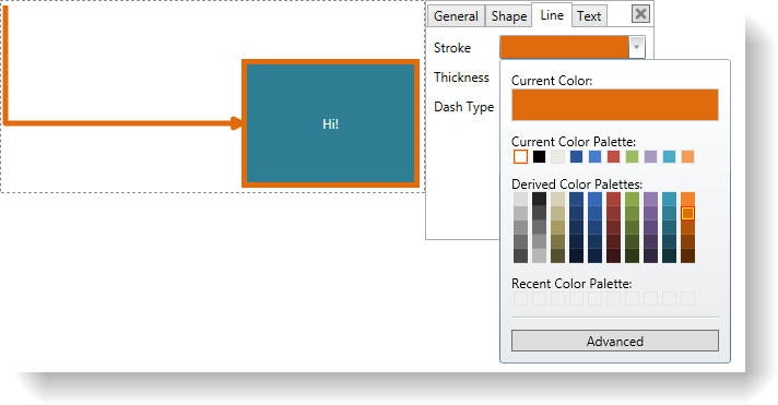
Selecting a single or multiple items displays a settings button for opening the context options pane. Using the options in the pane, users can customize the appearance of both nodes and connections. Some of the available customization aspects are opacity, colors for stroke and fill, thickness and dash types for the lines, font and font styling. For connections, the line type can be changed (straight or right-angle) and different start/end caps can be selected.
The following screenshot demonstrates the stroke color being edited for the selected connection and node.
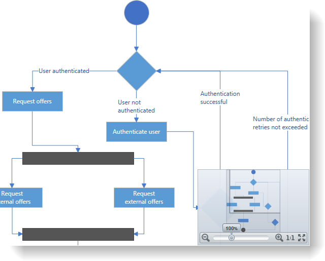
The xamDiagram uses the xamOverviewPlusDetailsPane control to display an overview of the diagram and to provide quick navigation options.
The following screenshot demonstrates the enabled navigation pane in a diagram.
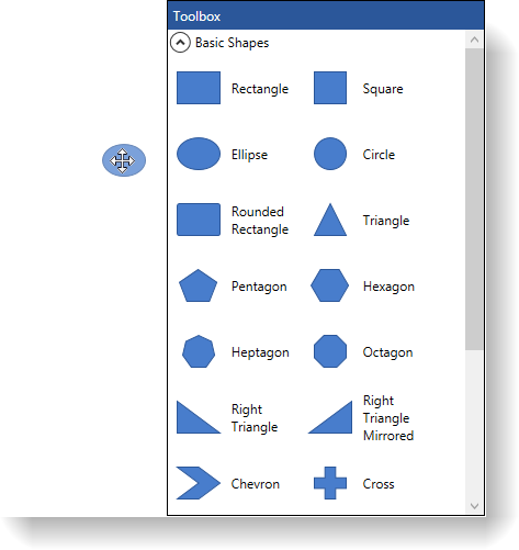
The xamDiagram provides a helper toolbox control which can be used together with the diagram to provide a better diagram authoring experience. The toolbox contains multiple predefined shapes that can be dragged onto the diagram; moreover, it can also be easily extended to provide custom shapes.
The following screenshot demonstrates an ellipse node being dropped from the toolbox to an empty diagram.
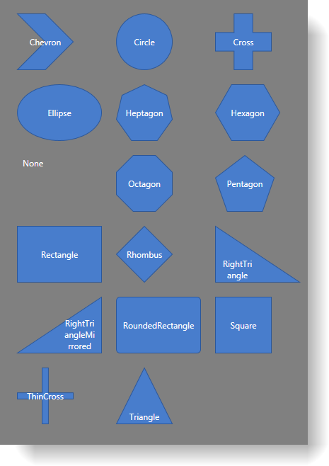
The xamDiagram provides a number of pre-defined shapes for the nodes. If the desired shape is not available as a pre-defined shape, a custom shape can be set to the Geometry property.
The following screenshot demonstrates some of the predefined shapes.
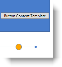
Any custom data template can be specified for displaying the diagram nodes’ and connections’ content. A separate template can be applied for editing.
The following screenshot demonstrates a node and connection with applied custom content template.
In order to support large amounts of data and keep performance high, the xamDiagram virtualizes items that are not currently in view and removes them from the visual tree; thus, improving performance.
The following topic provides additional information related to this topic.