Ignite UI for Web Components 시작하기
Ignite UI for Web ComponentsInfragistics Web Components을 위한 완전한 UI 위젯, 컴포넌트, Figma UI 키트 세트입니다. 개발자들은 데스크톱 브라우저, 모바일 경험, 그리고 프로그레시브 웹 앱(PWA)을 위한 현대적이고 고성능 HTML5 및 JavaScript 앱을 구축할 수 있습니다.
Ignite UI for Web Components 포함된 구성 요소와 서비스에 따라 MIT 또는 상업용 라이선스 하에 제공되는 여러 패키지로 구성되어 있습니다. 구성 요소와 라이선스에 대한 자세한 목록은 라이선스 FAQ와 설치 및 오픈 소스 대 프리미엄 주제를 참고해 주세요.
Install Ignite UI CLI
애플리케이션을 처음부터 만들고 Ignite UI Web Components 사용하도록 구성하려면 Ignite UI CLI를 사용할 수 있습니다. 첫 번째 단계는 다음과 같이 해당 패키지를 전역으로 설치하는 것입니다.
npm install -g igniteui-cli
이용 가능한 옵션들을 안내해 경험하고 싶다면, 새로운 애플리케이션을 만들고 설정하는 데 도움이 되는 단계별 모드를 초기화할 수 있습니다. 가이드를 시작하려면 다음 명령을 실행ig 하세요:
ig
그 다음 Web Components 프레임워크로 선택하고, 프로젝트 템플릿을 선택Base 하고, 특정 컴포넌트/뷰를 추가하거나 선택하세요Complete & Run. 또한, 이 주제에서 Ignite UI CLI에 대해 더 읽어볼 수 있습니다.
Install Polyfills
웹 구성 요소 폴리필을 설치하려면 다음 명령을 실행하세요.
npm install @webcomponents/custom-elements
그런 다음 웹 구성 요소 폴리필을 index.js로 가져옵니다.
import '@webcomponents/custom-elements/custom-elements.min';
import '@webcomponents/custom-elements/src/native-shim.js';
Install Ignite UI for Web Components
애플리케이션에서 Ignite UI Web Components을 사용하려면 다음 패키지를 설치igniteui-webcomponents 해야 합니다:
npm install igniteui-webcomponents
다음으로 파일에 사용할index.ts 컴포넌트를 불러와야 합니다. 다음과 같은 함수를 사용해defineComponents 하나 이상의 컴포넌트를 가져올 수 있습니다:
import { defineComponents, IgcAvatarComponent, IgcBadgeComponent } from 'igniteui-webcomponents';

defineComponents(IgcAvatarComponent, IgcBadgeComponent);
또한 다음 함수를 사용하여defineAllComponents 모든 컴포넌트를 가져올 수도 있습니다:
import { defineAllComponents } from 'igniteui-webcomponents';

defineAllComponents();
[!Note] Importing all of the components will increase the bundle size of your application. That's why we recommend you to import only the components that you are actually using.
마지막 단계는 구성 요소에 필요한 CSS를 가져와서 적절하게 스타일이 지정되도록 하는 것입니다.
import 'igniteui-webcomponents/themes/light/bootstrap.css';
구성 요소를 가져온 후 HTML에서 사용할 수 있습니다.
<igc-avatar initials="AZ"></igc-avatar>
<igc-badge></igc-badge>
Install Charts and Map Packages
Step 1 - Create the Web Component Project
1 - 명령줄을 열고 wc-html 이라는 디렉터리를 만듭니다.
mkdir wc-html
2 - 새로 생성된 디렉터리로 명령줄 경로를 변경합니다.
cd wc-html
3 - 디렉토리에서 npm 초기화
npm init -y
4 -webpack 번들러와 webpack cli를 개발자 종속성으로 설치합니다.
npm install webpack webpack-cli --save-dev
[!Note] Webpack is a module bundler. Its main purpose is to bundle JavaScript files for usage in a browser, yet it is also capable of transforming, bundling, or packaging just about any resource or asset.
5 -VS Code에서 프로젝트 열기
code .
6 - 다음 코드를 사용하여 index.html 이라는 새 파일을 만듭니다.
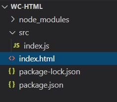
7 -src 라는 새 폴더를 만들고 해당 폴더 내에 index.js 라는 새 파일을 만듭니다. 프로젝트 구조는 다음과 같아야 합니다.
8 -webpack을 사용하여 빌드 스크립트를 포함하도록 package.json 파일을 업데이트합니다.
  "scripts": {
    "build": "webpack ./src/index.js -o ./dist/ --output-filename index.bundle.js"
  },
[!Note] This script will use webpack to bundle the index.js file into another file called index.bundle.js and place it into a folder named dist.
If a JavaScript heap out of memory issue occurs while building you can increase the heap size by using this build command instead:
"scripts": {
    "build": "node --max_old_space_size=8192 node_modules/webpack/bin/webpack src/index.js -o dist/index.bundle.js"
},
Step 2 - Install Polyfills
1 -VS Code에서 터미널 열기(보기-> 터미널 메뉴 또는 CTRL + ` 키 누르기)
2 - 웹 구성 요소 폴리필을 설치하려면 다음 명령을 입력합니다.
npm install @webcomponents/custom-elements
3 - 웹 구성 요소 폴리필을 index.js로 가져옵니다.
import '@webcomponents/custom-elements/custom-elements.min';
import '@webcomponents/custom-elements/src/native-shim.js';
Step 3 - Install Ignite UI for Web Components and lit-html
1 -npm을 사용하여 웹 구성 요소용 Ignite UI 설치합니다. 이 예에서는 Map 웹 구성 요소를 설치합니다.
npm install --save igniteui-webcomponents-core
npm install --save igniteui-webcomponents-charts
npm install --save igniteui-webcomponents-maps
npm install lit-html
2 -index.js 파일에서 지리적 지도 모듈과 ModuleManager를 가져옵니다.
import { IgcGeographicMapModule } from 'igniteui-webcomponents-maps';
import { IgcDataChartInteractivityModule } from 'igniteui-webcomponents-charts';
// module manager for registering the modules
import { ModuleManager } from 'igniteui-webcomponents-core';
3 -ModuleManager를 사용하여 지리적 지도 모듈 등록
ModuleManager.register(
    IgcGeographicMapModule,
    IgcDataChartInteractivityModule
);
4 -index.html 파일의 본문에 지리적 지도 웹 구성 요소를 추가합니다.
<body>
    <igc-geographic-map id="map" height="500px" width="100%">
    </igc-geographic-map>
</body>
Step 4 - Build and Run the Web Component Project
1 -VS Code에서 터미널을 열고 빌드 스크립트를 실행합니다.
npm run build
[!Note] This command will run the build script we created earlier. The build script will generate a file named index.bundle.js in a folder named dist
2 -index.html 파일의 본문 요소 끝에 index.bundle.js 스크립트를 추가합니다.
<body>
    <igc-geographic-map id="map" height="500px" width="100%">
    </igc-geographic-map>

    <script src="dist/index.bundle.js"></script>
</body>
3 - 프로젝트를 실행하려면 로컬 개발 서버를 시작합니다. 이 예에서는 Live Server를 사용하고 있습니다. index.html 편집기 내에서 마우스 오른쪽 버튼을 클릭하고 Live Server로 열기를 선택하세요.
[!Note] Live Server is an extension to Visual Studio Code that allows you to launch a local development server with live reload feature for static & dynamic pages. This extension can be installed via the Visual Studio Code Extensions tab, or by downloading it from the Visual Studio Marketplace.
4 - 로컬 서버의 웹 브라우저를 사용하여 index.html로 이동합니다. 최종 결과에는 대화형 세계 지도가 표시되어야 합니다.
Ignite UI for Web Components 패키지 개요
Ignite UI for Web Components 디자인 도구와 Web Components 지원 서비스를 위한 UI 위젯, 컴포넌트, UI 키트의 완전한 세트입니다. 개발자들이 최신 데스크톱 브라우저, 모바일 경험, 그리고 브라우저의 웹 구성 요소 API를 목표로 하는 점진적 웹 앱(PWA)을 위한 가장 현대적이고 고성능 HTML5 및 JavaScript 앱을 구축할 수 있도록 설계되었습니다.
Charts & Graphs
Ignite UI for Web Components 에는 65+ 종류의 차트 시리즈와 조합을 통해 모든 종류의 데이터를 시각화할 수 있는 차트 및 그래프 라이브러리가 포함되어 있어 멋지고 인터랙티브한 차트와 대시보드를 만들 수 있습니다. 속도와 아름다움을 위해 만들어졌고, 모든 최신 브라우저에서 작동하도록 설계되었으며, 완전한 터치와 상호작용을 지원해 어떤 기기에서든 빠르게 반응형 비주얼을 만들 수 있습니다.
게이지
Ignite UI for Web Components 데이터를 쉽고 직관적으로 설명할 수 있도록 방사형 게이지, 선형 계기, 불릿 그래프 구성 요소를 제공합니다. 방사형 게이지은 미리 정의된 형태와 축척을 만들기 위한 다양한 커스터마이징 옵션을 제공합니다. 선형 계기은 저울과 하나 이상의 범위와 비교한 값의 간단한 뷰를 제공합니다. 하나의 척도, 하나의 체크 표시 세트, 그리고 하나의 라벨 세트를 지원합니다. 불릿 그래프 컴포넌트는 대시보드에서 사용되는 미터와 게이지를 단순한 막대 차트로 대체하는 데이터 시각화를 가능하게 합니다.
지도
Ignite UI for Web Components 지리지도 구성 요소는 애플리케이션 내에서 지리 데이터를 시각화할 수 있는 기능을 제공합니다. 이 도구는 여러 지리적 위치로 구성된 데이터 세트를 마커, 선, 다각형, 심지어 인터랙티브 비트맵 형태로 렌더링할 수 있습니다. 여러 지도 레이어에 지리 데이터를 겹쳐 놓고, 특정 지리적 위치를 표시하며, 맞춤형 마커와 색상으로 정보를 표시할 수 있습니다.
Grids & Inputs
Ignite UI for Web Components 는 Grid Lite (MIT 라이선스 하의 경량형 그리드 컴포넌트), Data Grid (상업용 라이선스 기능의 풍부한 그리드 컴포넌트), List, Tree, 심지어 스프레드시트 등 다양한 형태로 데이터를 거의 설정하지 않고 바인딩하고 표시할 수 있는 여러 Grid 컴포넌트를 제공합니다.
Buttons, Inputs, Layouts, and Menus
Ignite UI for Web Components 다양한 종류의 버튼, 입력, 메뉴, 레이아웃을 제공하여 캡슐화와 의존성 없는 재사용 컴포넌트 개념을 활용해 현대적인 웹 애플리케이션을 구축할 수 있게 합니다. 스토리북은 여기에서 확인할 수 있습니다. 이 구성 요소들은 Indigo Design System를 기반으로 하며, App Builder에서 완전히 지원되고 Figma 즉시 사용할 수 있는 UI 키트로 뒷받침됩니다.