Web Components Stepper 개요
Web Components 스테퍼 구성 요소는 마법사와 같은 워크플로를 제공하며 번호가 매겨진 단계를 통해 진행 상황을 표시하는 데 사용됩니다. 개발자는 긴 콘텐츠를 일련의 논리적 단계로 나누어 최종 사용자가 전체 프로세스를 더 쉽게 탐색할 수 있도록 돕습니다. Web Components 스테퍼는 수직 또는 수평 선으로 표시됩니다. Web Components 스테퍼에는 단계 검증, 스타일링, 방향 및 키보드 탐색과 같은 여러 기능이 있습니다.
Web Components Stepper Example
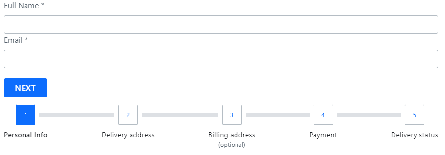
아래의 Ignite UI for Web Components 스테퍼 예제는 작동 중인 구성 요소를 보여줍니다. 최종 사용자가 몇 가지 연속 단계에 따라 주문 세부 정보를 구성하기 위해 거쳐야 하는 프로세스를 시각화합니다.
Getting Started with Web Components Stepper
먼저 다음 명령을 실행하여 Ignite UI for Web Components 설치해야 합니다.
npm install igniteui-webcomponents
사용하기IgcStepperComponent 전에 다음과 같이 등록해야 합니다:
import { defineComponents, IgcStepperComponent } from 'igniteui-webcomponents';

defineComponents(IgcStepperComponent);
Ignite UI for Web Components에 대한 완전한 소개는 '시작 주제'를 읽어보세요.
이제 Web ComponentsIgcStepperComponent과 그 단계의 기본 구성부터 시작할 수 있습니다.
How To Use Web Components Stepper
는IgcStepComponent에 속IgcStepperComponent 하는 모든 단계를 나타내는 것입니다. 스텝은 비즈니스 요구에 맞게 스테이트 상태를 구성할 수 있는 기능을 제공하는 속성과 기능을 제공합니다invalidactiveoptionaldisabledcomplete.
Declaring Web Components Stepper
다음 접근 방식 중 하나를 사용하여 단계를 선언할 수 있습니다.
- 데이터 세트 반복
<igc-stepper>
    ${stepsData.map((step) => html`
    <igc-step .disabled=${step.disabled}>
        <div slot="indicator">
            <igc-icon .iconName=${step.indicator}></igc-icon>
        </div>

        <p slot="title">${step.title}</p>
    </igc-step>
    `
</igc-stepper>
- 정적 단계 생성
<igc-stepper>
    <igc-step>
       <p slot="title">Step 1</p>
    </igc-step>
    <igc-step>
       <p slot="title">Step 2</p>
    </igc-step>
</igc-stepper>
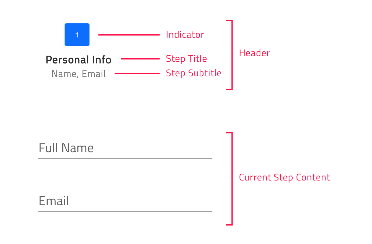
각 단계마다 사용자는 다음과 같은 'the ,Indicator andTitle slots'를 사용하여Subtitle indicator, title, subtitle을 구성할 수 있습니다:
[!Note] The
DefaultIgcStepComponentslot renders the content of the step.
<igc-stepper>
    <igc-step>
       <igc-icon slot="indicator" iconName="home"></igc-icon>
       <p slot="title">Home</p>
       <p slot="subtitle">Home Sub Title</p>
       <div>
          Step Content
       </div>
    </igc-step>
</igc-stepper>
Orientation in Web Components Stepper
노출orientation 된 속성을 통해 스테퍼 방향을 커스터마이즈할 수 있습니다. 수 평 (기본 값) 이나 수직으로 설정할 수도 있습니다.
수평 스테퍼 방향
수평은 방향 속성의IgcStepperComponent 기본 값입니다. Web Components 스테퍼가 수평 방향일 때, 스텝 내용이 헤더 위에 표시될지 아래에 표시될지 결정할 수 있습니다. 이는 다음 설정을 통해 달성할 수 있습니다.IgcStepperComponent contentTop 기본값이 false 인 불리언 속성입니다. 활성화되어 있으면 단계의 내용이 각 단계의 헤더 위에 표시됩니다.
수직 스테퍼 방향
수평 레이아웃에서 세로 레이아웃으로 쉽게 전환할 수 있습니다. 기본 방향을 변경하려면 다음 방향을 설정해야 합니다.orientation property를 세로.
아래 샘플은 스테퍼 방향과 제목 위치가 런타임에 어떻게 변경될 수 있는지 보여줍니다.
Step States
Web ComponentsIgcStepperComponent 다섯 단계 상태를 지원하며, 각 단계는 기본적으로 서로 다른 스타일을 적용합니다:
- active- 해당 단계가 현재 표시되는 것인지 여부를 결정합니다. 설계상, 사용자가 특정 단계의 활성 속성을 명시적으로 true로 설정하지 않으면, 초기 활성 단계가 비활성화되지 않은 첫 번째 단계가 됩니다.
- disabled- 단계가 해결 불가능한지 판단합니다. 기본적으로 단계의 비활성화된 속성은 false로 설정되어 있습니다.
- invalid- 해당 단계가 유효한지 여부를 결정합니다. 그 값을 바탕으로 사용자가 선형 스테퍼 모드에서 앞으로 이동할 수 있는지 결정됩니다. 기본 값은 false 입니다.
- optional- 기본적으로 단계의 선택적 속성은 false로 설정되어 있습니다. 선형 스테퍼 내 스텝의 유효성이 필요하지 않은 경우, 선택적 속성을 활성화하여 스텝 유효성과 독립적으로 진행할 수 있습니다.
- complete- 기본적으로 단계의 complete 속성은 false로 반환됩니다. 하지만 사용자는 필요에 따라 complete 속성을 설정하여 이 기본 완전 동작을 덮어쓸 수 있습니다. 단계가 완료로 표시되면 기본적으로 단계별 헤더의 스타일뿐만 아니라 완료된 단계와 다음 단계의 진행 줄도 변경됩니다.
Linear Web Components Stepper
Web ComponentsIgcStepperComponent이 속성을 이용linear 해 스텝 플로우를 설정할 수 있는 기회를 제공합니다. 기본적으로 선형은 false로 설정되어 있으며, 사용자는 비활성화되지 않은 단계의 어떤 단계IgcStepperComponent 든 선택할 수 있습니다.
<igc-stepper linear="true">
    <igc-step>
       <p slot="title">Step 1</p>
    </igc-step>
    <igc-step>
       <p slot="title">Step 2</p>
    </igc-step>
</igc-stepper>
선형 속성이 true로 설정되면, 스테퍼는 다음 단계로 넘어가기 전에 현재 비선택적 스텝이 유효해야 합니다.
현재 비선택적 단계가 유효하지 않은 경우 현재 단계를 확인할 때까지 다음 단계로 진행할 수 없습니다.
[!Note] Optional steps validity is not taken into account in order to move forward.
Step Interactions
IgcStepperComponent단계 상호작용을 위한 다음 API 메서드를 제공합니다:
- NavigateTo– 주어진 인덱스로 단계를 활성화합니다.
- next- 비활성화되지 않은 다음 단계를 활성화합니다.
- prev– 비활성화되지 않은 이전 단계를 활성화합니다.
- 재설정– 스테퍼를 초기 상태로 재설정합니다.
[!Note] The reset method would reset the stepper to its initial state, i.e. activates the first step. It would not clear the step`s content. This should be done manually.
Customizing the Steps
Ignite UI for Web Components Stepper를 사용하면 제목, 표시기 등에 대한 다양한 옵션을 구성할 수 있습니다.
이는 의 특성을 통해stepType 달성될 수 있습니다.IgcStepperComponent 값은 다음과 같습니다:
- Full (기본 값)
- 지시자
- 제목
부르다
제목과 부제목이 정의된 경우 이 설정을 사용하면 표시기와 제목이 모두 렌더링됩니다.
사용자는 또한 스텝 표시기 앞, 뒤, 위, 아래에 제목을 지정할 수 있는 기능을 가질 수 있습니다. 사용자는 이 속성을 사용하여titlePosition 타이틀 위치를 설정할 수 있습니다. 값은 다음과 같습니다:
- 정의되지 않음 (기본값)
- 끝
- 시작
- 맨 아래
- 맨 위
Web ComponentsIgcStepperComponent가 수평 방향이고 타이틀 위치가 정의되지 않은 경우, 타이틀은 표시기 아래에 표시됩니다.
방향이 수직으로 설정되어 있고 타이틀 위치가 정의되지 않으면, 타이틀은 표시기 뒤에 표시됩니다.
[!Note] titlePosition property is applicable only when the stepper stepType property is set to full.
깜빡이
단계별 표시만 표시하고 싶다면, stepType 옵션을 표시기로 설정하세요.
스텝 인디케이터는 모든 콘텐츠를 지원하지만, 크기는 항상 24픽셀 이라는 제한이 있습니다. 이 점을 염두에 두고, 우리는 단계적 지표로 사용하거나IgcIconComponent 사용하는IgcAvatarComponent 것을 권장합니다.
제목
단계별 제목만 표시하고 싶다면 stepType 옵션을 제목으로 설정하세요.
이런 방식으로 자막이 정의되면 단계 제목 아래에도 렌더링됩니다.
[!Note] This container could be re-templated as per your requirement without any size restrictions. For example, you could add an indicator with size greater than 24 pixels inside it.
아래 샘플은 노출된 모든 단계 유형과 변경 방법을 보여줍니다.
Stepper Animations
Web ComponentsIgcStepperComponent 애니메이션은 최종 사용자에게 정의된 단계와 상호작용하며 아름다운 경험을 제공합니다. 사용 가능한 애니메이션 옵션은 스테퍼의 방향에 따라 다릅니다.
스테퍼가 수평 방향일 때는 기본적으로 애니메이션을 사용하도록slide 설정되어 있습니다. 대안으로서도 지원fade 해요. 애니메이션은 입력을horizontalAnimation 통해 구성됩니다.
수직 방향 레이아웃에서는 애니메이션 유형을 다음 속성을 사용하여verticalAnimation 정의할 수 있습니다. 기본적으로 그 값은 로grow 설정되어 있으며, 사용자가 그 값도 로fade 설정할 수 있습니다.
두 애니메이션 입력 모두 설정하면none 스테퍼 애니메이션이 비활성화됩니다.
IgcStepperComponent이 컴포넌트는 또한 각 단계 간 전환 시간을 설정할 수 있는 기능을 제공합니다. 이는 숫자를 인수로 삼으며 두 방향 모두에 공통적인 성질을 통해animationDuration 달성할 수 있습니다. 기본 값은 320ms로 설정되어 있습니다.
Keyboard Navigation
Ignite UI for Web Components 스테퍼는 최종 사용자에게 다양한 키보드 상호작용을 제공합니다. 이 기능은 기본적으로 활성화되어 있어 최종 사용자가 단계를 쉽게 탐색할 수 있게 합니다. Web ComponentsIgcStepperComponent 내비게이션은 W3 접근성 기준을 준수하며 사용하기 편리합니다.
주요 조합
- TAB- 포커스를 다음 탭 가능한 요소로 이동합니다.
- SHIFT + TAB- 포커스를 이전 탭 가능 요소로 이동합니다.
- ↓- 스테퍼가 수직 방향 일 때 포커스를 다음 액세스 가능한 단계의 헤더로 이동합니다.
- ↑- 스테퍼가 수직 방향 일 때 액세스 가능한 이전 단계의 헤더로 포커스를 이동합니다.
- ←- 두 방향 모두에서 액세스 가능한 이전 단계의 헤더로 초점을 이동합니다.
- →- 초점을 두 방향 모두에서 액세스 가능한 다음 단계의 헤더로 이동합니다.
- HOME- 포커스를 스테퍼에서 FIRST 활성화 단계의 헤더로 이동합니다.
- END- 포커스를 스테퍼에서 LAST 활성화 단계의 헤더로 이동합니다.
- ENTER 또는 SPACE- 현재 포커스가 있는 단계를 활성화합니다.
Styling Web Components Stepper
아래에 나열된 노출된 CSS 부품 중 일부를 사용해 외IgcStepComponent 관을 변경할 수 있습니다:
| 부품명 | 설명 |
|---|---|
header-container |
단계 헤더 및 해당 구분 기호의 래퍼입니다. |
disabled |
비활성화된 상태를 나타냅니다. 헤더 컨테이너에 적용됩니다. |
complete-start |
현재 단계의 전체 상태를 나타냅니다. 헤더 컨테이너에 적용됩니다. |
complete-end |
이전 단계의 전체 상태를 나타냅니다. 헤더 컨테이너에 적용됩니다. |
optional |
선택적 상태를 나타냅니다. 헤더 컨테이너에 적용됩니다. |
invalid |
잘못된 상태를 나타냅니다. 헤더 컨테이너에 적용됩니다. |
top |
제목이 표시기 위에 있어야 함을 나타냅니다. 헤더 컨테이너에 적용됩니다. |
bottom |
제목이 표시기 아래에 있어야 함을 나타냅니다. 헤더 컨테이너에 적용됩니다. |
start |
제목이 표시기 앞에 와야 함을 나타냅니다. 헤더 컨테이너에 적용됩니다. |
end |
제목이 표시자 뒤에 와야 함을 나타냅니다. 헤더 컨테이너에 적용됩니다. |
header |
단계 표시기 및 텍스트의 래퍼입니다. |
indicator |
단계의 표시기입니다. |
text |
단계 제목 및 부제목의 래퍼입니다. |
empty |
단계에 제목과 부제목이 제공되지 않았음을 나타냅니다. 텍스트에 적용됩니다. |
title |
단계의 제목입니다. |
subtitle |
단계의 부제목입니다. |
body |
단계 콘텐츠의 래퍼입니다. |
content |
단계 내용. |
이 CSS 부품들을 사용하면 컴포넌트의IgcStepperComponent 외관을 다음과 같이 커스터마이즈할 수 있습니다:
igc-step::part(title) {
  color: var(--ig-primary-500);
}
igc-step[active]::part(indicator) {
  background-color: var(--ig-primary-500);
}
igc-step::part(indicator) {
  background-color: var(--ig-surface-500);
}